Quick wins for a faster PC:
Clear out junk files and repair common Windows errorsFree Scan →Fix the driver behind crashes, sound loss and screen glitchesFind Drivers →To make mobile game art look good and stay readable on a phone, choose a visual direction that fits the game, then test every important character, effect, icon, and text element at actual play size. Strong art does more than decorate: it helps players read the world, understand what happened, and feel the impact of an action. No single aesthetic suits every game, and attractive art alone does not guarantee better retention, satisfaction, or revenue.
Start with the game’s visual promise
Before settling on a rendering technique, define what the game should feel like and what players should recognize at a glance. Consider its genre, audience, mood, setting, and player fantasy. A visual direction for a tense survival game will likely make different choices from one for a playful puzzle game—not because one style is inherently better, but because each should support a different experience.
Google Play says there is no single preferred aesthetic; it values designs that are original, consistent, and appealing. Treat that as a test of fit and coherence, not a mandate to follow a trend. Establish a compact style guide covering palette, shape language, edges or line work, lighting, material cues, typography, and motion. Apply those rules to characters, environments, interface, animation, and promotional art so they feel like parts of the same game.
Google Play also recommends that animation, art style, audio, story, and controls work together. A beautifully rendered character can still feel out of place if the movement, sound, or interface suggests a different world.
#1 Best Overall
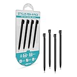
- Compatible with: Nintendo DS Lite and DSi
- Screen safe: Soft tip won’t scratch your touchscreen
- Great replacement: Ideal for lost or broken styluses
- Includes: 4 stylus pens
- Fits perfectly: Slides into DS Lite and DSi stylus slot
Make the play screen readable at phone size
During active play, players need to identify the elements that matter now: their character, threats, goals, resources, and immediate actions. Give those elements visual priority. If background detail or contrast competes with them, simplify or quiet the background rather than adding more emphasis everywhere.
Check the real viewing size
Review gameplay on supported phones, or inspect a screenshot at a size close to how it will appear in a player’s hands. Enlarged desktop artwork can hide problems: a small icon may lose its shape, a thin line may disappear, or text may become difficult to read. Apple’s game design guidance emphasizes legible text and adequate contrast, while Google’s Playables guidance calls for clear rendering across screen resolutions without blur, pixelation, or stretching.
Rank #2

- 20 Pieces Stylus Pens: the stylus pen comes in 10 colors, It's retractable, collapsing to 2.4 inches and extending to 3.1 inches; 2 pieces per color and 20 pieces in total, sufficient quantity available for you to use and replace
- Easy to Carry: the size of the stylus tablet pen with keychain is proper, it can attach to your keys or slip into your purse, and then can be easily put in pocket or bag for your next use; It can be plugged into any device with a 3.5mm headphone jack
- Serviceable Material: the product features an aluminum casing with colorful paint accents, giving it an attractive appearance; The pen tip is made of soft rubber, ensuring smooth operation without leaving marks; It's a small tool that combines aesthetics and practicality
- Universal Design: this capacitive stylus is compatible with various capacitive touchscreens; You can use it to draw and write, with smooth touch response, allowing users with large hands to operate accurately even on small screens
- Fit Most Capacitive Touch Screens: these digital pens are compatible with all smartphones, mobile phones, tablets and other devices equipped with capacitive touch screens, bringing convenience to your work; Nice gifts to share with families
Use platform guidance in its proper scope
Google’s current Playables design recommendations specify at least 4.5:1 contrast for text below 18pt, or bold text below 14pt, and at least 3:1 for other text. The same guidance recommends touch targets of at least 48 by 48 dp, spaced at least 8 dp apart. These are recommendations for Google Playables, not universal requirements for every mobile game or platform; check the guidance that applies to your release.
Regardless of platform, make important controls easy to find and operate. Contrast and readable type are useful starting points, but review the interface with players and on devices rather than assuming one treatment works for everyone.
Windows Errors? Fix Them Before They Spread
Repair common Windows errors and clear accumulated junk for a smoother, more stable PC - no reinstall needed.Free scan · no reinstallCrashes, No Sound, or Screen Glitches?
Random freezes, missing sound and display glitches usually trace back to one bad driver. Find and replace yours safely.Free scan · under a minuteRank #3

- 5PCS Portable Game Touch Pen Retractable Mini Metal Stylus Touch Screen Pen For New 3DS Console
- Package include: 5 x Metal Touch Pen
- Replace your broke or old touch pen
- Stylus Touch Screen Pen For NEW 3DS
Use visual language to teach and signal
Players learn a game’s visual rules as they play. Repeating shapes, color treatments, animation timing, and icon conventions can help distinguish friendly objects, hazards, interactables, and changing states. Use those conventions consistently: if a particular outline signals an interactable object, changing that meaning without warning can slow recognition.
Do not make color the only way to communicate a critical distinction. Pair it with another cue, such as shape, label, position, or animation, so the information remains available to players who have difficulty distinguishing particular colors. This is a usability practice, not a universal palette prescription.
Rank #4
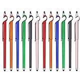
- 【Packaging Include】12 Pcs stylus pens, which include 6 colors: red, blue, green, orange, purple and black, each color have two black ink pens.
- 【3 in 1 Multifunctional】One side of this touch screen pens is a replaceable ballpoint pen, the other side is a capacitive stylus. The detachable pen cap is a simple mobile phone holder, which with a clip design, so easy to carry out.
- 【High Sensitive and Compatibility Rubber Tip】High quality soft rubber tip can be used on any touch screens devices of digital display products smoothly. It creates our ultra-sensitive and ultra-fast responsive speed, and keeping your touch screen away from fingerprints, scratches, and grease by your hands.
- 【A Most Convenient Phone Holder】The pen’s cap was made into a super simple phone holder, you can make your mobile phone stand up anywhere, for example, in the bedroom table, classroom desk, office, and dining-table. Very convenient to play games and watch movies.
- 【Perfect Writing Experience】The black ink pen is made of high-quality aluminum with excellent electroplating process, single pen weight 8.5g and 145mm length, you will get a good feel experience of your hand when writing. Also, our ballpoint pen is fine, smooth, long-lasting flow and the refill is replaceable. It's a good partner for your work and study.
Make effects clarify what happened
Animation and effects can make force, speed, damage, reward, and success easier to understand. Their job is not simply to look impressive: they should help players perceive an event and judge its importance. A motion trail, for example, can show an object’s recent direction and make its movement easier to follow.
Match an effect’s intensity to the event, and make sure it does not obscure the next decision. A screen-filling burst may suit a major victory but distract during a routine action. A survey of game feel describes visual polish as one way to amplify and clarify events, while emphasizing that game feel depends on context. Treat effects as part of the interaction, not decoration layered on afterward.
Free tools Windows power users keep installed
One-click scans. No signup required.
Best Value

- 【Enhanced Precision with Dual Rubber Tips - Smooth, Comfortable, and Stylish】Experience unparalleled accuracy with our dual-tip stylus, featuring two premium silicone rubber tips (7mm/5mm) designed for smooth, responsive performance across tasks like browsing, writing, drawing, and gaming. These soft, durable tips protect your screen from scratches and reduce fingerprints, making it perfect for users with long nails or larger fingers. Crafted with a sleek aluminum body, this stylus blends functionality and elegance, ensuring a seamless and stylish digital experience every time.
- 【High Precision & Scratch Protection】 This stylus Pen for Touchscreen is equipped with a highly sensitive rubber tip that glides effortlessly across the screen, delivering pixel-perfect precision for seamless writing, drawing, and navigation. Its anti-scratch design safeguards your device from fingerprints, smudges, and scratches, keeping your screen pristine. Perfect for unleashing creativity and enhancing productivity with smooth, lag-free performance.
- 【Ready to Use, No Hassle Setup】Experience instant creativity with our iPad stylus pen—no Bluetooth connection or charging required. Simply pick it up and start writing or drawing effortlessly. Perfect for jotting down ideas, sketching designs, or unleashing your creativity, it delivers a smooth, natural, and reliable performance every time.
- 【Universal Compatibility】 Our stylists pens for touch screens is designed to seamlessly work with all capacitive touch screen devices, including iPhone, iPad, Nintendo Switch, Android phones, Samsung Galaxy, tablets, Chromebooks, Microsoft Surface, and more. Perfect for drawing, writing, note-taking, browsing, and gaming, this versatile tool effortlessly adapts to your needs, enabling you to switch between devices and unleash your creativity with ease. One stylus is all you need for a smooth, pen-like experience across multiple platforms!
- 【Comprehensive Stylus Set and After-Sales Support】Elevate your touchscreen experience with this stylus set, designed for precision and versatility. It includes replaceable accessories, featuring two different-sized rubber tips for adaptable use. Both ends are easy to replace without any tools, ensuring effortless functionality. Perfect for personal use or sharing with family and friends, these styluses deliver exceptional accuracy. Have questions or need assistance? Our responsive customer support team is here to provide prompt and reliable solutions, ensuring your satisfaction every step of the way.
Compose for the devices players use
Mobile screens vary in resolution, aspect ratio, orientation, and physical form. Plan for the devices the game supports rather than polishing a single mock-up. Apple notes that games may encounter varied aspect ratios; Android’s game-design overview includes phones, foldables, tablets, and large-screen devices.
Make a device matrix for your supported configurations, including screen sizes, aspect ratios, orientations, and any tablet, foldable, or large-screen versions. For each one, check that key gameplay and interface content remain visible, art stays sharp after scaling, and controls remain usable. Decide deliberately how the composition adapts: expand the scene, reposition elements, or use letterboxing where appropriate. Keep essential information clear of system cutouts and other areas where it could be obscured.
Choose a style your team can sustain
Compare candidate directions against the needs of the game and the work your team must produce. A style can be distinctive and still be impractical if its detail or animation cannot be maintained across the required assets. Use a shared review rather than judging only a single hero image.
- Readability: Can players quickly distinguish characters, hazards, targets, and interface states at real screen size?
- Mood and genre fit: Does the art communicate the intended emotional tone and world?
- Consistency: Can the same visual rules work across characters, environments, interface, animation, and promotional images?
- Device resilience: Does the composition remain clear across supported aspect ratios and resolutions?
- Accessibility: Are critical distinctions still available without relying on color alone or small text?
- Production scope: Can the team maintain the chosen level of detail and animation across the assets the game needs?
Carry the art direction into the store listing
Store images introduce the game before a player launches it. Make the app icon, feature graphic, and screenshots feel related to the game’s visual identity, and use them to communicate what makes the experience distinctive. Google Play recommends a feature graphic measuring 1024 by 500 pixels, a clear focal area that avoids likely crop zones, and imagery without fine detail that disappears on many phones. It also recommends related colors and style across listing assets and the game, localization where appropriate, and alt text.
Review each asset at the small sizes where players will encounter it. A detailed scene may look impressive full-size but become visual noise when reduced. Prioritize a clear focal point and avoid placing essential content where cropping may remove it.
Quick Recap
Product prices and availability are accurate as of the date/time indicated and are subject to change. Any price and availability information displayed on Amazon at the time of purchase will apply.



