
Windows Errors? Fix Them Before They Spread
Repair common Windows errors and clear accumulated junk for a smoother, more stable PC - no reinstall needed.Free scan · no reinstallCrashes, No Sound, or Screen Glitches?
Random freezes, missing sound and display glitches usually trace back to one bad driver. Find and replace yours safely.Free scan · under a minuteVice City has the best GTA cover art, while GTA Advance has the weakest in this ranking. Vice City’s neon palette, sharp character portraits and unmistakable 1980s identity make the package readable at a glance. Advance has recognizable branding but a crowded, less distinctive composition. Everything between those extremes shows how Rockstar turned a photographic crime-game package into one of gaming’s most durable visual systems.
This is a subjective ranking of one representative officially released retail cover for each major GTA game or boxed expansion listed below. Regional, platform and reissue sleeves are treated as variants, not silently counted as separate games. The surviving retrospectives do not establish a complete catalog of every print run, so “every” here means every entry in this defined comparison, not every cover ever printed.
| # | Preview | Product | Price | |
|---|---|---|---|---|
| 1 |
|
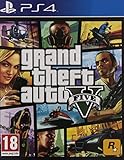
Grand Theft Auto 5 PS4 - PlayStation 4 ( GTA V Ps4) | $26.95 | Buy on Amazon |
| 2 |
|
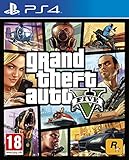
Grand Theft Auto V (PS4) | $26.45 | Buy on Amazon |
| 3 |

|
Grand Theft Auto V Premium Edition Playstation 4 | $19.93 | Buy on Amazon |
| 4 |
![Grand Theft Auto V Premium Edition - [PlayStation 4][AT-Pegi]](https://m.media-amazon.com/images/I/513YjKuODML._SL160_.jpg)
|
Grand Theft Auto V Premium Edition - [PlayStation 4][AT-Pegi] | $27.40 | Buy on Amazon |
As an Amazon Associate I earn from qualifying purchases.
How the ranking works
Each cover is judged on five consistent questions:
- Composition and focal hierarchy: can your eye find the important subject immediately?
- Small-size readability: does the logo and title remain clear on a shelf, thumbnail or store page?
- Color and contrast: does the palette separate characters, lettering and background?
- Distinctiveness: does it bring a fresh idea to the franchise’s visual language?
- Setting and personality: does the package communicate the game’s place, era and tone?
The order is an editorial judgment, not a score from a survey or an objective measurement. A lower-ranked cover can still be historically important, and a highly polished design can rank below a rougher one if it says less about its game.
Quick wins for a faster PC:
Fix the driver behind crashes, sound loss and screen glitchesFind Drivers →Repair Windows errors before they cause bigger problemsFix Now →The covers included
| Ranked entry | Representative cover treated as the main comparison |
|---|---|
| Grand Theft Auto Advance | Handheld retail cover |
| Grand Theft Auto: London 1961 | Expansion package using the London treatment |
| Grand Theft Auto: London 1969 | Expansion package using the London treatment |
| Grand Theft Auto | Original game cover |
| Grand Theft Auto 2 | Original game cover |
| Grand Theft Auto: Liberty City Stories | Console/handheld Stories cover |
| Grand Theft Auto: Vice City Stories | Stories cover with the Vice City palette |
| Grand Theft Auto: Chinatown Wars | Handheld cover |
| Grand Theft Auto III | Standard collage-style cover; regional variants discussed separately |
| Grand Theft Auto: Episodes from Liberty City | Boxed expansion compilation |
| Grand Theft Auto IV | Mainline GTA IV cover |
| Grand Theft Auto V | Mainline GTA V cover |
| Grand Theft Auto: San Andreas | Mainline San Andreas cover |
| Grand Theft Auto: Vice City | Mainline Vice City cover |
Physical editions can differ by territory, platform, age rating and rerelease. The table gives each game one clearly labeled representative rather than implying that one sleeve replaced all others.
#1 Best Overall
14. GTA Advance
Advance comes last because its package feels like a compromise between the series’ new collage identity and the practical limits of a handheld box. The logo is familiar, but the surrounding figures and action elements compete for attention instead of forming a clean visual sentence.
That is not a criticism of the game’s scale or ambition. A portable edition has less room for subtle background storytelling, and a cover designed to read on a small box has different constraints from a PlayStation 2-era sleeve. Even so, the design communicates “GTA” more strongly than it communicates this particular game. It is recognizable, but not especially memorable.
13. London 1961
The 1961 expansion inherits the blurred Union Jack treatment associated with the London mission packs. That gives it an immediate historical and geographic signal, but the flag effect also overwhelms the package. The image reads as a period marker before it reads as a game cover.
What’s actually slowing this PC down?
Pick the symptom - the matching free tool is one click away.
Its low rank reflects limited focal hierarchy rather than a lack of atmosphere. The deliberately rough, blurred treatment suits a prequel set in 1960s London, yet the design offers less character separation and less shelf clarity than the later collage covers.
12. London 1969
London 1969 edges above London 1961 because the same Union Jack idea feels more purposeful on the main London expansion. The national symbol, period styling and restrained color communicate the setting quickly, and the cover has a stronger sense of package identity than the smaller follow-up.
It still lacks the layered rhythm that would become the franchise signature. There is one dominant treatment rather than several competing-but-balanced visual beats, so the result feels like a period graphic wrapped around a game instead of a fully developed character poster.
11. Grand Theft Auto
The first GTA’s photographic approach is historically important and visually direct. Real-life photography gives the cover a documentary, street-level quality that separates it from the illustrated panels of later entries. You can understand the intended crime-and-city premise without decoding a stylized collage.
It ranks below the later games because the image is less specific as a complete package. The photograph does much of the work, while the logo and supporting elements do less to establish a distinctive personality. It is a clear beginning, not the franchise’s most controlled composition.
10. Grand Theft Auto 2
GTA 2 improves on the original’s photo-led identity by presenting a more futuristic, stylized mood. Its cover feels less like a snapshot and more like a deliberate statement about a strange urban world. That conceptual shift gives it greater distinctiveness than GTA 1.
The trade-off is clarity. The atmosphere is strong, but the visual language is not as immediately legible as the later panel system. It occupies an interesting middle ground: more authored than the first cover, less efficient than the template that followed.
Rank #2
- Experience the world of Grand Theft Auto V like never before with the power of the PlayStation 4.
- Explore the City of Los Santos, the countryside and even the ocean.
- Play through an epic single player experience using three very different characters.
- Join your friends in GTA Online and see what trouble you can cause.
- Play golf, tennis, see a film or call someone and just hang out.
9. Liberty City Stories
Liberty City Stories demonstrates how effectively the collage language could be adapted to a portable-focused release. Its panels preserve the recognizable GTA rhythm of portraits, action and location cues, while the overall treatment remains tied to Liberty City rather than copying a mainline sleeve exactly.
It lands in the lower middle because the design is competent more than revelatory. The familiar arrangement helps brand recognition, but it also reduces surprise. The cover tells you that this is GTA quickly; it takes a little longer to tell you why this Liberty City story is different.
8. Vice City Stories
Vice City Stories benefits from the same advantage as its parent game: the setting supplies an unusually strong palette. Warm pinks, blues and tropical contrast make the package pop, and the character panels feel at home in an 1980s crime melodrama.
It stops short of the top tier because the design is working inside an established formula. The colors and setting do more of the differentiating than the composition itself. It is attractive and legible, but Vice City’s original cover makes the same visual ingredients feel more decisive.
7. Chinatown Wars
Chinatown Wars keeps the recognizable franchise treatment while adjusting it for a handheld game with a different visual identity. The cover’s stronger graphic treatment and sharper contrasts help it stand apart from the Stories packages, and the urban setting is easy to read.
Its position reflects a successful adaptation rather than a complete reinvention. The package is distinctive enough to avoid blending into the mainline covers, yet it still relies on the established GTA arrangement to do much of the branding work.
6. Grand Theft Auto III
GTA III is the pivotal cover in the series’ visual history. The familiar boxed collage emerged here: individual panels, bold borders, expressive faces and a large logo that can be recognized at a distance. Even when later entries refine it, they are responding to this design.
GameSpot’s retrospective reports that Rockstar changed its planned GTA III cover after the September 11 attacks and that Rockstar co-founder Dan Houser credited artist Bliss with producing the replacement in one evening. GameSpot also reports that the initially planned collage continued to appear on the European release. Those are reported historical claims, not a complete packaging audit, so the version shown should always be labeled by region.
Houser was quoted by IGN as saying, “This was done by one of our artists in an evening, and as soon as we saw it, we preferred it to the cover we had planned to use.” In a separate CVG interview, he said, “It created the template for what was to become the game’s look, in all subsequent iterations.” The wording is reproduced as reported by GameSpot; readers needing a high-stakes historical citation should consult the original interviews.
GTA III ranks sixth because influence is not the same as perfection. Some later covers balance their panels, color and setting with more control, but very few are as important to the franchise’s identity.
Rank #3
- GRAND THEFT AUTO V: When a young street hustler, a retired bank robber and a terrifying psychopath land themselves in trouble, they must pull off a series of dangerous heists to survive in a city in which they can trust nobody, least of all each other.
- GRAND THEFT AUTO ONLINE: Discover an ever-evolving world of choices and ways to play as you climb the criminal ranks of Los Santos and Blaine County in the ultimate shared Online experience.
- THE CRIMINAL ENTERPRISE STARTER PACK: The Criminal Enterprise Starter Pack is the fastest way for new GTA Online players to jumpstart their criminal empires with the most exciting and popular content plus 1,000,000 dollars bonus cash to spend in GTA Online - all content valued at over GTA 10,000,000 dollares if purchased separately.
5. Episodes from Liberty City
The boxed Episodes from Liberty City package has a difficult job: it must sell two expansions while remaining visibly connected to GTA IV. Its presentation is more controlled and less explosively colorful than Vice City or San Andreas, which suits Liberty City’s colder, more grounded tone.
The cover earns its place through coherence. It feels like an expansion of the GTA IV world rather than an unrelated compilation, and its restrained treatment gives the package a clear adult-crime atmosphere. It is not as instantly iconic as the best mainline designs, but it handles a complicated product brief well.
4. Grand Theft Auto IV
GTA IV is the most polished expression of the collage system before GTA V. GamesRadar+’s retrospective calls it particularly stylish, and the difference is visible in the thinner borders, more detailed character portraits and tighter control of negative space.
Free tools Windows power users keep installed
One-click scans. No signup required.
The design communicates a more serious, metropolitan crime story without discarding the franchise’s visual grammar. Its characters feel observed rather than merely assembled into panels, while the logo remains readable. The cover is less colorful than Vice City or San Andreas, but that restraint is part of its identity.
3. Grand Theft Auto V
GTA V places its main characters, Los Santos setting and vehicles into a package that is immediately familiar and unusually information-dense. The result feels like a deliberate summary of the game’s fantasy: celebrity, crime, speed and a large sunlit city.
Its third-place finish is a close call with GTA IV. GTA V is more energetic and commercially legible, but its dependence on the established collage template makes it feel less surprising. GamesRadar+ described that familiarity as intentional, and the choice works: the cover promises continuity while adding a larger ensemble and a brighter setting.
2. Grand Theft Auto: San Andreas
San Andreas is one of the strongest examples of the template becoming a full visual language. It retains the recognizable panel structure but uses more detailed art and bolder colors, giving the package a confident rhythm from corner to corner.
Recommended Free Tools
The cover also communicates more than a cast list. Its palette and iconography suggest California heat, street culture, cars and gang conflict before the viewer reads a description. That combination of readability, setting and character makes it exceptionally effective. It narrowly misses first place because Vice City turns its period identity into an even more unified design concept.
Independent reader supportYour contribution helps us test, update, and keep practical guides available for everyone.1. Grand Theft Auto: Vice City
Vice City is the best cover in this ranking because every major decision points toward the same idea. The neon-lit logo, angular portraits, tropical colors and 1980s styling create a package that is legible in a thumbnail and richly specific at full size.
GameSpot describes the neon treatment as a reflection of Vice City’s 1980s setting. That is exactly why the cover works: the palette is not decoration added around generic GTA branding; it is the setting’s personality. The panels feel like parts of one poster, and the logo is both a title and a piece of the period design.
Rank #4
- GTA 5 . Premium AT
San Andreas has a broader sense of place and GTA V has a stronger ensemble pitch, but Vice City is the cleanest marriage of brand recognition and freshness. It looks unmistakably like GTA while making the strongest promise about one particular world.
Do these 3 things before closing this tab:
1Repair Windows errors before they cause bigger problems2Fix the driver behind crashes, sound loss and screen glitches3Clear out junk files and repair common Windows errorsHow GTA box art changed over time
Photographs established the street-level premise
The first two games used real-life photography, according to GameSpot’s history. That approach made the early packages feel grounded and immediate, but it left less room for a repeatable visual system across sequels.
The London packs used a single period signal
The London mission packs shifted toward a blurred Union Jack treatment. It efficiently communicated place and era, though it offered less character and panel variety than the later designs.
GTA III created the collage template
The post-GTA III look made the cover itself a collection of readable promises: a face, a vehicle, a location, an attitude and a large logo. That structure could absorb different cities and casts without losing the franchise’s identity.
Later games varied the template instead of abandoning it
GameSpot describes Vice City as using a neon-lit logo, San Andreas as bringing more detailed art and bolder colors, Liberty City Stories and Vice City Stories as continuing the trend, GTA IV as refining the borders and portraits, Chinatown Wars as retaining the recognizable treatment, GTA V as foregrounding characters, location and vehicles, and GTA VI’s announced visual direction as continuing the established design with a navy motif and prominent logo.
The Tool Desk
Outbyte Driver Updater FREEFix the driver behind crashes, sound loss and screen glitchesFind Drivers →Outbyte PC Repair FREEClear out junk files and repair common Windows errorsFree Scan →GTA VI is not ranked here as a confirmed retail-cover entry. Upcoming release, platform and packaging details can change, and promotional artwork should not be treated as a verified box sleeve without edition-specific evidence.
Why the covers look similar
The repeated collage is a branding advantage. A shopper can identify a GTA package before reading the subtitle, and each sequel can introduce a new city, cast and palette without rebuilding the franchise’s visual grammar from zero.
It is also the central criticism of the series’ packaging. Once the arrangement became familiar, freshness depended on the details inside it: panel rhythm, logo treatment, color contrast, character selection and setting cues. That is why this ranking does not treat every collage cover as interchangeable. GTA IV’s restrained portraits, San Andreas’s saturated palette and Vice City’s neon period design solve the same branding problem in different ways.
Variants, regional sleeves and reissues
A retail cover can change with territory, platform, age-rating panel, publisher packaging or rerelease. GTA III is the clearest warning against treating one image as universal: GameSpot reports that the planned collage appeared on the European release while another design became associated with the changed package. The safest practice is to name the region and platform whenever reproducing a cover.
Reissues should be discussed as packaging variants unless the artwork itself is the subject. A changed sleeve does not create a new game for this ranking, and a compilation should not be mistaken for a mainline installment. The list therefore includes Episodes from Liberty City as a boxed expansion compilation while keeping platform and regional alternatives out of the main order.
What this ranking says about the franchise
The best GTA covers do two jobs at once: they make the brand instantly recognizable and give the individual game a visual reason to exist. Vice City wins because its neon, typography and portraits all express one setting. San Andreas follows because its bolder, denser collage communicates a larger world without becoming unreadable. GTA V places third for turning the familiar formula into a clear ensemble pitch.
The weakest covers are not failures of marketing so much as weaker acts of differentiation. Advance, London 1961 and London 1969 identify the franchise or period effectively, but they give the viewer fewer distinct visual cues to remember than the later city-specific packages.
Quick Recap
Product prices and availability are accurate as of the date/time indicated and are subject to change. Any price and availability information displayed on Amazon at the time of purchase will apply.
Recommended Free Tools

