The fastest way to add a mega menu depends on your WordPress setup. A block theme can build one in Appearance > Editor with the Navigation block; a classic theme can use a menu plugin such as Max Mega Menu; and an Elementor header can use Elementor’s Menu widget after the required features are enabled. Developers can create a custom Mega Menu block when they need theme-level control.
Antihost offers managed WordPress hosting with free migration, one-click staging and a 14-day free trial.
A mega menu is a large, multi-column dropdown. Unlike a conventional submenu, it can organize many links into columns and, depending on the implementation, include headings, images, icons, widgets, or custom HTML. Use the route that matches your editing environment, then test keyboard, touch, desktop, tablet, and mobile behavior before publishing.
As an Amazon Associate I earn from qualifying purchases.
Quick wins for a faster PC:
Clear out junk files and repair common Windows errorsFree Scan →Scan for outdated or missing drivers - takes under a minuteDriver Scan →Repair Windows errors before they cause bigger problemsFix Now →What a mega menu is and when to use one
A mega menu expands from a top-level navigation item into a broad panel containing multiple groups of related links. Elementor defines it as “an advanced type of menu that allows you to display a large, multi-column dropdown layout with various elements like images, icons, and widgets.” The extra space is useful for sites with several sections, product categories, documentation areas, or media libraries that would become an unwieldy stack of nested links.
Use a mega menu when visitors need to scan several related destinations at once. Keep a conventional dropdown when a parent has only a few children; adding columns and imagery to a small menu increases visual and keyboard complexity without helping discovery. Whichever method you choose, retain a clear top-level label, logical headings, readable link text, and an obvious way to open and close each panel.
#1 Best Overall

- BLUE LIGHT BLOCKING GLASSES: Our blue light glasses for women boast UV400 protection, blocking harmful blue rays from computer screens. With these bluelight glasses women, you can enjoy gaming, reading, or watching TV with no worries of eye strain.
- EYE RELIEF: Our blue light glasses are engineered to reduce blurry vision or strain caused by prolonged screen time. These womens blue light glasses aid in better sleep by preventing blue light from disrupting your natural sleep cycle, helping you fall asleep faster and enjoy a more restful night's sleep, making them the perfect christmas present.
- COMFORTABLE: Crafted from durable material, our trendy blue light glasses for woman or blue light glasses men ensure long-lasting comfort. The high-transmittance lenses accessories, gamer gifts for men, help keep your eyes relaxed. Perfect stocking stuffers, gifts for gamers men, christmas gifts for men, halloween costumes.
- LIGHTWEIGHT: These clear blue light glasses feature a lightweight frame, meaning they’ll stay comfy for long-term wear. Perfect as blue blockers glasses for women or mens blue light glasses, these non-prescription fake glasses for men can be worn throughout the day. The blue light blocking glasses women feature polycarbonate HD lenses, which are anti-reflective and restore true color.
- WORRY-FREE PURCHASE: If you experience any issues, our support team is ready to assist you quickly. These are the perfect costume glasses for cosplay dressing up.
Choose the implementation route
| Route | Dependency | Editing model | Layout control | Mobile and keyboard considerations | Best fit |
|---|---|---|---|---|---|
| Native block theme | WordPress block theme and Site Editor | Navigation and other blocks in the Header template part | Nested links, plus Columns, Group, image, and other blocks where the active version and theme support them | Preview each viewport and verify focus, opening, and closing behavior | Sites that want the fewest moving parts and editor-native content |
| Max Mega Menu | Max Mega Menu plugin | Plugin menu panels, widgets, blocks, or custom HTML | Theme editor with multi-column panels and content elements | Configurable breakpoint, standard dropdown or off-canvas mobile mode, and documented TAB, ENTER/SPACE, and ESC controls | Classic themes or sites needing extensive panel and responsive controls |
| Elementor | Elementor header template and its Menu-related features | Elementor canvas and Menu widget | Columns, headings, links, images, icons, and other widgets | Set the mobile breakpoint and test focus order and keyboard operation | Sites already building headers in Elementor |
| Custom block | Custom plugin or theme development | Custom block, Navigation integration, template parts, and PHP rendering | Code-defined markup, styling, allowed blocks, and interactions | Developer must implement responsive behavior, focus handling, and open/close interactions | Teams maintaining a bespoke design system or theme |
Prepare your menu before adding columns
Plan the information architecture before opening the editor. Decide which items are true top-level destinations and which are only labels for a group. Write short, descriptive link names; visitors should understand the destination without surrounding copy. Group related links under meaningful headings rather than making one enormous list.
- Identify the top-level trigger that will open the panel.
- Arrange child links into groups that can become columns.
- Choose any images or icons that add orientation rather than decoration alone.
- Decide whether the parent item should navigate to a page, open the panel, or do both through a separate “View all” link.
- Record the header location where the menu must appear. A header template part may be reused on posts, pages, archives, and commerce templates, but verify those contexts in your own theme.
Keep a backup or revision of the current header and menu before changing it. A mega menu touches navigation structure and header layout, so an easy rollback is valuable if a theme update or a misplaced block changes the appearance.
Recommended Free Tools
Route A: build a mega menu with a block theme
WordPress documentation describes the Navigation block as the place to edit a site’s navigation structure and design, with each menu item represented as a block. WordPress 6.3 introduced menu editing in the Site Editor, and a Navigation block can be placed in a template part such as a Header.
1. Open the Header template part
- In the WordPress dashboard, open Appearance > Editor to enter the Site Editor.
- Open the template-parts or patterns area, then select the active Header template part. The exact visual list varies by theme.
- Click the existing Navigation block if the header already contains one. If it does not, insert a Navigation block in the header where the menu should appear.
2. Create or select the menu
- Within the Navigation block, create a new menu or select the menu already assigned to the site.
- Choose Edit when the editor offers that option. A Page List can then be converted into individually editable links instead of remaining a single automatically generated list.
- Add, remove, and reorder top-level items. Give the future mega-menu trigger a clear label that describes the group below it.
3. Nest links and form columns
- Move related links under the chosen top-level item so they become its submenu.
- Use the Navigation block’s child-item controls to establish the hierarchy. Keep the nesting understandable in the list view as well as on the canvas.
- Where the active WordPress version and theme expose the necessary blocks, add Columns or Group blocks to organize the panel. Place headings, links, images, or other supported blocks inside the groups.
- Keep each column focused on one topic. If a column becomes a long unbroken list, split it into smaller groups with headings rather than shrinking the text.
4. Save and check every template context
- Save the Header template part and any menu changes when prompted.
- Preview the header on a page, a post, an archive, and any other templates your theme uses. A navigation change is only complete when the active header appears consistently.
- Resize the preview to desktop, tablet, and a narrow mobile width. Confirm that columns do not run off-screen and that links remain readable when text is enlarged.
Native blocks are the least dependent route, but the available column and content controls depend on the active WordPress version and theme. If the editor does not expose the layout you need, use a plugin, Elementor, or custom development instead of forcing unsupported markup into the Navigation block.
Rank #2

- WINDEX GAMING WIPES: effortlessly clean all your gaming gear and gaming electronics in one easy step with our new Windex Gaming Wipes
- AMMONIA FREE: our ammonia-free formula is safe to use on all of your favorite gaming equipment like consoles, headsets, controllers, screens, keyboards, and more
- PRE-MOISTENED WIPES: each wipe instantly removes dust, dirt, and stubborn smudges and fingerprints leaving a streak-free shine
- ANTI-STATIC: great for cleaning and wiping down your gaming gear and electronics leaving behind no visible residue
- COMPACT RESEALABLE PACKAGE: store your pack of Windex Gaming Wipes anywhere in your home for whenever a quick and easy wipedown is needed
Route B: add a mega menu with Max Mega Menu
The WordPress.org listing describes Max Mega Menu as a menu-management plugin built for the block editor, page builders, and classic themes. It can place blocks, widgets, and custom HTML in submenu panels and provides a theme editor for styling.
1. Install and activate the plugin
- Open Plugins > Add New in the WordPress dashboard.
- Search for Max Mega Menu, install it, and activate it.
- Create a new WordPress menu or choose the existing menu you want to enhance.
2. Build the panel content
- Open the plugin’s menu-management interface and select the top-level item that will open the panel.
- Configure that item as a mega-menu panel, then add the required columns or groups.
- Insert widgets, blocks, or custom HTML into the panel. Use headings and short link lists so the panel is scannable.
- Open the plugin’s theme editor to set typography, spacing, colors, hover states, and the panel’s visual separation from the page.
3. Place the menu in the site
The result can be output through the plugin block, a widget, a shortcode, a page-builder element, or the wp_nav_menu function. Choose the method that matches your theme’s header. If the header already renders the same WordPress menu, remove or disable the duplicate output before publishing so visitors do not see two navigation systems.
Free tools Windows power users keep installed
One-click scans. No signup required.
4. Configure and test mobile behavior
- Set the responsive breakpoint at which the desktop panel changes to the mobile presentation.
- Choose the documented mobile mode that suits the design: a standard dropdown or an off-canvas panel.
- Test touch opening and closing on a real phone or a narrow viewport.
- Test keyboard controls. The plugin listing documents TAB for moving through controls, ENTER/SPACE for activation, and ESC for closing an open panel.
Because this route adds a plugin dependency, check compatibility after updating WordPress, the active theme, or another page builder. Keep a record of the menu location and output method so you can diagnose a missing header quickly after an update.
Route C: create the menu with Elementor
Elementor’s documented workflow requires its Menu-related features before the Menu widget appears for mega-menu construction. The relevant settings are Flexbox Containers, Nested Elements, and Menu. Elementor states that these replace the standard Nav Menu widget with the WordPress Menu and Menu widgets for this workflow.
Rank #3

- Ergonomic & Adjustable Design: Fight "text neck" and improve your posture. Designed for comfort, it offers an adjustable height (7.1in-8.5in) (1.4in adjustable range) and angle (5°-85°) Please note: cell phone stand is only 9 inches tall—the length of a standard pencil
- Without blocking subtitles Perfect for office desk Tiktok Face Time Zoom video—this is the ultimate kitchen desk essential for phones! Perfect viewing experience while reducing neck back strain, A must-have for gamers streamers desk, and anyone who values both style and support!
- Sleek & Stable Design fits Otterbox Case: Say goodbye to bent cables, tangles, and tip-overs! LISEN’s stylish adjustable desk phone holder features a built-in charging hole and smart cable management, keeping your phone secure and your workspace clutter-free cool gadgets for men
- ANTI-SLIP DESIGN free hands: The under 10.00 items easy gadgets back and the bottom of this kitchen essentials for women are fully covered by anti-skid silicone, which LISEN stand up desk decor can provide maximum protection device from any scratches and slides
- Your Perfect Viewing Companion:If your product arrives damaged or breaks within 365 days, reach out to LISEN for a quick and hassle-free solution. Struggling with assembly, like tightening the screw? We’ve got your back! Your experience matters to us. (Product including: phone Holder stand*1, screw*1, hexagon screwdriver*1, specification*1)
1. Enable the required Elementor features
- Open Elementor’s settings or features screen in the WordPress dashboard.
- Activate Flexbox Containers, Nested Elements, and Menu, following the status controls shown by your installed Elementor version.
- Save the settings, then reopen the header editor if the Menu widget was not previously available.
2. Edit the header template
- Open the header template in the Elementor Theme Builder.
- Insert the Menu widget in the header location where the navigation should appear.
- Select the WordPress menu that contains your top-level and child links.
3. Enable mega-menu behavior and design the panel
- In the Menu widget settings, enable the mega-menu behavior for the relevant menu item.
- Build the panel with columns and add headings, links, images, icons, or other widgets as needed.
- Use consistent spacing and heading levels. Keep decorative elements from interrupting the order in which a keyboard user encounters links.
- Set the menu’s alignment, width, overlay, and open-state styling so the panel remains within the viewport at the desktop width used by your audience.
4. Check responsive and focus behavior
- Review Elementor’s responsive controls and set the mobile breakpoint deliberately rather than relying on an accidental wrap.
- Preview the header at desktop, tablet, and mobile widths.
- Use the keyboard to reach the trigger, open the panel, move through every link, and close it. Confirm that focus remains visible and does not jump behind the overlay.
- Publish the header only after checking it on the content templates where Elementor applies it.
If the Menu widget is missing, first verify the three feature settings and reload the editor. If it appears but the panel is not visible, confirm that the selected WordPress menu has child items and that the header template is the one assigned to the page you are previewing.
Route D: develop a custom Mega Menu block
A custom implementation is possible when the menu is part of a maintained theme or plugin rather than a one-off visual edit. The WordPress Developer Blog describes a custom Mega Menu block integrated into the Navigation block, with menu template parts designed in the Site Editor and rendered with PHP.
What’s actually slowing this PC down?
Pick the symptom - the matching free tool is one click away.
What the development work includes
- Scaffolding a custom block and defining its editor and front-end assets.
- Registering which blocks are allowed inside the mega-menu area.
- Connecting the custom block to the Navigation block and Site Editor template parts.
- Rendering the menu and its template parts with PHP.
- Writing CSS for columns, widths, breakpoints, and visible focus states.
- Implementing interaction code for opening, closing, keyboard focus, touch input, and Escape handling.
This route gives the team control over markup and avoids handing the panel layout to a third-party editor, but it also makes the team responsible for every accessibility and compatibility detail. Use it when you can maintain the block through WordPress, theme, and browser changes; otherwise, a supported editor route is safer.
Accessibility and quality-assurance checklist
A visually impressive panel can still fail if a keyboard user cannot discover or dismiss it. Test the finished menu as an interaction, not just as a screenshot.
Rank #4

- Easy Installation: Our gaming lights have been designed to enhance your entertainment experience. Simply position the led light bar next to your TV or game console to create a game room environment with ease. They come with USB power and a 60 inch cord for direct mounting and mobility
- Audio Syncing & Extensive Mode: The built-in high-sensitivity music sensor allows you to sync the TV led lights to your favorite music. Lights react and move to the beat of music, film and game audio, creating an incredible immersive sound and light experience – and all without the need for an additional hub. You can choose from 64+ patterns, including strobe, illusion, jump, energy, gradient, running, chasing, fluttering mode etc. Each mode can be applied to different scenes
- 64+ Chasing IC+RGB & W Effect: The independent control design of IC+RGB and white all-in-one multifunctional rgbw led bar lights monitor backlight allows you to easily switch the led lights for desk between IC+RGB and white to enjoy a variety of lighting effects, you can choose white lighting mode with high brightness for better illumination when working, etc. Choose IC+RGB lighting mode when you need to create an entertaining atmosphere for the light show, 16 million colours of Color changing rgb light bar let you dance to the beat and create a dynamic party atmosphere
- Dynamic and Dimmable Lights: 1%-full brightness free brightness adjustment gives you the flexibility to adjust dimmable led light bar for room decorations or a variety of occasions
- USB Powered: USB light bars for room can be powered by powernank, usb charger, TV, Monitor, laptop PC mainframe, making behind TV led lighting bar easy to install in any location.TV led lights are powered by the TV usb interface / PC mainframe, can be turned on/off synchronously with TV / PC
- Labels: Keep a clear top-level label and meaningful headings for each group.
- Keyboard reachability: Tab to the trigger and every interactive child. Make the focus indicator clearly visible against the panel background.
- Open and close: Test opening and closing with the keyboard as well as with a mouse or touch. Verify that Escape closes an open panel where the chosen implementation provides that behavior.
- Focus order: Confirm that focus moves through the panel in a logical order and does not become trapped behind an overlay.
- Viewport safety: Test the actual mobile breakpoint and a narrower viewport. Panels must not overflow horizontally.
- Text sizing: Increase text size and check that labels remain readable and columns do not overlap.
- Template coverage: Check posts, pages, archives, and WooCommerce templates or other specialized templates used by the site.
- Touch targets: On a phone, make sure the trigger and links can be tapped without accidentally activating adjacent items.
Common problems and practical fixes
The mega menu does not appear
Confirm that the edited menu is the one rendered by the active header. In a block theme, reopen the Header template part and inspect its Navigation block. In Elementor, verify the assigned header template and selected WordPress menu. With Max Mega Menu, check whether the header uses the plugin block, widget, shortcode, page-builder element, or wp_nav_menu output you configured.
The panel is only a single vertical list
A nested menu alone does not create columns. Add Columns or Group blocks where the native editor supports them, configure panel columns in Max Mega Menu, or enable mega-menu behavior and add columns in Elementor. For a custom block, inspect the allowed-block registration and front-end markup.
The Tool Desk
Outbyte PC Repair FREERepair Windows errors before they cause bigger problemsFix Now →Outbyte Driver Updater FREEScan for outdated or missing drivers - takes under a minuteDriver Scan →Mobile links are cut off or unusable
Recheck the breakpoint, then test below it rather than only at the exact breakpoint value. Choose a standard dropdown or off-canvas mode when the desktop panel cannot fit a narrow viewport. Remove oversized images, reduce unnecessary nesting, and ensure the close control is reachable by touch and keyboard.
The editor shows no Menu widget
In Elementor, activate Flexbox Containers, Nested Elements, and Menu in the documented feature settings, save, and reload the editor. The widget will not be available for this workflow until those prerequisites are enabled.
Best Value
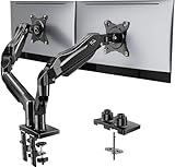
- Compatible with Wide Screens - To ensure compatibility with the dual monitor mount, your each monitor must meet three conditions at the same time: First, computer screens size range: 13 to 32 inches. Second, screen weight range: 4.4 to 19.8 lbs. Third, the back of the monitor screen must have VESA mounting holes with a pitch of 75x75mm or 100x100mm.
- Regarding the compatibility with desks - Your desk must meet three conditions at the same time: First, desk material: Only wooden desks are recommended, plastic or glass desks cannot be used. Second, desk thickness range: 0.59" - 3.54". Third, the bottom of the desk should not have any cross beams or panels, as this will interfere with installation. We recommend carefully checking that your desk and monitors meets all above conditions before purchasing.
- Dual C-Clamp Hold - Worried your dual monitors might wobble or slip? Our upgraded base uses a larger platform plus a dual C-clamp structure to lock the dual monitor arm firmly to your desk. Each arm safely keeps your screens steady while you type, click and game—no shaking, no sliding, just a clean and secure setup you can trust every day. It also provides Grommet Mounting installation choice, both options ensure stable and secure fixation for your 0.59" - 3.54" desk.
- Full-Motion Adjustment For Comfortable View - Pull the screen closer when you’re deep in a spreadsheet, push it back to watch videos, or rotate to portrait for coding — moving everything smoothly with just one hand. The monitor stand offers +85°/-50° tilt, ±90° swivel and 360° rotation. Raise your monitor up to 15.75″ to support a healthy sitting posture. Whether you’re working from home, gaming through the night, or switching between video calls and documents, getting the screens to your natural line of sight helps relieve neck, shoulder and back strain so you can stay focused longer with less fatigue.
- Keep Your Desk Organized: By lifting both screens off the desktop, this dual monitor stand opens up valuable space for your keyboard, notebook, docking station or a simple, clutter-free work area. Built-in cable management guides wires along the arms, keeping cords out of sight and out of the way. Enjoy a tidy, modern workstation that looks as good as it feels to use.
Keyboard focus is missing or disappears
Use the browser keyboard to start at the header and record the order of focus. Add or restore visible focus styling in the selected editor or custom CSS, ensure the trigger has a usable label, and make the close action reachable without a pointer. Re-test after every styling change because overlays and absolute positioning can hide focus.
The menu changed after an update
Check compatibility among the active theme, WordPress editor, Elementor version, and menu plugin. Compare the updated header with the saved version, then verify the menu location, selected menu, breakpoint, and template assignments before rebuilding content.
Maintenance after launch
Treat the mega menu as part of the site’s information architecture, not as a one-time decoration. When adding a section, place its link in the correct column and heading group, then check the panel at every supported viewport. Remove retired links promptly so the panel does not become a catalogue of outdated destinations.
Keep the implementation documented: note whether the site uses the Navigation block, Max Mega Menu output, Elementor’s Menu widget, or a custom block; record the mobile breakpoint and the header templates that contain it. Re-run the keyboard and touch checklist after WordPress, theme, Elementor, or plugin updates. This small regression test catches missing panels, changed focus behavior, and mobile overflow before visitors do.
Which route should you use?
Start with the native Navigation block if the site uses a block theme and your required content fits the blocks exposed by the active WordPress version and theme. Choose Max Mega Menu when you need widgets, blocks, custom HTML, configurable mobile modes, or support for a classic theme. Choose Elementor when the header is already built in Elementor and you want to compose the panel on its canvas after enabling the required Menu features. Choose custom development only when your team needs bespoke markup and can maintain rendering, styling, responsive behavior, and accessibility code over time.
Quick Recap
Product prices and availability are accurate as of the date/time indicated and are subject to change. Any price and availability information displayed on Amazon at the time of purchase will apply.