
Outdated Drivers Are Slowing You Down
One free scan finds every outdated or missing driver and matches the right update for your exact hardware.Free scan · exact hardware matchWindows Errors? Fix Them Before They Spread
Repair common Windows errors and clear accumulated junk for a smoother, more stable PC - no reinstall needed.Free scan · no reinstallUse settings.typography to decide which typography controls and presets the editor exposes, then use styles.typography to apply the defaults. In a block theme (and in compatible classic-theme setups), theme.json can register font families, define a type scale, bundle web-font files, generate responsive sizes, and limit editors to approved values. The practical pattern is: register capabilities and presets under settings, consume them with preset references under styles, and verify the WordPress version supports every property you use.
Antihost offers managed WordPress hosting with free migration, one-click staging and a 14-day free trial.
How theme.json separates typography settings from styles
A theme.json file is the configuration layer for global settings and styles. The two branches have different jobs:
As an Amazon Associate I earn from qualifying purchases.
Quick wins for a faster PC:
Fix the driver behind crashes, sound loss and screen glitchesFind Drivers →Repair Windows errors before they cause bigger problemsFix Now →Scan for outdated or missing drivers - takes under a minuteDriver Scan →| Branch | What it controls | Typical typography entries |
|---|---|---|
settings |
Editor capabilities and reusable preset data | customFontSize, lineHeight, fluid, fontFamilies, fontSizes |
styles |
Defaults that WordPress applies to the site, elements, or blocks | fontFamily, fontSize, fontWeight, lineHeight, letterSpacing, textTransform |
The v3 reference documents typography controls including fontStyle, fontWeight, fluid, letterSpacing, lineHeight, textDecoration, textTransform, dropCap, and writingMode, as well as style properties such as fontFamily, fontSize, and textShadow. Check the official schema when targeting a specific WordPress release: WordPress theme.json schema.
A setting does not automatically become a site-wide style. For example, adding a family to settings.typography.fontFamilies makes it available as a preset; assigning var:preset|font-family|your-slug in styles.typography.fontFamily makes it the default.
#1 Best Overall

- BLUE LIGHT BLOCKING GLASSES: Our blue light glasses for women boast UV400 protection, blocking harmful blue rays from computer screens. With these bluelight glasses women, you can enjoy gaming, reading, or watching TV with no worries of eye strain.
- EYE RELIEF: Our blue light glasses are engineered to reduce blurry vision or strain caused by prolonged screen time. These womens blue light glasses aid in better sleep by preventing blue light from disrupting your natural sleep cycle, helping you fall asleep faster and enjoy a more restful night's sleep, making them the perfect christmas present.
- COMFORTABLE: Crafted from durable material, our trendy blue light glasses for woman or blue light glasses men ensure long-lasting comfort. The high-transmittance lenses accessories, gamer gifts for men, help keep your eyes relaxed. Perfect stocking stuffers, gifts for gamers men, christmas gifts for men, halloween costumes.
- LIGHTWEIGHT: These clear blue light glasses feature a lightweight frame, meaning they’ll stay comfy for long-term wear. Perfect as blue blockers glasses for women or mens blue light glasses, these non-prescription fake glasses for men can be worn throughout the day. The blue light blocking glasses women feature polycarbonate HD lenses, which are anti-reflective and restore true color.
- WORRY-FREE PURCHASE: If you experience any issues, our support team is ready to assist you quickly. These are the perfect costume glasses for cosplay dressing up.
A complete starter configuration
The following baseline uses theme.json version 3, exposes a controlled type scale, and sets a global family, size, and line height. Put it in the theme’s root theme.json file.
{
  "$schema": "https://schemas.wp.org/trunk/theme.json",
  "version": 3,
  "settings": {
    "typography": {
      "customFontSize": false,
      "lineHeight": true,
      "fluid": true,
      "fontFamilies": [
        {
          "name": "System Sans",
          "slug": "system-sans",
          "fontFamily": "-apple-system, BlinkMacSystemFont, "Segoe UI", sans-serif"
        }
      ],
      "fontSizes": [
        {
          "name": "Body",
          "slug": "body",
          "size": "1rem",
          "fluid": false
        },
        {
          "name": "Display",
          "slug": "display",
          "size": "clamp(2rem, 1.25rem + 3vw, 4rem)",
          "fluid": false
        },
        {
          "name": "Lead",
          "slug": "lead",
          "size": "1.25rem",
          "fluid": {
            "min": "1.125rem",
            "max": "1.5rem"
          }
        }
      ]
    }
  },
  "styles": {
    "typography": {
      "fontFamily": "var:preset|font-family|system-sans",
      "fontSize": "var:preset|font-size|body",
      "lineHeight": "1.6"
    }
  }
}
The $schema URL enables editor validation and autocomplete. Slugs are identifiers, so use lowercase, stable names rather than labels that may change in the design UI.
Do these 3 things before closing this tab:
1Repair Windows errors before they cause bigger problems2Fix the driver behind crashes, sound loss and screen glitches3Clear out junk files and repair common Windows errorsRegistering font families
System stacks without font files
A family object requires name, slug, and fontFamily. The value is ordinary CSS, so a system stack needs no download:
{
  "name": "System Sans",
  "slug": "system-sans",
  "fontFamily": "-apple-system, BlinkMacSystemFont, "Segoe UI", sans-serif"
}
After registration, WordPress generates a custom property named --wp--preset--font-family--system-sans. The editor can offer the family, and style declarations can reference it through var:preset|font-family|system-sans.
Bundled web fonts owned by the theme
For a theme-owned web font, keep the family in fontFamilies and add a fontFace array. Each face declares metadata and one or more source files. The file path is relative to the theme and uses the file: prefix:
{
  "name": "Brand Sans",
  "slug": "brand-sans",
  "fontFamily": ""Brand Sans", sans-serif",
  "fontFace": [
    {
      "fontFamily": "Brand Sans",
      "fontStyle": "normal",
      "fontWeight": "400 700",
      "src": ["file:./assets/fonts/brand-sans.woff2"]
    }
  ]
}
Place the file at assets/fonts/brand-sans.woff2 and make the declared family match the family name used by the browser. A weight range such as 400 700 is appropriate for a variable font; separate static files should use separate face entries with their own weight values. Use one consistent slug for a family’s weights and variations so preset references do not change when you add another face.
Recommended Free Tools
Licensing and loading considerations
Only ship files you are licensed to distribute. A system stack avoids transfer and licensing overhead; a bundled face gives a predictable visual result but adds requests, bytes, and possible loading shifts. If you obtain a hosted or licensed web font, confirm that its license permits use and redistribution in a WordPress theme before adding the files.
Building a reusable font-size scale
Each entry in settings.typography.fontSizes requires name, slug, and size. The size accepts CSS units such as rem, or a complete clamp() expression. WordPress turns the slug into --wp--preset--font-size--{slug} and provides a matching preset class.
Rank #2
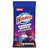
- WINDEX GAMING WIPES: effortlessly clean all your gaming gear and gaming electronics in one easy step with our new Windex Gaming Wipes
- AMMONIA FREE: our ammonia-free formula is safe to use on all of your favorite gaming equipment like consoles, headsets, controllers, screens, keyboards, and more
- PRE-MOISTENED WIPES: each wipe instantly removes dust, dirt, and stubborn smudges and fingerprints leaving a streak-free shine
- ANTI-STATIC: great for cleaning and wiping down your gaming gear and electronics leaving behind no visible residue
- COMPACT RESEALABLE PACKAGE: store your pack of Windex Gaming Wipes anywhere in your home for whenever a quick and easy wipedown is needed
{
  "fontSizes": [
    { "name": "Small", "slug": "sm", "size": "0.875rem" },
    { "name": "Body", "slug": "body", "size": "1rem" },
    { "name": "Lead", "slug": "lead", "size": "1.25rem" },
    { "name": "Display", "slug": "display", "size": "clamp(2rem, 1.25rem + 3vw, 4rem)", "fluid": false }
  ]
}
Use a registered preset in a global style rather than copying its raw value:
{
  "styles": {
    "typography": {
      "fontSize": "var:preset|font-size|body"
    }
  }
}
WordPress resolves that reference to the generated custom property. Preset references keep your style tree readable and let you revise the scale in one place.
Making sizes responsive with fluid typography
Enable fluid sizing globally
Set settings.typography.fluid to true to ask WordPress to generate viewport-based scaling for eligible registered sizes. WordPress calculates a clamp() value from minimum and maximum bounds. A size below the default minimum can remain static, so inspect the generated CSS instead of assuming every preset will scale.
{
  "settings": {
    "typography": {
      "fluid": true
    }
  }
}
Opt out for an individual preset
Set a preset’s fluid property to false when it must remain fixed, such as a compact label or body size that should not change with viewport width.
{
  "name": "Small",
  "slug": "sm",
  "size": "1rem",
  "fluid": false
}
Supply explicit minimum and maximum values
A per-size object gives you a bounded range while WordPress generates the interpolation:
{
  "name": "Heading",
  "slug": "heading",
  "size": "2rem",
  "fluid": {
    "min": "1.75rem",
    "max": "3.5rem"
  }
}
Use a hand-authored clamp when the formula is part of the design system
If the interpolation itself matters, put the complete expression in size and disable generated fluid behavior for that preset. This preserves the exact formula:
{
  "name": "Display",
  "slug": "display",
  "size": "clamp(2rem, 1.25rem + 3vw, 4rem)",
  "fluid": false
}
Do not combine a hand-authored clamp() with an additional fluid object unless you deliberately want WordPress to regenerate the value.
Choosing a typography strategy
There is no single best configuration. Compare the choices against the project’s visual and editorial requirements before writing the presets.
Rank #3

- Ergonomic & Adjustable Design: Fight "text neck" and improve your posture. Designed for comfort, it offers an adjustable height (7.1in-8.5in) (1.4in adjustable range) and angle (5°-85°) Please note: cell phone stand is only 9 inches tall—the length of a standard pencil
- Without blocking subtitles Perfect for office desk Tiktok Face Time Zoom video—this is the ultimate kitchen desk essential for phones! Perfect viewing experience while reducing neck back strain, A must-have for gamers streamers desk, and anyone who values both style and support!
- Sleek & Stable Design fits Otterbox Case: Say goodbye to bent cables, tangles, and tip-overs! LISEN’s stylish adjustable desk phone holder features a built-in charging hole and smart cable management, keeping your phone secure and your workspace clutter-free cool gadgets for men
- ANTI-SLIP DESIGN free hands: The under 10.00 items easy gadgets back and the bottom of this kitchen essentials for women are fully covered by anti-skid silicone, which LISEN stand up desk decor can provide maximum protection device from any scratches and slides
- Your Perfect Viewing Companion:If your product arrives damaged or breaks within 365 days, reach out to LISEN for a quick and hassle-free solution. Struggling with assembly, like tightening the screw? We’ve got your back! Your experience matters to us. (Product including: phone Holder stand*1, screw*1, hexagon screwdriver*1, specification*1)
| Decision | Option one | Option two | Practical consequence |
|---|---|---|---|
| Font source | System stack | Bundled or hosted web font | System stacks need no font files; a bundled face gives a predictable brand appearance but adds files, loading work, and licensing obligations. |
| Size behavior | Fixed rem values |
Fluid values or explicit clamp() |
Fixed values are easier to reason about; fluid presets scale between bounds, while a hand-authored formula gives exact design-system control. |
| Editor freedom | Custom values enabled | Preset-only scale | Custom values help authors solve one-off layouts; customFontSize: false keeps content on the approved scale. |
| Default scope | Global typography | Block or element typography | Global styles establish body defaults; narrower scopes are appropriate for headings, buttons, or another block-wide rule. |
Make the decision explicit in the theme rather than relying on editor users to reconstruct it. A controlled scale is most useful when labels, slugs, and intended uses are stable; unrestricted controls are more appropriate when the site deliberately allows local variation.
Applying defaults at global, block, and element levels
The top-level styles.typography object establishes the site default. The same style tree can scope typography to blocks or elements, allowing a heading scale or button label to differ from body text. A global default might look like this:
The Tool Desk
Outbyte PC Repair FREEClear out junk files and repair common Windows errorsFree Scan →Outbyte Driver Updater FREEFix the driver behind crashes, sound loss and screen glitchesFind Drivers →{
"styles": {
"typography": {
"fontFamily": "var:preset|font-family|system-sans",
"fontSize": "var:preset|font-size|body",
"lineHeight": "1.6",
"letterSpacing": "0"
},
"blocks": {
"core/heading": {
"typography": {
"fontFamily": "var:preset|font-family|system-sans",
"fontWeight": "700"
}
}
}
}
}Use the narrowest scope that expresses the design rule: global for body copy, a block scope for all instances of a block, and an individual block’s style UI for a one-off exception. A preset remains available to editors only if the relevant setting is enabled.
Keep the distinction between a capability and a value in mind when debugging. Turning on fontWeight or letterSpacing under settings exposes a control, but it does not assign a weight or tracking value. Conversely, a value in the styles tree can establish a default even when authors are not allowed to change it locally.
Controlling what editors can change
Custom sizes versus a controlled scale
customFontSize governs whether users can enter arbitrary values. Set it to false when every size should come from your registered scale; leave it enabled when page authors need local values.
{
  "settings": {
    "typography": {
      "customFontSize": false
    }
  }
}
Line-height controls
Set lineHeight to true to expose line-height controls. The default line height still belongs in styles.typography.lineHeight (for example, 1.6); the setting only controls the capability.
Free tools Windows power users keep installed
One-click scans. No signup required.
Other typography capabilities
Enable only the controls your design system can support. Depending on your target WordPress version, settings include font style, weight, letter spacing, text decoration, text transform, drop caps, writing mode, and fluid sizing. Keeping the editor surface intentional reduces accidental combinations that your font files or layout cannot handle.
Understanding generated variables and preset classes
Every registered family and size gets a predictable custom-property name:
Rank #4

- Easy Installation: Our gaming lights have been designed to enhance your entertainment experience. Simply position the led light bar next to your TV or game console to create a game room environment with ease. They come with USB power and a 60 inch cord for direct mounting and mobility
- Audio Syncing & Extensive Mode: The built-in high-sensitivity music sensor allows you to sync the TV led lights to your favorite music. Lights react and move to the beat of music, film and game audio, creating an incredible immersive sound and light experience – and all without the need for an additional hub. You can choose from 64+ patterns, including strobe, illusion, jump, energy, gradient, running, chasing, fluttering mode etc. Each mode can be applied to different scenes
- 64+ Chasing IC+RGB & W Effect: The independent control design of IC+RGB and white all-in-one multifunctional rgbw led bar lights monitor backlight allows you to easily switch the led lights for desk between IC+RGB and white to enjoy a variety of lighting effects, you can choose white lighting mode with high brightness for better illumination when working, etc. Choose IC+RGB lighting mode when you need to create an entertaining atmosphere for the light show, 16 million colours of Color changing rgb light bar let you dance to the beat and create a dynamic party atmosphere
- Dynamic and Dimmable Lights: 1%-full brightness free brightness adjustment gives you the flexibility to adjust dimmable led light bar for room decorations or a variety of occasions
- USB Powered: USB light bars for room can be powered by powernank, usb charger, TV, Monitor, laptop PC mainframe, making behind TV led lighting bar easy to install in any location.TV led lights are powered by the TV usb interface / PC mainframe, can be turned on/off synchronously with TV / PC
--wp--preset--font-family--system-sansfor a family slug ofsystem-sans.--wp--preset--font-size--bodyfor a size slug ofbody.
WordPress also emits classes for font-size presets. Use the preset reference syntax in theme.json rather than hard-coding those generated names; the syntax is portable across changes to the underlying value:
"fontFamily": "var:preset|font-family|system-sans"
"fontSize": "var:preset|font-size|body"
When debugging, inspect the rendered element in browser developer tools. Confirm that the custom property exists, that the declaration resolves to the expected value, and that a more specific block or user style has not overridden it.
Common implementation pitfalls
- Changing slugs after content exists: the slug is part of the generated variable and preset class. Renaming it can leave existing blocks pointing at a value that no longer exists, so treat slugs as public, stable identifiers.
- Duplicating a slug: two families or sizes with the same slug make the generated reference ambiguous. Give every preset a unique slug and check the generated CSS when a value seems wrong.
- Confusing labels with CSS family names:
nameis the editor label, whilefontFamilyis the CSS stack. For a bundled face, thefontFace.fontFamilyvalue must match the family name used by the browser. - Declaring weights that are not present: a variable range such as
400 700should describe the actual file. Static fonts need separate face entries with their own weight values; otherwise the browser may synthesize or fall back. - Assuming every fluid size will scale: WordPress can leave a size below its default minimum static. Inspect the generated declaration and use explicit bounds or a hand-authored
clamp()when the behavior is non-negotiable. - Mixing raw values and presets without a reason: repeated raw values drift over time. Put reusable values in
fontSizesorfontFamiliesand reference them from styles; reserve raw values for deliberate exceptions. - Ignoring the oldest supported WordPress version: a valid v3 key can still be ignored on an older installation. Test the editor and front end at the minimum supported release.
Version 3 and default font sizes
When adopting theme.json version 3, review settings.typography.defaultFontSizes. Its behavior affects the core presets shown in the editor:
| Value | Effect | Use when |
|---|---|---|
true |
Keeps core default font sizes visible and prevents the theme from overriding them | You want the standard WordPress sizes alongside your own presets |
false |
Hides the core defaults and lets the theme use the default slugs for its own scale | Your design system must present only your approved sizes |
Decide this deliberately before content is created. Changing or reusing slugs later can alter the appearance of existing blocks that reference those presets.
Compatibility checks before shipping
Theme.json properties are not all available in every WordPress release. The v3 reference’s support table identifies when properties were added; newer controls such as textIndent, textShadow, and some typography options require later versions. A theme supporting older installations should avoid assuming that every v3 property will be recognized.
- Choose the minimum WordPress version your theme supports.
- Compare each typography setting and style property against that release’s support information.
- Test the editor and front end on the minimum version, not only on the latest version.
- Keep a fallback in regular CSS for a nonessential enhancement, or remove the unsupported property when it affects core readability.
Also validate the JSON itself. A trailing comma, misspelled key, duplicate slug, or malformed preset reference can make a section silently fail. The schema URL at the top of the file helps editors flag many structural errors.
What’s actually slowing this PC down?
Pick the symptom - the matching free tool is one click away.
Troubleshooting missing controls and incorrect typography
The Typography panel or a control is missing
- Confirm the corresponding boolean is enabled, such as
lineHeight: trueorcustomFontSize: true. - Check that the block supports the control; not every block exposes every typography feature.
- Verify that the active theme is loading the edited
theme.jsonand that you are editing the correct site or child theme. - Check the WordPress version against the property’s support period.
A registered family does not appear
- Ensure the object has all three required keys:
name,slug, andfontFamily. - Use a unique slug with lowercase characters and no accidental whitespace.
- For a bundled face, confirm the
file:path, file name, and server permissions. - Inspect the browser’s network and font panels for a 404, CORS error, or a face whose declared family does not match the CSS family.
The preset appears but text uses another font
Inspect the computed font-family. A block-level style, an element rule, or custom CSS may be more specific than the global declaration. Check that the style uses the exact preset reference and that the requested weight or style exists in the bundled face; otherwise the browser will synthesize or fall back to another face.
Fluid sizing is not changing
- Check that global
fluidis true or that the individual preset has a fluid object. - Look at the generated value: a size under WordPress’s default minimum may intentionally remain static.
- Remove an unintended
fluid: falseoverride. - If you need a precise formula, put an explicit
clamp()insizeand test the resulting CSS at narrow and wide viewport widths.
A practical publishing checklist
- Define stable family and size slugs before authors build pages.
- Register every family and size under
settings.typography. - Reference presets from
styles.typographyinstead of repeating raw values. - Choose global fluid behavior, then override individual sizes where needed.
- Decide whether arbitrary font sizes and line-height controls belong in the editor.
- Review
defaultFontSizeswhen using version 3. - Test bundled fonts, weights, italic faces, and file paths on the front end.
- Test unsupported-property behavior on the oldest WordPress version you claim to support.
- Inspect generated custom properties and computed styles before release.
Frequently Asked Questions
How do I control typography in WordPress with theme.json?
Put editor capabilities and reusable families and sizes under settings.typography. Apply the defaults under styles.typography, usually by referencing presets such as var:preset|font-size|body and var:preset|font-family|system-sans.
Best Value
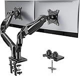
- Compatible with Wide Screens - To ensure compatibility with the dual monitor mount, your each monitor must meet three conditions at the same time: First, computer screens size range: 13 to 32 inches. Second, screen weight range: 4.4 to 19.8 lbs. Third, the back of the monitor screen must have VESA mounting holes with a pitch of 75x75mm or 100x100mm.
- Regarding the compatibility with desks - Your desk must meet three conditions at the same time: First, desk material: Only wooden desks are recommended, plastic or glass desks cannot be used. Second, desk thickness range: 0.59" - 3.54". Third, the bottom of the desk should not have any cross beams or panels, as this will interfere with installation. We recommend carefully checking that your desk and monitors meets all above conditions before purchasing.
- Dual C-Clamp Hold - Worried your dual monitors might wobble or slip? Our upgraded base uses a larger platform plus a dual C-clamp structure to lock the dual monitor arm firmly to your desk. Each arm safely keeps your screens steady while you type, click and game—no shaking, no sliding, just a clean and secure setup you can trust every day. It also provides Grommet Mounting installation choice, both options ensure stable and secure fixation for your 0.59" - 3.54" desk.
- Full-Motion Adjustment For Comfortable View - Pull the screen closer when you’re deep in a spreadsheet, push it back to watch videos, or rotate to portrait for coding — moving everything smoothly with just one hand. The monitor stand offers +85°/-50° tilt, ±90° swivel and 360° rotation. Raise your monitor up to 15.75″ to support a healthy sitting posture. Whether you’re working from home, gaming through the night, or switching between video calls and documents, getting the screens to your natural line of sight helps relieve neck, shoulder and back strain so you can stay focused longer with less fatigue.
- Keep Your Desk Organized: By lifting both screens off the desktop, this dual monitor stand opens up valuable space for your keyboard, notebook, docking station or a simple, clutter-free work area. Built-in cable management guides wires along the arms, keeping cords out of sight and out of the way. Enjoy a tidy, modern workstation that looks as good as it feels to use.
How do I register a custom font in a block theme?
Add an object with name, slug, and fontFamily to settings.typography.fontFamilies. For a theme-owned web font, add a fontFace array with the family metadata, weight and style, and a file: source path.
How do I create responsive font sizes?
Set settings.typography.fluid to true for eligible registered sizes, or give an individual size a fluid object with min and max. Use an explicit clamp() in size with fluid: false when the exact formula must be preserved.
Why are my typography controls missing in the editor?
Check the relevant capability, such as lineHeight or customFontSize, then confirm the block supports that feature and that the active theme is loading the edited file. Also compare the property with the minimum WordPress version you support.
What does defaultFontSizes do in theme.json version 3?
With true, core default sizes stay visible and cannot be overridden by the theme. With false, core defaults are hidden so the theme can use the default slugs for its own scale.
Why does a bundled font load but not display?
Check the computed font-family, the network request, and the declared weight and style. A wrong file: path, a 404 or CORS error, a family-name mismatch, or a requested weight absent from the file can cause fallback.
Should I use a system font or bundle a web font?
A system stack needs no font files, transfer, or font redistribution license. A bundled or hosted face provides a more predictable brand appearance but adds files, loading considerations, and licensing requirements.
Can I stop editors from entering arbitrary font sizes?
Yes. Set settings.typography.customFontSize to false and provide the approved values in fontSizes. Authors can then choose the registered presets instead of entering custom values.
The Bottom Line
Keep the model simple: define typography capabilities, families, and sizes in settings.typography; apply site, block, and element defaults in styles; reference stable presets instead of repeating raw CSS; and test generated variables, font files, fluid bounds, and version support before publishing.
Quick Recap
Product prices and availability are accurate as of the date/time indicated and are subject to change. Any price and availability information displayed on Amazon at the time of purchase will apply.

