The Tool Desk
Outbyte Driver Updater FREEFix the driver behind crashes, sound loss and screen glitchesFind Drivers →Outbyte PC Repair FREEClear out junk files and repair common Windows errorsFree Scan →Build the table with WordPress’s core Table block, add real header cells and a caption, then let wide tables scroll horizontally inside their own container on small screens. This preserves column relationships instead of shrinking text to an unreadable size. Use a stacked mobile layout only when each row still makes sense without the full grid; use a table plugin when you need sorting, search, imports, exports or sticky headers.
Antihost offers managed WordPress hosting with free migration, one-click staging and a 14-day free trial.
What a responsive WordPress table should do
A responsive table adapts to the available viewport while keeping its data understandable. On a desktop screen, a comparison grid may show many columns side by side. On a phone, forcing those same columns into the available width can make labels microscopic, cause awkward wrapping or hide the relationship between a value and its header.
There is no single mobile transformation that fits every table. The right pattern depends on the data:
As an Amazon Associate I earn from qualifying purchases.
| Situation | Recommended pattern | Reason |
|---|---|---|
| A few columns, all needed for comparison | Horizontal scroll wrapper | Preserves the grid and header relationships |
| Each row stands alone on mobile | Stacked or two-column transformation | Makes row labels visible without squeezing every column |
| Long data set | Plugin with sticky header or sorting | Keeps context and supports scanning |
| Data imported from spreadsheets or needing search/export | Dedicated table builder | Adds workflow features unavailable in the core block |
For most editorial tables, start with the core block and horizontal scrolling. It requires no extra plugin, keeps WordPress’s semantic table structure and gives readers access to every column. A game-platform comparison, for example, can remain a grid on a phone while the reader swipes to reach release date, resolution, frame-rate target and price columns.
Build a semantic table with the core Table block
1. Decide whether the information belongs in a table
Use a table for relationships between row and column values, such as comparing game editions, hardware specifications or launch features. Do not use a table to position page elements or create a visual layout. If the information becomes difficult to follow as a grid, simplify it, split it into smaller tables or present it as a list instead.
#1 Best Overall

- BLUE LIGHT BLOCKING GLASSES: Our blue light glasses for women boast UV400 protection, blocking harmful blue rays from computer screens. With these bluelight glasses women, you can enjoy gaming, reading, or watching TV with no worries of eye strain.
- EYE RELIEF: Our blue light glasses are engineered to reduce blurry vision or strain caused by prolonged screen time. These womens blue light glasses aid in better sleep by preventing blue light from disrupting your natural sleep cycle, helping you fall asleep faster and enjoy a more restful night's sleep, making them the perfect christmas present.
- COMFORTABLE: Crafted from durable material, our trendy blue light glasses for woman or blue light glasses men ensure long-lasting comfort. The high-transmittance lenses accessories, gamer gifts for men, help keep your eyes relaxed. Perfect stocking stuffers, gifts for gamers men, christmas gifts for men, halloween costumes.
- LIGHTWEIGHT: These clear blue light glasses feature a lightweight frame, meaning they’ll stay comfy for long-term wear. Perfect as blue blockers glasses for women or mens blue light glasses, these non-prescription fake glasses for men can be worn throughout the day. The blue light blocking glasses women feature polycarbonate HD lenses, which are anti-reflective and restore true color.
- WORRY-FREE PURCHASE: If you experience any issues, our support team is ready to assist you quickly. These are the perfect costume glasses for cosplay dressing up.
2. Insert the block
- Open the post or page in the WordPress editor.
- Select the inserter and search for Table.
- Choose the number of columns and rows, then insert the block.
- Enter one discrete value per cell. Keep each cell concise enough to scan on a narrow screen.
The core block is intended for data tables. WordPress’s developer reference describes semantic table, thead, tbody, th and td elements, which gives browsers and assistive technology the relationships they need.
Quick wins for a faster PC:
Scan for outdated or missing drivers - takes under a minuteDriver Scan →Repair Windows errors before they cause bigger problemsFix Now →3. Add a header section
Select the Table block and enable its header section in the block settings. Put the column labels in header cells, not ordinary data cells. A useful header says exactly what the values represent: Platform, Resolution, Release date or Storage required is more useful than a vague label such as Details.
For tables where the first cell in each row identifies the subject, make that row label a header as well when your chosen markup or block settings support it. Readers should be able to identify both the column and the row while moving through the data.
4. Add a caption or descriptive heading
Use the block’s caption field when it is available. A caption tells a sighted reader and a screen-reader user what the table is about before they start navigating cells. If a caption is not practical, place a correctly nested heading immediately above the table and make its wording specific, such as Performance targets by console rather than simply Specifications.
5. Add a class in Advanced settings
- Select the Table block.
- Open the block settings sidebar and expand Advanced.
- Enter a class such as
responsive-tablein Additional CSS class(es). - Save or update the post, then view the published page at a phone-sized width.
Adding a class scopes your mobile rule to the tables that need it. This is safer than changing every table on the site through a broad selector.
Outdated Drivers Are Slowing You Down
One free scan finds every outdated or missing driver and matches the right update for your exact hardware.Free scan · exact hardware matchPC Slower Than It Used to Be?
A free scan shows the junk files, broken settings and background clutter dragging Windows down - then fixes them in one click.Free scan · Windows 10 & 11Add horizontal scrolling for wide tables
Place the horizontal overflow on the table’s wrapper, not on the entire page. The following pattern uses the class added to the block and gives the table a minimum width so its columns do not collapse into unreadable slivers:
Rank #2

- WINDEX GAMING WIPES: effortlessly clean all your gaming gear and gaming electronics in one easy step with our new Windex Gaming Wipes
- AMMONIA FREE: our ammonia-free formula is safe to use on all of your favorite gaming equipment like consoles, headsets, controllers, screens, keyboards, and more
- PRE-MOISTENED WIPES: each wipe instantly removes dust, dirt, and stubborn smudges and fingerprints leaving a streak-free shine
- ANTI-STATIC: great for cleaning and wiping down your gaming gear and electronics leaving behind no visible residue
- COMPACT RESEALABLE PACKAGE: store your pack of Windex Gaming Wipes anywhere in your home for whenever a quick and easy wipedown is needed
.responsive-table {
  max-width: 100%;
  overflow-x: auto;
  -webkit-overflow-scrolling: touch;
}

.responsive-table table {
  min-width: 40rem;
  width: 100%;
}

@media (max-width: 48rem) {
  .responsive-table {
    overflow-x: auto;
  }
}
Add the CSS in the place your theme provides for additional CSS, or in a child-theme stylesheet that is loaded on the front end. The 40rem minimum width and 48rem breakpoint are practical implementation guidance, not WordPress requirements. Increase or decrease the minimum width according to the longest header and the number of columns. A table with four short columns may need less room; a table with long edition names may need more.
The max-width: 100% rule keeps the wrapper inside its content column. overflow-x: auto creates a horizontal scrollbar only when the table is wider than that wrapper. -webkit-overflow-scrolling: touch improves the feel of scrolling on older WebKit-based mobile browsers. The media query makes the narrow-screen intent explicit, although the overflow declaration can remain active at every width without harming a table that already fits.
Using the block selector directly
WordPress support guidance also demonstrates applying mobile scrolling to .wp-block-table with display: block, overflow-x: auto and white-space: nowrap. A scoped version looks like this:
.wp-block-table.responsive-table {
  display: block;
  max-width: 100%;
  overflow-x: auto;
  white-space: nowrap;
}

.wp-block-table.responsive-table table {
  width: 100%;
  min-width: 40rem;
}
Use white-space: nowrap carefully. It prevents headers and cells from wrapping, which can make a comparison easier to scan, but it also makes long text increase the scroll width. If a cell contains a paragraph, a long accessibility description or a multi-line note, allow that particular content to wrap instead of forcing every cell onto one line.
Keep the scrollbar discoverable
A reader must be able to tell that more columns exist. Do not clip the table with overflow: hidden, and do not hide the scrollbar with custom styling that removes the visual cue. Leave enough padding around the wrapper that a user can place a finger on the table without accidentally activating a link behind it. If the table is wider than the viewport, a short note such as Swipe horizontally to see all columns can help, especially when the first screenful does not reveal an obvious scrollbar.
Choose the mobile layout before you write the CSS
Horizontal scrolling: the default for comparisons
Horizontal scrolling is the safest option when the meaning depends on seeing multiple columns together. Keep the header row aligned with the data, preserve the same column order and let the reader pan left and right. This works well for console comparisons, graphics settings, game editions and other grids where removing a column would hide an important distinction.
Rank #3

- Ergonomic & Adjustable Design: Fight "text neck" and improve your posture. Designed for comfort, it offers an adjustable height (7.1in-8.5in) (1.4in adjustable range) and angle (5°-85°) Please note: cell phone stand is only 9 inches tall—the length of a standard pencil
- Without blocking subtitles Perfect for office desk Tiktok Face Time Zoom video—this is the ultimate kitchen desk essential for phones! Perfect viewing experience while reducing neck back strain, A must-have for gamers streamers desk, and anyone who values both style and support!
- Sleek & Stable Design fits Otterbox Case: Say goodbye to bent cables, tangles, and tip-overs! LISEN’s stylish adjustable desk phone holder features a built-in charging hole and smart cable management, keeping your phone secure and your workspace clutter-free cool gadgets for men
- ANTI-SLIP DESIGN free hands: The under 10.00 items easy gadgets back and the bottom of this kitchen essentials for women are fully covered by anti-skid silicone, which LISEN stand up desk decor can provide maximum protection device from any scratches and slides
- Your Perfect Viewing Companion:If your product arrives damaged or breaks within 365 days, reach out to LISEN for a quick and hassle-free solution. Struggling with assembly, like tightening the screw? We’ve got your back! Your experience matters to us. (Product including: phone Holder stand*1, screw*1, hexagon screwdriver*1, specification*1)
Do not shrink the font until it is difficult to read. A scrollable table is usually more usable than a compressed table whose values wrap unpredictably or overlap.
Stacked rows: useful when records are independent
A stacked layout turns each row into a small record, often showing the field name beside its value. It can work for a list of games where every row is a self-contained item and the reader mainly wants to inspect one item at a time. It is a poor fit for a matrix in which the reader must compare several values across the same row or column.
Because a stacked transformation changes the visual and sometimes the HTML structure, implement it deliberately. Confirm that every value retains its label, that the reading order remains logical and that keyboard users can reach links and controls in the same order as sighted users. If your theme or plugin supplies the transformation, inspect the generated markup rather than assuming the visual result is accessible.
Split a complex table
When one table has unrelated groups of columns, create two or more focused tables. For example, separate a game’s technical requirements from its accessibility features if placing both groups in one grid forces excessive horizontal movement. Give each table its own caption or heading so readers know what changed.
When a responsive table plugin is justified
The core block covers straightforward data, headers, captions and custom CSS. A dedicated table builder becomes useful when the workflow or the data set demands more:
Recommended Free Tools
- Sticky headers: keep column labels visible while a long table scrolls vertically.
- Sorting: let readers reorder rows by release date, score or another field.
- Search: provide filtering when the table contains many records.
- Imports: bring in spreadsheet data instead of entering every cell manually.
- Exports: allow readers or editors to download the data in a supported format.
- Mobile transformations: create a two-column or stacked presentation when a simple scroll wrapper is not enough.
Listings for Make Tables Responsive describe a two-column mobile layout. Auto Responsive Table listings describe responsive behavior, sticky headers, sortable headers and style controls. The WordPress responsive-table directory lists additional options for scrolling, comparison layouts, imports, sorting and export. These are vendor listing claims, not independent performance or accessibility tests. Before installing one, verify its current WordPress compatibility, update history, output markup, licensing and whether it works with your active theme.
Questions to answer before installing
- Does the plugin output real table elements with header cells, or does it simulate a table with generic containers?
- Can you add a caption and identify row headers where needed?
- Does its mobile mode preserve the relationship between each value and its label?
- Can keyboard users scroll, sort, search and activate links without a mouse?
- Does it add scripts or styles to every page, even pages without a table?
- Can you export or recover your data if the plugin is disabled?
Accessibility requirements for responsive tables
Use a real HTML table
Do not create columns with spaces, repeated hyphens, slash characters or decorative divider lines. Those tricks may look aligned in one font and collapse in another; screen readers cannot infer the relationships. Use a real HTML table with semantic headers and data cells. The accessibility guidance states: “Make sure you use a real HTML table and not, for example, spaces or other dividers to separate the data.”
Rank #4

- Easy Installation: Our gaming lights have been designed to enhance your entertainment experience. Simply position the led light bar next to your TV or game console to create a game room environment with ease. They come with USB power and a 60 inch cord for direct mounting and mobility
- Audio Syncing & Extensive Mode: The built-in high-sensitivity music sensor allows you to sync the TV led lights to your favorite music. Lights react and move to the beat of music, film and game audio, creating an incredible immersive sound and light experience – and all without the need for an additional hub. You can choose from 64+ patterns, including strobe, illusion, jump, energy, gradient, running, chasing, fluttering mode etc. Each mode can be applied to different scenes
- 64+ Chasing IC+RGB & W Effect: The independent control design of IC+RGB and white all-in-one multifunctional rgbw led bar lights monitor backlight allows you to easily switch the led lights for desk between IC+RGB and white to enjoy a variety of lighting effects, you can choose white lighting mode with high brightness for better illumination when working, etc. Choose IC+RGB lighting mode when you need to create an entertaining atmosphere for the light show, 16 million colours of Color changing rgb light bar let you dance to the beat and create a dynamic party atmosphere
- Dynamic and Dimmable Lights: 1%-full brightness free brightness adjustment gives you the flexibility to adjust dimmable led light bar for room decorations or a variety of occasions
- USB Powered: USB light bars for room can be powered by powernank, usb charger, TV, Monitor, laptop PC mainframe, making behind TV led lighting bar easy to install in any location.TV led lights are powered by the TV usb interface / PC mainframe, can be turned on/off synchronously with TV / PC
Give every column a meaningful header
Header text should explain the type and unit of the value. If a column contains storage amounts, include the unit in the heading or consistently in every cell. Avoid relying on color, icons or position alone to distinguish values. A user who cannot see the color or who encounters the table in a different reading mode should still understand it.
Provide context before navigation begins
Use a caption when possible, or a correctly nested heading directly above the table. Introduce abbreviations in nearby text or spell them out in the header. If the table has a footnote, connect it to the relevant cell with a clear marker and make the note reachable in the reading order.
What’s actually slowing this PC down?
Pick the symptom - the matching free tool is one click away.
Check the transformed version, not just the desktop view
Responsive CSS and plugins can change focus order, hide headers or duplicate content. Test the published page with a keyboard: tab into the table, reach every link or control, and verify that focus remains visible. Test horizontal scrolling with a keyboard and a touch device. Use a screen reader if your team has access to one, and run an accessibility checker such as WAVE on the rendered page. Inspect the plugin-generated markup when a visual transformation is involved.
WordPress block-theme responsive settings
WordPress documentation notes that responsive styles can vary block settings by viewport in block themes and that the feature is included in block themes requiring WordPress 7.1 or higher. These per-viewport controls can complement custom CSS, but they do not replace semantic table markup or a strategy for wide columns. A responsive font size or spacing setting cannot make six long columns fit comfortably on a phone.
After changing a block’s responsive settings, check both the editor preview and the published page. Theme styles, editor styles and front-end styles can differ, and a theme update may alter the available controls. Keep the table’s mobile behavior understandable even when those controls are unavailable.
Independent reader supportYour contribution helps us test, update, and keep practical guides available for everyone.Practical example: a game-platform comparison
Suppose you are documenting a game with columns for platform, release date, resolution, frame-rate target, download size and accessibility features. The purpose is comparison, so keep the grid and use horizontal scrolling rather than turning every row into a separate card.
Best Value
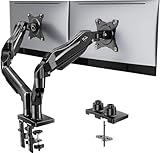
- Compatible with Wide Screens - To ensure compatibility with the dual monitor mount, your each monitor must meet three conditions at the same time: First, computer screens size range: 13 to 32 inches. Second, screen weight range: 4.4 to 19.8 lbs. Third, the back of the monitor screen must have VESA mounting holes with a pitch of 75x75mm or 100x100mm.
- Regarding the compatibility with desks - Your desk must meet three conditions at the same time: First, desk material: Only wooden desks are recommended, plastic or glass desks cannot be used. Second, desk thickness range: 0.59" - 3.54". Third, the bottom of the desk should not have any cross beams or panels, as this will interfere with installation. We recommend carefully checking that your desk and monitors meets all above conditions before purchasing.
- Dual C-Clamp Hold - Worried your dual monitors might wobble or slip? Our upgraded base uses a larger platform plus a dual C-clamp structure to lock the dual monitor arm firmly to your desk. Each arm safely keeps your screens steady while you type, click and game—no shaking, no sliding, just a clean and secure setup you can trust every day. It also provides Grommet Mounting installation choice, both options ensure stable and secure fixation for your 0.59" - 3.54" desk.
- Full-Motion Adjustment For Comfortable View - Pull the screen closer when you’re deep in a spreadsheet, push it back to watch videos, or rotate to portrait for coding — moving everything smoothly with just one hand. The monitor stand offers +85°/-50° tilt, ±90° swivel and 360° rotation. Raise your monitor up to 15.75″ to support a healthy sitting posture. Whether you’re working from home, gaming through the night, or switching between video calls and documents, getting the screens to your natural line of sight helps relieve neck, shoulder and back strain so you can stay focused longer with less fatigue.
- Keep Your Desk Organized: By lifting both screens off the desktop, this dual monitor stand opens up valuable space for your keyboard, notebook, docking station or a simple, clutter-free work area. Built-in cable management guides wires along the arms, keeping cords out of sight and out of the way. Enjoy a tidy, modern workstation that looks as good as it feels to use.
- Insert a Table block with six columns.
- Enable the header section and label each column precisely.
- Add a caption such as Technical specifications by platform.
- Keep the first column short enough to identify the platform quickly.
- Add
responsive-tableunder Advanced settings. - Apply the scoped overflow CSS.
- Preview at a narrow width and swipe from the first column to the last.
- Confirm that values remain aligned with the correct headers after scrolling.
If the table later grows to dozens of rows, add a sorting or search workflow through a suitable table builder rather than forcing readers to swipe through an enormous static grid. If the columns change from technical specifications to independent game records, reconsider whether a stacked presentation would be clearer.
Troubleshoot common failures
The page itself scrolls sideways
The overflow rule may be attached to the table while a child element or theme wrapper is wider than the content column. Inspect the rendered page and apply max-width: 100% to the wrapper. Check long unbroken URLs, image dimensions and preformatted text inside cells; any of them can create overflow outside the intended container.
The scrollbar never appears
Confirm that the class is attached to the Table block and that the stylesheet loads on the front end. Temporarily remove width: 100% and check whether the table has a minimum width. If every column is allowed to shrink, the table may fit without needing a scrollbar. If the theme applies overflow: hidden to a parent, that parent can clip the scroll area.
Headers wrap into multiple lines
Wrapping is not automatically an error. It may be preferable to a very wide table when headers are short and the row height remains manageable. If wrapping destroys the comparison, scope white-space: nowrap to the header or the table, then allow long descriptive cells to wrap so the table does not become unnecessarily wide.
The mobile transformation loses labels
Switch back to the horizontal-scroll pattern or revise the transformation so every value keeps its row and column label. Do not rely on a visual card design that removes the header relationship. Inspect the HTML and test with keyboard navigation and a screen reader.
Styles work in the editor but not on the published page
Check that the CSS was added to a front-end stylesheet or the site’s additional CSS area rather than only to an editor preview. Clear any page cache, then inspect the published page again. A theme or plugin selector with higher specificity may be overriding your rule; scope the selector to the custom class instead of adding broad global styles.
Quick Recap
Pre-publish checklist
- The table represents data relationships rather than page layout.
- The core Table block or plugin outputs a real HTML table.
- Column labels use header cells and describe the values precisely.
- A caption or descriptive heading explains the table’s purpose.
- The mobile pattern matches the data: scrolling for comparisons, stacking for independent rows.
- Wide content scrolls inside the table wrapper instead of moving the entire page.
- No text, link or control is clipped at phone width.
- Keyboard focus is visible and follows a logical order.
- Touch users can swipe through every column.
- A screen reader or accessibility checker can identify headers and values.
- Plugin-generated markup and compatibility have been checked after updates.
Product prices and availability are accurate as of the date/time indicated and are subject to change. Any price and availability information displayed on Amazon at the time of purchase will apply.