Do these 3 things before closing this tab:
1Repair Windows errors before they cause bigger problems2Fix the driver behind crashes, sound loss and screen glitches3Clear out junk files and repair common Windows errorsWordPress thumbnails are usually wrong for one of two reasons: the image derivative was created with an old size definition, or the page is requesting a different file than the one you inspected. Fix the definition first, then regenerate existing attachments, and finally check the HTML that controls responsive image selection.
Antihost offers managed WordPress hosting with free migration, one-click staging and a 14-day free trial.
Start by recording the dimensions shown on the page and the exact image URL being loaded. That evidence tells you whether to change Settings > Media, a theme or plugin registration, the crop mode, or the rendered markup.
As an Amazon Associate I earn from qualifying purchases.
PC Slower Than It Used to Be?
A free scan shows the junk files, broken settings and background clutter dragging Windows down - then fixes them in one click.Free scan · Windows 10 & 11Outdated Drivers Are Slowing You Down
One free scan finds every outdated or missing driver and matches the right update for your exact hardware.Free scan · exact hardware matchWhy a WordPress thumbnail can have the wrong size
When an image is uploaded, WordPress keeps the original file and creates derivative files for registered image sizes. Those derivatives are separate files. Changing a Media setting or editing theme code changes what WordPress will use for future processing, but it does not rebuild files that already exist in the media library.
There are also two configuration layers. The administrator can define the built-in Thumbnail, Medium and Large dimensions under Settings > Media. A theme or plugin can register additional sizes, or define the featured-image size, with set_post_thumbnail_size() and add_image_size(). A page can therefore request a theme size even when the Media screen appears correct.
#1 Best Overall

- BLUE LIGHT BLOCKING GLASSES: Our blue light glasses for women boast UV400 protection, blocking harmful blue rays from computer screens. With these bluelight glasses women, you can enjoy gaming, reading, or watching TV with no worries of eye strain.
- EYE RELIEF: Our blue light glasses are engineered to reduce blurry vision or strain caused by prolonged screen time. These womens blue light glasses aid in better sleep by preventing blue light from disrupting your natural sleep cycle, helping you fall asleep faster and enjoy a more restful night's sleep, making them the perfect christmas present.
- COMFORTABLE: Crafted from durable material, our trendy blue light glasses for woman or blue light glasses men ensure long-lasting comfort. The high-transmittance lenses accessories, gamer gifts for men, help keep your eyes relaxed. Perfect stocking stuffers, gifts for gamers men, christmas gifts for men, halloween costumes.
- LIGHTWEIGHT: These clear blue light glasses feature a lightweight frame, meaning they’ll stay comfy for long-term wear. Perfect as blue blockers glasses for women or mens blue light glasses, these non-prescription fake glasses for men can be worn throughout the day. The blue light blocking glasses women feature polycarbonate HD lenses, which are anti-reflective and restore true color.
- WORRY-FREE PURCHASE: If you experience any issues, our support team is ready to assist you quickly. These are the perfect costume glasses for cosplay dressing up.
The crop setting is a separate decision from the pixel dimensions. Proportional scaling preserves the source aspect ratio, so one dimension may be smaller than the nominal maximum. Hard cropping forces an exact rectangle and removes pixels from the edges. Finally, a correct derivative on disk can still look wrong if the browser receives another candidate through responsive srcset and sizes attributes, or if CSS changes the rendered box.
Diagnose the actual problem before changing anything
Measure the box that visitors see
Right-click the image in a desktop browser and choose the developer-tools command that inspects the element. Record the rendered width and height shown in the styles or layout panel, not just the dimensions you expected from the design. Note whether the image is displayed in a fixed rectangle, allowed to grow with its container, or constrained by CSS such as width, height, max-width or object-fit.
Quick wins for a faster PC:
Repair Windows errors before they cause bigger problemsFix Now →Fix the driver behind crashes, sound loss and screen glitchesFind Drivers →Clear out junk files and repair common Windows errorsFree Scan →A 300-pixel file can be displayed at 600 pixels and a 1,000-pixel file can be displayed at 240 pixels. Displayed dimensions alone therefore cannot prove that the generated thumbnail is wrong; they only establish what the visitor sees.
Inspect the requested image URL
In the element inspector, look at the final src value and every candidate in srcset. Open the selected URL in a new tab and record its intrinsic dimensions. Look for filename patterns such as:
-150x150, which commonly indicates a square thumbnail derivative.-300x...or another numeric suffix, which indicates a generated width and height.- A custom suffix registered by a theme or plugin, such as a card or hero size.
- The original full-size filename with no derivative suffix.
If the URL points to the original file, the template may not be requesting a thumbnail at all. If it points to a correctly sized derivative but the page still looks distorted, inspect CSS and the responsive attributes before regenerating anything.
Separate an old derivative from a bad definition
Compare one older attachment with one image uploaded after your intended settings are in place. If only older images are wrong, the definitions may already be correct and the library simply needs regeneration. If new uploads are also wrong, inspect the Media values, theme registrations and crop arguments first. Regenerating with the same incorrect definition only creates a fresh set of incorrect files.
Recommended Free Tools
Rank #2
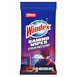
- WINDEX GAMING WIPES: effortlessly clean all your gaming gear and gaming electronics in one easy step with our new Windex Gaming Wipes
- AMMONIA FREE: our ammonia-free formula is safe to use on all of your favorite gaming equipment like consoles, headsets, controllers, screens, keyboards, and more
- PRE-MOISTENED WIPES: each wipe instantly removes dust, dirt, and stubborn smudges and fingerprints leaving a streak-free shine
- ANTI-STATIC: great for cleaning and wiping down your gaming gear and electronics leaving behind no visible residue
- COMPACT RESEALABLE PACKAGE: store your pack of Windex Gaming Wipes anywhere in your home for whenever a quick and easy wipedown is needed
Check Settings > Media
In the WordPress dashboard, open Settings > Media. Review each built-in size that could be used by the template.
| Setting | What to record | What it controls |
|---|---|---|
| Thumbnail | Width, height and whether exact cropping is enabled | The built-in thumbnail derivative. WordPress documents the default Thumbnail dimensions as 150 × 150 pixels. |
| Medium | Maximum width and height | A proportional derivative unless a separate registration or crop rule overrides what the template requests. |
| Large | Maximum width and height | A larger built-in derivative used by templates that request the Large size. |
| Crop thumbnail to exact dimensions | Enabled or disabled | Whether the Thumbnail setting is a fixed crop rectangle or a proportional limit. |
Do not infer the current values from a design mock-up. Read the saved values, write down the desired geometry, and decide whether the image should fit inside those limits or fill a fixed box. The wording of the crop checkbox matters: with exact cropping enabled, WordPress can remove content from the sides or top and bottom to reach the requested rectangle.
Saving this screen changes the rules used when images are processed in the future. It does not rewrite existing attachments. That distinction is the reason an apparently successful settings change can leave every old post unchanged.
Inspect the active theme and plugins for registered sizes
Search the active theme and enabled image-related plugins for set_post_thumbnail_size() and add_image_size(). A child theme can override or supplement a parent theme, and a plugin can register a size that a block, widget or custom post type requests.
What’s actually slowing this PC down?
Pick the symptom - the matching free tool is one click away.
set_post_thumbnail_size()
This function defines the size used when a template asks for the post-thumbnail size. Its width, height and third argument determine the geometry. With the crop argument set to false, the image is scaled proportionally within the requested bounds. With the crop argument set to true, WordPress creates a hard crop.
<?php
set_post_thumbnail_size( 640, 360, true );
The numbers in this example are an illustration of a 16:9 target, not a WordPress default. Use the dimensions required by your own layout. Also note the limitation documented for this function: it will not resize existing featured images. Existing attachments still require regeneration after the code is corrected.
Rank #3

- Ergonomic & Adjustable Design: Fight "text neck" and improve your posture. Designed for comfort, it offers an adjustable height (7.1in-8.5in) (1.4in adjustable range) and angle (5°-85°) Please note: cell phone stand is only 9 inches tall—the length of a standard pencil
- Without blocking subtitles Perfect for office desk Tiktok Face Time Zoom video—this is the ultimate kitchen desk essential for phones! Perfect viewing experience while reducing neck back strain, A must-have for gamers streamers desk, and anyone who values both style and support!
- Sleek & Stable Design fits Otterbox Case: Say goodbye to bent cables, tangles, and tip-overs! LISEN’s stylish adjustable desk phone holder features a built-in charging hole and smart cable management, keeping your phone secure and your workspace clutter-free cool gadgets for men
- ANTI-SLIP DESIGN free hands: The under 10.00 items easy gadgets back and the bottom of this kitchen essentials for women are fully covered by anti-skid silicone, which LISEN stand up desk decor can provide maximum protection device from any scratches and slides
- Your Perfect Viewing Companion:If your product arrives damaged or breaks within 365 days, reach out to LISEN for a quick and hassle-free solution. Struggling with assembly, like tightening the screw? We’ve got your back! Your experience matters to us. (Product including: phone Holder stand*1, screw*1, hexagon screwdriver*1, specification*1)
add_image_size()
Custom sizes are registered with a name and dimensions. The fourth argument controls cropping.
<?php
add_image_size( 'post-card', 320, 180, true );
A template must request the same registered name for this derivative to be used. If the template asks for post-card but that size was removed, renamed or registered with different dimensions, the generated URL and the visible result will not match the current design.
When searching code, check both the registration and the template call. A registration alone does not prove that a page uses it; a template may call a built-in size, the post-thumbnail size, or the original image instead.
Choose proportional scaling or a hard crop
Use proportional scaling when the whole image matters
Proportional scaling keeps the original aspect ratio. Landscape, portrait and square uploads will not all end up with identical rectangles, but no edge content is deliberately removed. This is appropriate for galleries, product-like images, screenshots and any design that can tolerate variable height.
Use a hard crop when the layout requires a fixed box
A hard crop produces the exact registered width and height. It is useful for uniform card grids, banners and avatars, but the crop can remove a face, subtitle or other focal detail. If the important subject is near an edge, changing the crop dimensions alone may not solve the problem; you may need a different focal point or a more forgiving ratio.
The crop argument in theme code and the crop checkbox in Media settings must agree with the visual goal. A proportional setting cannot fill a fixed-height card without either empty space or CSS cropping, while a hard crop can make every card uniform at the cost of visible content.
Free tools Windows power users keep installed
One-click scans. No signup required.
Apply the correction in the right order
- Write down the target. Specify the intended width, height, aspect ratio, and whether the complete image must remain visible.
- Correct the administrator settings. In Settings > Media, update Thumbnail, Medium or Large values and the exact-crop checkbox when the template uses a built-in size.
- Correct registrations. If the page uses a theme or plugin size, update
set_post_thumbnail_size()oradd_image_size()in the active code path. Keep the size name unchanged when existing templates depend on it. - Save and deploy the change. Confirm that the edited theme or plugin is the one active on the affected site, not merely a copy in a development directory.
- Regenerate existing attachments. Use an administrator regeneration tool or WP-CLI after the definitions are correct. This is the step that rebuilds old derivatives.
- Test both generations. Check one old attachment and upload a new test image. Compare intrinsic dimensions, crop and focal-point placement.
- Inspect the rendered markup. If the files are right but the page is wrong, continue to the responsive-image and CSS checks below.
Regenerate thumbnails after changing sizes
Regeneration reads the current registered sizes and creates new derivatives for existing media-library attachments. It does not change the original full-size upload, so the source remains available for a later size decision.
Rank #4

- Easy Installation: Our gaming lights have been designed to enhance your entertainment experience. Simply position the led light bar next to your TV or game console to create a game room environment with ease. They come with USB power and a 60 inch cord for direct mounting and mobility
- Audio Syncing & Extensive Mode: The built-in high-sensitivity music sensor allows you to sync the TV led lights to your favorite music. Lights react and move to the beat of music, film and game audio, creating an incredible immersive sound and light experience – and all without the need for an additional hub. You can choose from 64+ patterns, including strobe, illusion, jump, energy, gradient, running, chasing, fluttering mode etc. Each mode can be applied to different scenes
- 64+ Chasing IC+RGB & W Effect: The independent control design of IC+RGB and white all-in-one multifunctional rgbw led bar lights monitor backlight allows you to easily switch the led lights for desk between IC+RGB and white to enjoy a variety of lighting effects, you can choose white lighting mode with high brightness for better illumination when working, etc. Choose IC+RGB lighting mode when you need to create an entertaining atmosphere for the light show, 16 million colours of Color changing rgb light bar let you dance to the beat and create a dynamic party atmosphere
- Dynamic and Dimmable Lights: 1%-full brightness free brightness adjustment gives you the flexibility to adjust dimmable led light bar for room decorations or a variety of occasions
- USB Powered: USB light bars for room can be powered by powernank, usb charger, TV, Monitor, laptop PC mainframe, making behind TV led lighting bar easy to install in any location.TV led lights are powered by the TV usb interface / PC mainframe, can be turned on/off synchronously with TV / PC
Using an administrator regeneration tool
Install a reputable thumbnail-regeneration tool through the normal WordPress administration workflow, run it only after saving the corrected settings or code, and select the scope it offers. A complete-library run is appropriate when a site-wide size changed; a selected-attachment run is safer when you are testing one template. Watch the tool’s result for failed attachments, timeouts or insufficient storage, and rerun only the failed scope after addressing the cause.
Regeneration can be resource-intensive on a large library. Schedule it during a quiet period, keep the browser or maintenance session open if the tool requires it, and confirm that newly created files are present before deleting anything. Do not delete the original uploads as a shortcut; derivatives can be rebuilt from them.
Using WP-CLI
On a site where WP-CLI is available, the core command is:
The Tool Desk
Outbyte PC Repair FREERepair Windows errors before they cause bigger problemsFix Now →Outbyte Driver Updater FREEFix the driver behind crashes, sound loss and screen glitchesFind Drivers →wp media regenerateTo target particular attachments, append their attachment IDs:
wp media regenerate 123 456 789To rebuild only one registered size, use the image-size filter:
wp media regenerate --image_size=post-cardReplace post-card with the exact registered size name. If you changed several sizes, run the command for each required name or run an unfiltered regeneration. The command can only create sizes that are currently registered, so a typo or a size removed from the theme will not produce the file you expect.
Best Value
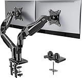
- Compatible with Wide Screens - To ensure compatibility with the dual monitor mount, your each monitor must meet three conditions at the same time: First, computer screens size range: 13 to 32 inches. Second, screen weight range: 4.4 to 19.8 lbs. Third, the back of the monitor screen must have VESA mounting holes with a pitch of 75x75mm or 100x100mm.
- Regarding the compatibility with desks - Your desk must meet three conditions at the same time: First, desk material: Only wooden desks are recommended, plastic or glass desks cannot be used. Second, desk thickness range: 0.59" - 3.54". Third, the bottom of the desk should not have any cross beams or panels, as this will interfere with installation. We recommend carefully checking that your desk and monitors meets all above conditions before purchasing.
- Dual C-Clamp Hold - Worried your dual monitors might wobble or slip? Our upgraded base uses a larger platform plus a dual C-clamp structure to lock the dual monitor arm firmly to your desk. Each arm safely keeps your screens steady while you type, click and game—no shaking, no sliding, just a clean and secure setup you can trust every day. It also provides Grommet Mounting installation choice, both options ensure stable and secure fixation for your 0.59" - 3.54" desk.
- Full-Motion Adjustment For Comfortable View - Pull the screen closer when you’re deep in a spreadsheet, push it back to watch videos, or rotate to portrait for coding — moving everything smoothly with just one hand. The monitor stand offers +85°/-50° tilt, ±90° swivel and 360° rotation. Raise your monitor up to 15.75″ to support a healthy sitting posture. Whether you’re working from home, gaming through the night, or switching between video calls and documents, getting the screens to your natural line of sight helps relieve neck, shoulder and back strain so you can stay focused longer with less fatigue.
- Keep Your Desk Organized: By lifting both screens off the desktop, this dual monitor stand opens up valuable space for your keyboard, notebook, docking station or a simple, clutter-free work area. Built-in cable management guides wires along the arms, keeping cords out of sight and out of the way. Enjoy a tidy, modern workstation that looks as good as it feels to use.
| Fix approach | Source of size | Geometry handled | Scope | Execution |
|---|---|---|---|---|
| Media-setting correction | Settings > Media | Built-in proportional limits or Thumbnail exact crop | Future uploads until regeneration is run | Dashboard save, then regeneration |
| Theme or plugin correction | set_post_thumbnail_size() or add_image_size() |
Explicit dimensions and crop argument | Templates that request that registered name | Code deployment, then regeneration |
| Selected regeneration | Existing registered definition | Rebuilds the chosen size | One attachment or selected IDs | Regeneration tool or WP-CLI with IDs |
| Library-wide regeneration | Existing registered definitions | Rebuilds all requested derivatives | Entire media library | Regeneration tool or unfiltered WP-CLI |
When the file is correct but the page is still wrong
WordPress has native responsive-image support. As the WordPress developer documentation states, “Since WordPress 4.4, native responsive images is supported by including srcset and sizes attributes to the image markup it generates.” The browser uses those attributes, the available viewport and the image’s rendered slot to choose a candidate; the URL in the plain src attribute is not always the file ultimately downloaded.
Check srcset and sizes
In developer tools, expand the image element and list every URL in srcset. Identify the candidate marked as the current request in the network panel. Then read the sizes value. If it describes a slot wider than the actual card, the browser may select a larger file; if it describes a slot that is too small, the browser may select a visibly soft file. A correct derivative cannot fix an incorrect slot calculation.
The responsive system includes a medium-large default of 768 pixels wide. That value is a candidate in the responsive-size system, not a promise that every image will display at 768 pixels or that every theme will use it.
Check the theme’s requested size
Search the template for the image function that outputs the featured image or attachment. Confirm that its requested size name matches the registration you corrected. A page can continue to request medium, large, post-thumbnail or the original file even after you repair a custom size that the page never uses.
Check CSS and layout constraints
Inspect computed styles for width, height, max-width, aspect-ratio, object-fit and overflow rules. CSS can stretch a proportionally scaled image into a different ratio, or visually crop it inside a fixed container while the underlying file remains correct. Test the image with temporary overrides in developer tools; if the appearance changes without changing the URL, regeneration is not the solution.
Common symptoms and precise remedies
| Symptom | Likely cause | Remedy |
|---|---|---|
| Old posts are wrong, new uploads are right | Existing derivatives were created under an earlier definition | Regenerate the affected size or the library. |
| New and old images are both the wrong dimensions | Media settings or theme/plugin registration is incorrect | Correct the source definition, then regenerate. |
| Every image is a square despite a wide design | Thumbnail exact crop or a theme crop argument is enabled | Disable hard cropping for proportional output, or register the intended wide rectangle and regenerate. |
| Subjects are cut off | The fixed crop removes edge content | Use proportional scaling, change the target ratio, or adjust the source focal point before regenerating. |
| The downloaded file has the right intrinsic size but looks stretched | CSS width and height, aspect-ratio or object-fit rules distort the rendered box | Correct the computed styles and retest without changing the derivative. |
| The HTML lists the right size but the browser downloads another file | Responsive srcset/sizes selection |
Fix the slot description or template output, then test at the affected viewport. |
| A custom-size URL is missing | The size is no longer registered, or the name does not match the template | Restore the registration with the exact name and regenerate. |
Verification checklist after the repair
- Open an old attachment and confirm that the regenerated derivative exists at the intended dimensions.
- Upload a new image with a different aspect ratio, such as portrait when the original test was landscape, to expose accidental stretching or cropping.
- Compare the focal subject’s position in the generated file and in the page’s visible box.
- Inspect both
srcand the selectedsrcsetcandidate at desktop and mobile widths. - Confirm that the original full-size file remains intact in the media library.
- Check every template that uses the same registered name; archives, search results, widgets and single posts may request different sizes.
- If a cache or image-delivery layer is present, purge the affected page and image URLs only after verifying that the new files exist.
Prevent the problem from returning
Document each custom size name, its dimensions and crop mode beside the template that uses it. Treat a change to any of those values as a migration: update the definition, regenerate the required attachments, and test representative old and new images. Avoid silently reusing a size name for a radically different ratio when long-lived cached markup or external image caches may still reference the old geometry.
Keep the original upload untouched, use explicit size names in templates, and check the generated HTML whenever a design changes. This workflow makes it possible to tell whether a future mismatch is a file-generation problem, a template-selection problem or a purely visual CSS problem before rebuilding the entire library.
Quick Recap
Product prices and availability are accurate as of the date/time indicated and are subject to change. Any price and availability information displayed on Amazon at the time of purchase will apply.