Do these 3 things before closing this tab:
1Clear out junk files and repair common Windows errors2Fix the driver behind crashes, sound loss and screen glitches3Repair Windows errors before they cause bigger problemsMake the theme’s first viewport smaller, earlier, and more stable: ship only the CSS and JavaScript the current template needs, serve an image sized for the phone slot, reserve space for media, and keep the largest contentful paint (LCP) element discoverable without lazy loading. Measure a representative mobile URL before and after each change. Judge the result with real-user data at the 75th percentile, aiming for LCP of 2.5 seconds or less, interaction to next paint (INP) under 200 milliseconds, and cumulative layout shift (CLS) under 0.1.
Antihost offers managed WordPress hosting with free migration, one-click staging and a 14-day free trial.
For a gaming site, test the home page, article page, category/archive, and any store or checkout template separately. A theme can be quick on an article and slow on a media-heavy home page because each template builds a different critical path.
As an Amazon Associate I earn from qualifying purchases.
Start with mobile evidence, not a code change
Run a mobile test in Google PageSpeed Insights for each representative template and record the URL, date, score, Core Web Vitals, and the diagnostics shown below the scores. PageSpeed Insights combines a controlled laboratory run with available real-user data. The lab run helps you find a likely cause; field data tells you what visitors actually experienced.
Use Google Search Console’s Core Web Vitals report to see field results grouped by device, metric, and URL group. Field status is evaluated at the 75th percentile for mobile. A single green lab run is not proof that a theme is fast for your audience, and one slow test is not enough to establish a regression. Keep the same URLs and test conditions when comparing fixes.
#1 Best Overall

- BLUE LIGHT BLOCKING GLASSES: Our blue light glasses for women boast UV400 protection, blocking harmful blue rays from computer screens. With these bluelight glasses women, you can enjoy gaming, reading, or watching TV with no worries of eye strain.
- EYE RELIEF: Our blue light glasses are engineered to reduce blurry vision or strain caused by prolonged screen time. These womens blue light glasses aid in better sleep by preventing blue light from disrupting your natural sleep cycle, helping you fall asleep faster and enjoy a more restful night's sleep, making them the perfect christmas present.
- COMFORTABLE: Crafted from durable material, our trendy blue light glasses for woman or blue light glasses men ensure long-lasting comfort. The high-transmittance lenses accessories, gamer gifts for men, help keep your eyes relaxed. Perfect stocking stuffers, gifts for gamers men, christmas gifts for men, halloween costumes.
- LIGHTWEIGHT: These clear blue light glasses feature a lightweight frame, meaning they’ll stay comfy for long-term wear. Perfect as blue blockers glasses for women or mens blue light glasses, these non-prescription fake glasses for men can be worn throughout the day. The blue light blocking glasses women feature polycarbonate HD lenses, which are anti-reflective and restore true color.
- WORRY-FREE PURCHASE: If you experience any issues, our support team is ready to assist you quickly. These are the perfect costume glasses for cosplay dressing up.
Targets to use as decision gates
| Metric | Good threshold | How to use it |
|---|---|---|
| First Contentful Paint (FCP) | 1,800 ms or less | Shows when the first content appears; useful for finding slow initial delivery. |
| Largest Contentful Paint (LCP) | 2,500 ms or less | Prioritize the element that represents the main content in the first viewport. |
| Interaction to Next Paint (INP) | Under 200 ms | Check menu, search, consent, form, cart, and other interactions rather than relying on score alone. |
| Cumulative Layout Shift (CLS) | Under 0.1 | Find content that moves while images, ads, embeds, or fonts load. |
| Time to First Byte (TTFB) | 800 ms or less (experimental guidance) | Use as a server and delivery clue; a theme change cannot fix every source of delay. |
Google describes good LCP as occurring within the first 2.5 seconds after loading starts, INP as less than 200 milliseconds, and CLS as less than 0.1. These are published thresholds, not a performance guarantee for a particular host, theme, device, or connection.
Capture the causes, not just the score
In the PageSpeed report, identify the LCP element, render-blocking stylesheets, long JavaScript tasks, layout-shift sources, and oversized images. Note the transferred bytes and the number of requests that block rendering. When two fixes appear similar, compare them on mobile LCP, INP, and CLS; bytes transferred; main-thread JavaScript time; render-blocking request count; visual fidelity; accessibility; and the risk of breaking navigation, search, forms, or commerce interactions.
Quick wins for a faster PC:
Scan for outdated or missing drivers - takes under a minuteDriver Scan →Repair Windows errors before they cause bigger problemsFix Now →Map the theme’s critical path
The critical path is the work required before a visitor can see and use the first viewport. In a WordPress theme that usually includes the document response, critical CSS, fonts, the LCP image or embed, and JavaScript needed for the header and primary interaction. Start there instead of optimising a below-the-fold carousel that has no effect on the first screen.
Keep responsive foundations simple
WordPress documentation describes a default mobile range of 480px wide and narrower, with tablet widths wider than 480px through 782px. A theme may customise those breakpoints, so inspect the actual CSS rather than assuming the defaults. Keep the base style usable at every width, then add only the overrides needed for narrower screens. This avoids downloading a desktop-only design and undoing it with a large collection of mobile rules.
Use the theme’s style.css, theme.json, templates, and component styles as deliberate responsive surfaces. Remove declarations that no component uses, avoid desktop-only effects on phones, and keep selectors and DOM depth reasonable. Fewer nested wrappers and simpler selectors reduce style calculation and make later debugging easier.
Rank #2
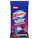
- WINDEX GAMING WIPES: effortlessly clean all your gaming gear and gaming electronics in one easy step with our new Windex Gaming Wipes
- AMMONIA FREE: our ammonia-free formula is safe to use on all of your favorite gaming equipment like consoles, headsets, controllers, screens, keyboards, and more
- PRE-MOISTENED WIPES: each wipe instantly removes dust, dirt, and stubborn smudges and fingerprints leaving a streak-free shine
- ANTI-STATIC: great for cleaning and wiping down your gaming gear and electronics leaving behind no visible residue
- COMPACT RESEALABLE PACKAGE: store your pack of Windex Gaming Wipes anywhere in your home for whenever a quick and easy wipedown is needed
Make critical CSS small
Inline or otherwise deliver only the rules needed to render the first viewport quickly. Header layout, navigation state, typography used above the fold, the main content frame, and the dimensions of the LCP media usually belong in this first set. Move styles for a footer, an off-canvas panel that is closed initially, and below-the-fold widgets out of the critical path. Keep a fallback that leaves the page usable if a noncritical stylesheet is delayed.
Enqueue assets through WordPress
Do not hard-code stylesheet and script tags in a theme template. WordPress’s enqueue APIs provide dependency ordering, versioning, footer placement, and loading strategies, and they let the theme decide which assets are needed by the current template or component.
function game_theme_assets() {
    wp_enqueue_style(
        'game-theme',
        get_stylesheet_uri(),
        array(),
        wp_get_theme()->get('Version')
    );

    if ( is_singular('post') ) {
        wp_enqueue_style(
            'game-article',
            get_template_directory_uri() . '/assets/article.css',
            array('game-theme'),
            wp_get_theme()->get('Version')
        );
    }

    wp_enqueue_script(
        'game-navigation',
        get_template_directory_uri() . '/assets/navigation.js',
        array(),
        wp_get_theme()->get('Version'),
        array(
            'in_footer' => true,
            'strategy'  => 'defer',
        )
    );
}
add_action('wp_enqueue_scripts', 'game_theme_assets');
The example keeps the article stylesheet off unrelated templates and places navigation code in the footer with a deferred strategy. Adapt the conditions to your theme: an archive may need filter controls, while a checkout template may need a payment or validation script. Do not defer code that must run before an interaction is available without testing the resulting behavior.
Audit third-party and builder bundles
Widgets, sliders, icon libraries, analytics, consent controls, and page-builder bundles can add more work than the theme itself. Inventory every request and identify whether it is required for the first viewport. Defer or delay code that is not needed immediately, but retest keyboard navigation, touch menus, site search, login and comment forms, consent controls, carts, and checkout. A higher performance score that disables an essential interaction is a failed optimisation.
Deliver images for the phone slot
Images are often the largest transfer on a game-news home page. WordPress has generated responsive image markup since version 4.4. Its srcset and sizes attributes let the browser choose an appropriate candidate instead of downloading the full desktop file on a narrow screen.
Free tools Windows power users keep installed
One-click scans. No signup required.
Rank #3

- Ergonomic & Adjustable Design: Fight "text neck" and improve your posture. Designed for comfort, it offers an adjustable height (7.1in-8.5in) (1.4in adjustable range) and angle (5°-85°) Please note: cell phone stand is only 9 inches tall—the length of a standard pencil
- Without blocking subtitles Perfect for office desk Tiktok Face Time Zoom video—this is the ultimate kitchen desk essential for phones! Perfect viewing experience while reducing neck back strain, A must-have for gamers streamers desk, and anyone who values both style and support!
- Sleek & Stable Design fits Otterbox Case: Say goodbye to bent cables, tangles, and tip-overs! LISEN’s stylish adjustable desk phone holder features a built-in charging hole and smart cable management, keeping your phone secure and your workspace clutter-free cool gadgets for men
- ANTI-SLIP DESIGN free hands: The under 10.00 items easy gadgets back and the bottom of this kitchen essentials for women are fully covered by anti-skid silicone, which LISEN stand up desk decor can provide maximum protection device from any scratches and slides
- Your Perfect Viewing Companion:If your product arrives damaged or breaks within 365 days, reach out to LISEN for a quick and hassle-free solution. Struggling with assembly, like tightening the screw? We’ve got your back! Your experience matters to us. (Product including: phone Holder stand*1, screw*1, hexagon screwdriver*1, specification*1)
Match intrinsic dimensions to rendered dimensions
First measure the image slot at the mobile viewport, including the column width and the device-pixel ratio you intend to support. Export a source that can cover that slot without sending a multi-thousand-pixel desktop original to a phone. Compress the source and use a modern format when it is supported by the project’s delivery stack, while retaining a usable fallback.
When outputting an attachment, let WordPress generate its candidates rather than assembling a fixed desktop URL:
<?php
 echo wp_get_attachment_image(
     $hero_id,
     'large',
     false,
     array(
         'class'    => 'article-hero',
         'sizes'    => '(max-width: 480px) 100vw, 760px',
         'loading'  => 'eager',
         'decoding' => 'async',
     )
 );
?>
The sizes value must describe the actual layout. If the image occupies the full viewport below 480px but only 760 CSS pixels in the article column above that point, the browser can avoid selecting a needlessly large candidate. Verify the generated HTML and the selected resource in mobile developer tools; a correct srcset is not useful if CSS later makes the image much larger than the declared slot.
Reserve space to prevent layout shifts
Give every image a width and height, or use a CSS aspect ratio that matches the file. The browser can then allocate space before bytes arrive. Apply the same rule to thumbnails, avatars, ad containers, video posters, and embeds. A stable box prevents the headline and controls from jumping while media loads, directly reducing CLS.
What’s actually slowing this PC down?
Pick the symptom - the matching free tool is one click away.
Decide lazy loading from viewport position
Lazy loading is appropriate for images and embeds below the fold. It is not a blanket setting for every <img> element. Inspect the first viewport manually on a narrow screen. If the hero image is the LCP element, it must be discoverable early and should not receive an automatic loading="lazy" attribute merely because it is an image. The same caution applies to an above-the-fold iframe that forms the main content.
Rank #4

- Easy Installation: Our gaming lights have been designed to enhance your entertainment experience. Simply position the led light bar next to your TV or game console to create a game room environment with ease. They come with USB power and a 60 inch cord for direct mounting and mobility
- Audio Syncing & Extensive Mode: The built-in high-sensitivity music sensor allows you to sync the TV led lights to your favorite music. Lights react and move to the beat of music, film and game audio, creating an incredible immersive sound and light experience – and all without the need for an additional hub. You can choose from 64+ patterns, including strobe, illusion, jump, energy, gradient, running, chasing, fluttering mode etc. Each mode can be applied to different scenes
- 64+ Chasing IC+RGB & W Effect: The independent control design of IC+RGB and white all-in-one multifunctional rgbw led bar lights monitor backlight allows you to easily switch the led lights for desk between IC+RGB and white to enjoy a variety of lighting effects, you can choose white lighting mode with high brightness for better illumination when working, etc. Choose IC+RGB lighting mode when you need to create an entertaining atmosphere for the light show, 16 million colours of Color changing rgb light bar let you dance to the beat and create a dynamic party atmosphere
- Dynamic and Dimmable Lights: 1%-full brightness free brightness adjustment gives you the flexibility to adjust dimmable led light bar for room decorations or a variety of occasions
- USB Powered: USB light bars for room can be powered by powernank, usb charger, TV, Monitor, laptop PC mainframe, making behind TV led lighting bar easy to install in any location.TV led lights are powered by the TV usb interface / PC mainframe, can be turned on/off synchronously with TV / PC
Conversely, gallery images, related-story cards, and comments that begin below the initial viewport can be lazy-loaded. Keep their dimensions reserved so deferring the request does not create a later shift. After changing loading behavior, confirm in the network panel that the LCP resource is requested early and that below-the-fold media is not competing with it during initial load.
Reduce JavaScript work and improve INP
INP reflects the delay between a user interaction and the next painted response. A theme can have a reasonable LCP and still feel slow if a large script parses on startup or a click handler runs a long task on the main thread.
Ship only the behavior the template uses
- Load a carousel module only on templates that render a carousel.
- Load filter and sorting code only where those controls exist.
- Keep search autocomplete, share dialogs, and comment enhancements out of pages that do not render them.
- Split optional behavior so it can be requested after the first interaction or when its component approaches the viewport.
Use dependency declarations rather than concatenating unrelated scripts into one global bundle. A smaller initial bundle lowers parse and execution time and reduces the chance that an unrelated feature blocks a menu tap.
Recommended Free Tools
Delay safely, then test real interactions
Deferring noncritical scripts can improve first paint, but it changes when globals and event listeners become available. Open the navigation menu with a finger and keyboard, submit search, focus and validate forms, accept or reject consent, and exercise any cart or checkout flow after every loading change. Check that focus management, escape-key behavior, and error messages still work; performance work must not reduce accessibility.
Independent reader supportYour contribution helps us test, update, and keep practical guides available for everyone.Control fonts, caching, and static delivery
Limit font work
Use only the font families and weights the design actually displays. Remove unused variants rather than downloading a complete family for a single heading weight. Locally hosted or otherwise predictable font delivery can fit a project when it reduces dependency and connection overhead. Define a reliable fallback so text remains readable while the chosen face loads, and check that late font swaps do not alter the dimensions of headlines or navigation enough to create a layout shift.
Best Value
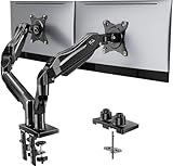
- Compatible with Wide Screens - To ensure compatibility with the dual monitor mount, your each monitor must meet three conditions at the same time: First, computer screens size range: 13 to 32 inches. Second, screen weight range: 4.4 to 19.8 lbs. Third, the back of the monitor screen must have VESA mounting holes with a pitch of 75x75mm or 100x100mm.
- Regarding the compatibility with desks - Your desk must meet three conditions at the same time: First, desk material: Only wooden desks are recommended, plastic or glass desks cannot be used. Second, desk thickness range: 0.59" - 3.54". Third, the bottom of the desk should not have any cross beams or panels, as this will interfere with installation. We recommend carefully checking that your desk and monitors meets all above conditions before purchasing.
- Dual C-Clamp Hold - Worried your dual monitors might wobble or slip? Our upgraded base uses a larger platform plus a dual C-clamp structure to lock the dual monitor arm firmly to your desk. Each arm safely keeps your screens steady while you type, click and game—no shaking, no sliding, just a clean and secure setup you can trust every day. It also provides Grommet Mounting installation choice, both options ensure stable and secure fixation for your 0.59" - 3.54" desk.
- Full-Motion Adjustment For Comfortable View - Pull the screen closer when you’re deep in a spreadsheet, push it back to watch videos, or rotate to portrait for coding — moving everything smoothly with just one hand. The monitor stand offers +85°/-50° tilt, ±90° swivel and 360° rotation. Raise your monitor up to 15.75″ to support a healthy sitting posture. Whether you’re working from home, gaming through the night, or switching between video calls and documents, getting the screens to your natural line of sight helps relieve neck, shoulder and back strain so you can stay focused longer with less fatigue.
- Keep Your Desk Organized: By lifting both screens off the desktop, this dual monitor stand opens up valuable space for your keyboard, notebook, docking station or a simple, clutter-free work area. Built-in cable management guides wires along the arms, keeping cords out of sight and out of the way. Enjoy a tidy, modern workstation that looks as good as it feels to use.
Serve cacheable files as static resources
CSS, JavaScript, fonts, and images are static resources. They do not need PHP or database generation on every request and can be cached by the operating system and the browser. Give files stable version identifiers so a changed asset is fetched while unchanged files remain reusable. Confirm that cache headers, compression, and a delivery layer are not being defeated by query-string or cookie variations that the theme does not need.
Caching improves repeat visits and reduces origin work, but it cannot compensate for shipping an oversized hero image or an unused application bundle on the first visit. Treat delivery caching as one layer after the theme’s bytes and execution have been made proportional to the page.
The Tool Desk
Outbyte PC Repair FREEClear out junk files and repair common Windows errorsFree Scan →Outbyte Driver Updater FREEFix the driver behind crashes, sound loss and screen glitchesFind Drivers →Use a repeatable validation loop
- Record a baseline. Run mobile PageSpeed Insights on one representative home, article, archive, product, or checkout URL as applicable. Save the LCP element, render-blocking resources, long tasks, layout-shift sources, image candidates, and field-data status in Search Console.
- Choose one dominant cause. If the LCP resource is an oversized hero, fix its dimensions and discovery first. If a script creates a long task, isolate or defer that script. If the layout shifts, reserve space before changing unrelated code.
- Implement at the theme layer. Change the enqueue condition, CSS surface, markup, or component responsible for the finding. Avoid a site-wide switch when only one template needs the asset.
- Re-run the same URL. Compare LCP, INP, CLS, transferred bytes, main-thread time, and render-blocking requests under the same test setup. Record visual differences and accessibility effects.
- Exercise the page manually. Use a physical phone or a narrow emulated viewport. Open menus, search, forms, consent controls, comments, media players, and commerce interactions. Look for missing styles, delayed handlers, focus traps, and content movement.
- Monitor field data over time. Search Console groups real-user results by device, metric, and URL group. Wait for enough traffic to establish a trend; do not claim a theme improvement from a single laboratory score.
Troubleshoot by the failing metric
LCP is above 2.5 seconds
- Inspect which element PageSpeed identifies as LCP; do not assume it is the hero image.
- Remove render-blocking CSS that is not needed for the first viewport and keep critical CSS compact.
- Make the LCP image discoverable early, use the mobile-sized candidate, and remove automatic lazy loading from that element.
- Defer nonessential JavaScript and third-party requests competing for the connection or main thread.
- Use the TTFB diagnostic to separate delivery delay from theme work; the experimental good guidance is 800ms or less, but a theme edit cannot fix every server-side cause.
INP is 200 milliseconds or higher
- Find the interaction associated with the longest task in the lab trace or field diagnostics.
- Reduce the startup bundle, split feature code, and defer scripts that do not support the first interaction.
- Inspect click and input handlers for synchronous layout work, large DOM updates, or third-party callbacks.
- Retest touch and keyboard interactions after every change so a faster trace does not hide a broken menu, search form, or checkout step.
CLS is 0.1 or higher
- Give images, video posters, iframes, ads, and embeds fixed dimensions or matching aspect ratios.
- Check whether late font loading changes headline or navigation dimensions.
- Reserve space for injected notices, consent controls, and recommendation modules before they appear.
- Watch the first viewport during a cold load and a repeat load; shifts can have different causes in each case.
The mobile score is low despite small files
Score components include timing and execution, not just total bytes. Check render-blocking request count, main-thread JavaScript time, the order in which the browser discovers the LCP resource, and whether a desktop candidate is being selected on a phone. Also verify that the test URL is representative: a lightweight article cannot stand in for a home page with a video rail and multiple widgets.
A practical release checklist
- Mobile PageSpeed Insights and Search Console field data were recorded for each important template.
- The theme’s responsive breakpoints and component styles were inspected rather than assumed.
- Critical CSS contains only first-viewport rules, and unused declarations and desktop-only effects were removed.
- Styles and scripts are enqueued through WordPress APIs and conditionally loaded where appropriate.
- Noncritical JavaScript is deferred or delayed only after navigation, search, forms, consent, and commerce paths pass testing.
- Images use WordPress responsive candidates, accurate
sizes, compressed sources, and reserved dimensions. - Below-the-fold media is lazy-loaded, while the above-the-fold LCP image or iframe remains discoverable early.
- Fonts are limited to used families and weights, and static assets have effective caching.
- Changes are compared on LCP, INP, CLS, bytes, main-thread time, render-blocking requests, visual fidelity, accessibility, and regression risk.
- Field data is monitored over time instead of being inferred from one lab run.
The Bottom Line
The fastest WordPress theme is not the one with the fewest features; it is the one that sends the right work for the current mobile template, discovers the LCP content early, reserves space for everything that will load, and postpones the rest without breaking interaction. Measure at the 75th percentile, fix the largest critical-path cause first, and validate both the numbers and the page a player actually uses.
Quick Recap
Product prices and availability are accurate as of the date/time indicated and are subject to change. Any price and availability information displayed on Amazon at the time of purchase will apply.