Quick wins for a faster PC:
Fix the driver behind crashes, sound loss and screen glitchesFind Drivers →Repair Windows errors before they cause bigger problemsFix Now →There is no definitive ranking of the best video game menus. These ten picks are an editorial selection of menus and interface moments that stand out for visual identity, atmosphere, thematic fit, or expressive presentation. The examples are not all famous for the same reason: some make navigation part of the spectacle, while others set a mood before the game begins.
What makes an in-game menu incredible?
A memorable menu does more than list options. It can introduce a game’s world, make routine navigation feel distinctive, or extend the tone of the fiction into the pause screen. Strong visual style is only one part of the picture: layout, readable text, clear controller focus, contrast, and motion also affect whether a menu is usable. Those considerations are laid out in Hadjoudj Idris’s 2026 guide to game menu design. The selections below emphasize the qualities that sources specifically describe, rather than applying an invented score or claiming an objective top ten.
10 in-game menus worth remembering
1. Persona 5 — navigation with graphic flair
Persona 5 gives its interface a visual personality as bold as its wider presentation. GameSpot’s 2016 coverage singled out the menus and UI, including combat options, Persona displays, and map screens. The appeal is not confined to a title screen: the same graphic energy carries into choices players make throughout the game. GameSpot’s look at Persona 5’s menus
2. The Elder Scrolls V: Skyrim — a world introduced in a single screen
Skyrim uses its main menu to establish atmosphere before the adventure starts. A 2018 ACM SIGCHI paper on interfaces and narrative describes the dragon emblem, fog or smoke, and choral music as elements that help introduce the game’s epic fantasy setting. This is a case for mood-setting, not evidence that the screen is especially strong as a navigation design. The paper’s discussion of interfaces and narrative
Recommended Free Tools
#1 Best Overall

- Experience your Favorite MARVEL vs. CAPCOM classics All in One – Enjoy 7 of your favorite classic titles that helped shaped the MARVEL vs. CAPCOM universe both single player and online.
- Enjoy Enhanced Features Added to the Classic Collection – To enhance your playability experience, we incorporated the favorite added features from Capcom Fighting Collection including gallery mode, quick save, training mode for all fighting titles, and the high score challenge. Beginners and first timers into the franchise are also welcome to play through adjusted settings and execution of one-button specials!
- Play with Friends Worldwide through Online Compatibility – This collection also includes rollback net code for a smooth and enjoyable experience online. Play casually or competitively through casual, ranked, or custom matches using rules of your choosing!
3. DOOM (2016) — a deliberately authored interface
DOOM’s menus have a designed visual identity rather than feeling like generic screens placed around the action. UI visual designer Jake Raymor documented work on the game, including pause-menu look development and iterations that carried layouts across menu pages. That account makes the interface an interesting example of craft and consistency; it is not, by itself, a verdict that the menu is objectively among the best. Jake Raymor’s DOOM 2016 interface work
4. Killer7 — menus in step with an unsettling tone
Killer7 is a useful example of menu presentation treated as part of a game’s thematic identity. GameDeveloper’s discussion of thematic storytelling through menu design points to its title-card sequence and stylized presentation. The larger design idea is compelling: a menu can contribute to a game’s unease instead of acting as a neutral doorway. GameDeveloper on thematic storytelling through menu design
Rank #2
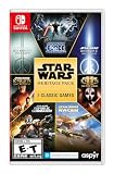
- The following games are included in the cartridge: STAR WARS Jedi Knight: Jedi Academy (3.6 GB)
- STAR WARS Jedi Knight II: Jedi Outcast (1.1 GB)
- STAR WARS Episode I Racer (254 MB)
- STAR WARS Republic Commando (2.5 GB)
- STAR WARS: The Force Unleashed (3.4 GB)
5. Brütal Legend — an introduction framed as an interactive movie
Brütal Legend is associated with an unusual opening-menu concept: an interactive movie in which Jack Black manipulates a gatefold vinyl record. That makes it a memorable format for an introduction, though the available description is secondary and does not establish detailed design or usability claims. It belongs here as an intriguing example of a menu that turns an object tied to the game’s musical identity into part of the presentation.
6. Persona 5’s map screens — a menu view with its own visual character
The map is worth separating from Persona 5’s broader menu system because GameSpot specifically called out map presentation alongside combat options and Persona displays. It shows how a functional screen can retain the game’s visual identity rather than becoming a plain, disconnected utility panel. This is a distinct strength within the same game, not a separate game entry. GameSpot’s coverage
Rank #3

- The games that inspired a generation come to life once more, in the ultimate 2D pixel remaster!
- These games are newly developed remaster editions based on the original titles. Some of the changes and additional elements found in other remakes of these games are not included.
- The Anniversary Edition includes a pixel character sticker sheet.
- Universally updated 2D pixel graphics, including the iconic FINAL FANTASY character designs created by Kazuko Shibuya, the original artist and current collaborator.
- Beautifully rearranged soundtrack in a faithful FINAL FANTASY style, overseen by original composer Nobuo Uematsu.
7. Skyrim’s title screen — atmosphere before interaction
The main-menu composition in Skyrim deserves its own look for the way its elements work together: the dragon emblem, mist or smoke, and choral music establish a fantasy mood before the player enters the world. The ACM SIGCHI paper reads these elements as part of the game’s narrative introduction. Its example is a reminder that a menu’s achievement may be what it makes a player feel, not how many options it presents. ACM SIGCHI paper
8. DOOM’s pause-menu look development — consistency across pages
Raymor’s account of DOOM’s UI work also highlights repeated layouts across menu pages. Consistency matters in a menu system: players should be able to recognize where they are and how to move between related choices, even when the interface has a strong aesthetic. The documented design process offers a concrete example of that concern, rather than a claim about measured player outcomes. Jake Raymor’s project page
Rank #4

- The Mega Man Star Force Legacy Collection includes Mega Man Star Force Pegasus, Mega Man Star Force Leo, Mega Man Star Force Dragon, Mega Man Star Force 2 Zerker x Ninja, Mega Man Star Force 2 Zerker x Saurian, Mega Man Star Force 3 Black Ace & Mega Man Star Force 3 Red Joker.
- Browse over 1,000 pieces of official artwork, including rare concept illustrations. You can also rock out to music from all three Mega Man Star Force titles plus newly arranged tracks, with select tracks that can be set as in-game background music.
- Customize gameplay by increasing your Mega Buster power, adjusting encounter rates, and playing through Casual for easy play or Ranked Matches for global competition.
- Optional high-resolution filters allow you to enjoy smoother visuals or toggle them off at any time to experience the classic look.
- Rare bonus cards previously obtainable only through events or merchandise are included. You can also combine them with cards earned during gameplay to build even more powerful decks (some bonus cards are not included).
9. Killer7’s title-card sequence — the menu as part of the fiction
The title-card sequence discussed in GameDeveloper’s Killer7 example suggests an approach in which the game’s identity is present before a player begins navigating. That kind of presentation can make a menu feel like an opening beat in the work, not merely a pause before it. The source offers design commentary rather than a technical breakdown, so the point here is thematic integration. GameDeveloper’s design commentary
10. Persona 5’s combat options and Persona displays — functional screens, not just decoration
GameSpot’s examples of Persona 5 include both combat options and Persona views. Those screens show why memorable UI is not only about a striking first impression: the game’s style appears in places where the player is actively making choices. A useful menu has to keep those choices legible as well as expressive, a balance emphasized in practical menu-design guidance on layout, typography, contrast, and controller focus. GameSpot and Hadjoudj Idris’s menu-design guide
What’s actually slowing this PC down?
Pick the symptom - the matching free tool is one click away.
Why these menus stand out in different ways
These examples do not form a single ladder. Persona 5 is notable for visual personality across multiple interface screens; Skyrim for using emblem, atmosphere, and sound to frame its world; and DOOM for documented attention to interface look development and repeated layouts. Killer7 and Brütal Legend point toward more overtly thematic or unusual introductions. A player who values expressive navigation may favor one, while someone drawn to atmosphere or presentation may choose another.
There is no sourced statistic here that establishes which menu players prefer or proves that a particular design is more effective. The best choice is therefore a matter of taste, informed by what each menu is trying to do.
Quick Recap
Product prices and availability are accurate as of the date/time indicated and are subject to change. Any price and availability information displayed on Amazon at the time of purchase will apply.