There is no single fastest WordPress theme for every phone, host and plugin stack. In 2026, the best mobile-friendly choice is the theme that keeps your actual pages readable, navigable and usable after you add your fonts, images, forms, commerce features and plugins. For a flexible all-purpose starting point, look at Astra; for a performance-first blog, GeneratePress; for visual header, footer and typography controls, Kadence; for a content site or store needing modern responsive controls, Blocksy; for WooCommerce-focused projects, OceanWP; and for a lightweight general option, Neve.
Use that shortlist as a starting point, not a universal ranking. A controlled independent test can reveal how themes behave with identical content, but your results will change with hosting, templates, caching, image sizes, fonts and plugins.
As an Amazon Associate I earn from qualifying purchases.
What “mobile-friendly” should mean in 2026
A mobile-friendly theme does more than shrink a desktop layout. It must preserve comfortable reading, clear navigation, usable controls and stable media behavior at the widths your visitors actually use. Evaluate five areas together:
The Tool Desk
Outbyte Driver Updater FREEFix the driver behind crashes, sound loss and screen glitchesFind Drivers →Outbyte PC Repair FREEClear out junk files and repair common Windows errorsFree Scan →- Typography: text should remain legible, with a line length that does not force exhausting horizontal scanning.
- Spacing and layout: headings, buttons, cards and form fields need enough room to tap without making the page feel wasteful.
- Navigation: menus, search, account links, cart controls and breadcrumbs must remain discoverable on narrow screens.
- Media: images, videos, galleries and embeds should fit their containers without overflow or unnecessary download weight.
- Interaction: accordions, sliders, pop-ups, checkout fields and other scripts must work with touch input and a narrow viewport.
WordPress’s responsive-styles documentation describes separate values for Default, Tablet and Mobile viewports. Its documented defaults are Mobile at 480px wide and narrower, Tablet wider than 480px up to 782px, and Default as the fallback; a theme can customize those widths. The practical implication is that a single “mobile preview” is not enough: check at least a narrow phone width, a larger phone, a tablet width and a desktop fallback.
#1 Best Overall

- 【Strong Adsorption】The inspiration of the silicone phone suction case comes from the adhesive force of the octopus. Each suction cup phone mount is 3.15 inches long and 2.17 inches wide, with 24 independent suction cups providing a stronger and more stable suction force, so you don't have to worry about your phone falling during use.
- 【Back of Phone Suction Grip】Remove the adhesive film on the phone suction cup and stick it on the phone case. You can then fix the phone on any smooth surface, which is very convenient. (The phone suction cup cannot be removed and reused after being attached to the phone case. It is recommended to attach it to a regular phone case, not a valuable one.)
- 【Widely Used】Our non-slip silicone phone sticky grip mount attaches to almost any flat phone case and make it compatible with common mobile phones such as iPhone and Android.You can shoot, watch videos or video calls in the kitchen, gym, dance studio, bathroom and other places.
- 【Capture the Wonderful Picture】Whether you are a TikTok creator or just like to share videos and photos, this phone suction cup can help you hands-free capture wonderful videos and photos for sharing with friends.
- 【Note】You can fix the phone suction cup on a smooth surface such as a mirror or glass. If necessary, wipe the suction cup with a damp cloth to obtain stronger suction. Before releasing your hand, make sure the phone is firmly fixed. (Not applicable to rough walls, wooden surfaces, and other uneven surfaces)
Responsive settings belong to the whole site, not just the theme. A theme can provide controls, but your block settings, page-builder widgets, font files, image dimensions, plugin markup and custom CSS determine the final result. Always test representative pages with the configuration you intend to publish.
Which theme fits your site?
| Theme | Best starting use | Evidence-backed strengths | What to verify before committing |
|---|---|---|---|
| Astra | General-purpose sites needing starter templates and workflow flexibility | Broad hybrid approach, Gutenberg readiness, starter sites, block support, page-builder flexibility and WooCommerce coverage are part of the 2026 comparison | Whether the chosen starter design, builder and plugin set remain light and readable on your pages |
| GeneratePress | Performance-first blogs and developer-controlled layouts | Included in an independent 2026 mobile-reading comparison; positioned as a lean base with detailed layout control | How much custom work is required for headers, archives, forms and commerce features |
| Kadence | Sites where visual header/footer construction and typography matter | Appears in both the 2026 block-theme comparison and the independent mobile-reading test; strong candidate for visual construction controls | Whether typography and responsive spacing stay consistent across templates and plugins |
| Blocksy | Content-focused sites and stores wanting modern responsive controls | Included in the independent mobile-reading test and a current responsive-theme shortlist; supports commerce integrations | Real page weight and interaction behavior after enabling store, account and cart features |
| OceanWP | WooCommerce-oriented sites needing documented device settings | Official WordPress.org listing documents responsive behavior, tablet and mobile settings and WooCommerce features | Current compatibility and update behavior for your WordPress, WooCommerce and extension versions |
| Neve | Lightweight general-purpose sites | Included in the 2026 block-theme comparison and the responsive-theme shortlist | Whether its available templates and controls cover your content model without add-on bloat |
This table describes fit, not a speed leaderboard. The available test evidence does not establish one theme as fastest for every installation.
Astra: the flexible all-purpose starting point
Astra is the broadest fit when you want to begin with a starter site and retain freedom to use the block editor or a page builder. The 2026 comparison evaluates it among hybrid, Gutenberg-ready themes and considers starter sites, block support, WooCommerce and pricing. That combination makes it practical for a blog, service site, portfolio or store whose design may evolve.
What’s actually slowing this PC down?
Pick the symptom - the matching free tool is one click away.
When Astra makes sense
- You want to import a starter layout rather than design every template from a blank canvas.
- Your team may switch between the block editor and a page builder.
- You need a theme that can accommodate WooCommerce as the site grows.
Mobile checks for Astra
- Import the starter design into a staging site, then remove sections you do not need.
- Check the header at the narrowest phone width: logo, menu trigger, search and account or cart controls should not collide.
- Inspect the same page with your production fonts and image sizes; a starter demo’s results are not your results.
- Review archive cards, single-post content, forms and checkout separately. A polished home page cannot prove that every template is mobile-friendly.
GeneratePress: a lean base for performance-minded publishers
GeneratePress is a strong starting point for a performance-first blog or a site maintained by someone comfortable with deliberate layout work. It was included in an independent 2026 mobile-reading comparison that placed the same eight-post blog on seven themes and measured type size, line length, speed and what happened after the final paragraph.
That test is useful because it controls the content, but it is not a promise for your site. Hosting, caching, fonts, images and plugins can change the page substantially.
Rank #2

- SUPERIOR COMFORT — Unlike traditional circular ear buds, the design of EarPods is defined by the geometry of the ear. Which makes them more comfortable for more people than any other ear bud–style headphones.
- HIGH-QUALITY AUDIO — The speakers inside EarPods have been engineered to maximize sound output and minimize sound loss, which means you get high-quality audio.
- BUILT-IN REMOTE — EarPods with USB-C plug also include a built-in remote that lets you adjust the volume, control the playback of music and video, and answer or end calls with a pinch of the cord.
- COMPATIBILITY — Works with all devices that have a USB-C port.
- INTEGRATED MICROPHONE — A built-in microphone precisely captures your voice while you’re on the phone, taking a FaceTime call, or summoning Siri — so you’re always heard loud and clear.
Choose GeneratePress when
- Reading comfort and a small baseline are more important than a large library of visual effects.
- You or a developer want precise control over container widths, archives, headers and post templates.
- Your site is primarily a blog, documentation project or publication rather than a feature-heavy shop.
Plan the implementation
Define your content width, heading scale, metadata and related-post behavior before styling individual pages. Then test a long article, a short article, an archive and a search-results page. A lean theme can reduce defaults, but it cannot compensate for oversized images, multiple font families or a plugin that injects heavy scripts.
Kadence: visual construction and typography control
Kadence is a good candidate when the header, footer and type system are central to your design decisions. It appears in both the 2026 block-theme comparison and the independent mobile-reading test, giving it evidence across a design-oriented comparison and a controlled reading setup.
Where Kadence is most useful
- Brands that need to build distinct desktop, tablet and phone header arrangements visually.
- Sites where hierarchy, font pairing and spacing require frequent editorial adjustments.
- Teams that prefer configuring templates instead of writing every responsive rule manually.
Typography decisions to make before launch
- Choose a body size that remains readable on a 320–480px viewport, then verify the actual loaded font rather than a fallback.
- Set a measure for paragraphs so lines do not span the full width of a large phone.
- Scale headings independently for phone and tablet views; a desktop heading copied unchanged can dominate a narrow screen.
- Check buttons, labels and error messages at the largest text setting you expect visitors to use.
Blocksy: responsive controls for content sites and stores
Blocksy appears in the independent mobile-reading test and in a current responsive-theme shortlist. It is a candidate for content-focused sites and stores that need modern responsive controls and commerce integrations.
Good reasons to shortlist Blocksy
- Your site combines editorial content with product, account or cart experiences.
- You want responsive controls available while composing headers, layouts and content areas.
- You need to inspect both reading pages and transaction pages during the same evaluation.
Store-specific test path
- Test a product grid with long and short titles, sale labels and different image ratios.
- Open a product page on a phone and verify gallery controls, variation selectors and add-to-cart feedback.
- Run through cart, account and checkout with the keyboard and touch input.
- Confirm that notices, shipping fields and payment buttons remain visible when the on-screen keyboard opens.
Commerce integrations add scripts and markup. Measure the complete store, not an empty theme demo.
OceanWP: a documented WooCommerce-oriented option
OceanWP is aimed at sites that need responsive behavior alongside WooCommerce features. Its official WordPress.org listing documents tablet and mobile settings and was updated on September 8, 2026. That recent listing date is a useful compatibility signal, but it does not guarantee that every extension in your stack is current.
Rank #3

- Secure Hold: Our PopSockets adhesive phone grip gives your cell phone a secure, comfortable hold in hand to help prevent drops while texting, taking photos, or scrolling on the go. Designed to stick firmly to most phone cases and devices.
- Hands-Free Made Easy: Easily turn your PopSocket into a phone stand to prop up your phone anywhere, perfect for watching videos, video calls, or following recipes. A must-have phone holder that keeps your device secure and ready for anything.
- Compatibility: Works with all phones, tablets, and Kindles. Sticks best to smooth, hard plastic cases and may not adhere to silicone or textured cases. Easily swap your PopTop to change up your style.
- Black PopSockets: Simple, refined, and endlessly versatile. A timeless essential for any phone.
- Travel Must-Have for People On the Go: A must-have travel accessory for flights, flying, airports, air travel, airplanes, planes, international trips, cruises, and long travel days. Key gadget for your airport haul, travel accessories and must-haves.
Use OceanWP when
- Your site’s primary risk is a difficult mobile shopping journey rather than a simple article layout.
- You want explicit device-specific settings for store components.
- You are prepared to test WooCommerce templates, payment flows and extensions after each update.
Compatibility checklist
- Record your WordPress, WooCommerce, PHP and extension versions on staging.
- Test product, category, cart, checkout and account pages at phone and tablet widths.
- Check notices and validation messages after an intentional form error.
- Repeat the test after theme and WooCommerce updates; responsive regressions often occur in templates or extensions rather than the base homepage.
Neve: a lightweight general option
Neve is included in the 2026 block-theme comparison and a current responsive-theme shortlist. It is worth considering when you want a lightweight general-purpose foundation without choosing a commerce-first or developer-first direction.
Free tools Windows power users keep installed
One-click scans. No signup required.
Questions to answer in a trial
- Do the available templates match your content model, or will you need several add-ons?
- Can you create the mobile header and footer without duplicate navigation elements?
- Do your forms, membership features or shop components inherit sensible spacing and typography?
Keep the trial site close to production. A theme that feels light before you add fonts, analytics, forms and commerce can behave differently afterward.
How to compare themes fairly on a real site
The independent Mobius Studio test, dated October 3, 2026, used the same eight-post blog on seven themes and measured type size, line length, speed and the behavior after the final paragraph. This kind of controlled comparison is more informative than comparing unrelated demos, but its values remain setup-specific.
Build a representative test set
- Home page with your real hero image, navigation and calls to action.
- Long article with headings, lists, images, captions, embeds and comments or a form.
- Archive or category page with the card layout you will publish.
- Search results and a 404 page.
- If applicable, product, cart, checkout and account pages.
Keep conditions identical
- Use the same host, WordPress version, content, fonts, image files, plugins and caching settings for every theme.
- Start from a clean staging copy and document which starter templates or extensions you activate.
- Test after caches warm and again after clearing them, because first-load and repeat-load behavior can differ.
- Record viewport width, connection profile and the page state when comparing results.
- Repeat tests after changing a theme setting; a typography or header adjustment can alter both layout and page weight.
What to inspect
- Reading: body size, line length, paragraph spacing, heading breaks and the point where related content begins after an article.
- Performance: whether images are appropriately sized, scripts load only where needed and layout remains stable while assets arrive.
- Accessibility: keyboard focus, contrast, heading order, labels, error announcements and zoom behavior.
- Responsive editing: whether mobile and tablet values can be set independently and whether those values apply consistently to templates.
- Maintenance: update history, compatibility notes, support quality and the effort required to preserve customizations.
Responsive breakpoints and practical testing steps
Use the documented WordPress viewport defaults as a baseline: Mobile at 480px and below, Tablet above 480px through 782px, and Default as the fallback. Because themes can customize widths, inspect the actual breakpoints exposed by your theme or builder.
- Open the page in a staging site and set the viewport to 320px, 375px, 480px, 768px and a typical desktop width.
- At each width, open and close the menu, search, cart and any modal; do not judge only the initial screenshot.
- Scroll through the longest page and watch for horizontal overflow, clipped buttons, overlapping sticky elements or sudden jumps when images load.
- Use browser zoom and larger text settings to expose fixed-height containers and truncated labels.
- Submit every form once with valid data and once with an error. Confirm that the message and the field needing attention are visible.
- On stores, complete the cart and checkout flow with touch input and with a keyboard.
Responsive editing is a setting system, not a substitute for testing. WordPress describes it as giving a block different settings depending on the screen size at which it is viewed; the final result still depends on the theme and the blocks or widgets you place inside it.
Rank #4

- [360 ° Flexible Rotation Design] Comes with a rotatable lanyard ring that supports 360 ° free rotation, effectively solving the problem of twisted and tangled lanyards
- [Wide compatibility] The ultra-thin 0.02-inch design does not block the charging port at all, and both wired and wireless charging can be used directly without removing the pad. Compatible with most smartphones such as iPhone, compatible with various wristbands, lanyards, crossbody straps, and keychains
- [Durable and Portable Material] Premium rust-resistant stainless steel material with good flexibility, which not only avoids scratching the phone case, but also has excellent anti rust and anti fading performance
- [Multi scenario Practical] Paired with a lanyard or wristband, hands-free use can be achieved. The phone is within reach and not easily dropped, ideal for daily commuting and outdoor activities. Suitable for full coverage phone cases, does not support half coverage phone cases
- [Quality Service] If you find any damage or other issues with the product upon receipt, please contact us immediately. We will handle it quickly
How to choose by site type
Blog, newsletter or documentation site
Start with GeneratePress if a lean reading experience and developer control are your priorities. Consider Kadence when visual typography and header construction matter more. Astra and Neve are reasonable general alternatives when you want starter layouts or a broad template approach.
Marketing site or portfolio
Astra is a practical first trial when you want starter sites and the freedom to use blocks or a page builder. Kadence is worth testing when your visual system depends on carefully tuned headers, footers and type scales.
WooCommerce store
Shortlist OceanWP for its documented responsive and WooCommerce settings. Also test Blocksy when modern responsive controls and commerce integrations are important, and Astra when you need broad starter-site or builder flexibility. Judge the product, cart and checkout journey rather than the marketing homepage.
Developer-maintained custom site
GeneratePress is a natural starting point for a team that wants a lean base and intends to control templates directly. Any theme can work if the team documents its responsive rules and tests updates on staging.
Recommended Free Tools
Common mobile failures and fixes
Text is technically responsive but uncomfortable
Check the loaded font, body size, line length and paragraph spacing. Reduce the measure before shrinking text further; extremely small type can create an accessibility problem.
Best Value
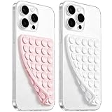
- 【PKYAA Double Sided Silicone Suction Phone Case Mount】PKYAA With Double Sided 40 Strong and Reliable individual suction cups, PKYAA provides a thicken and upgraded universal silicon suction mount for your phone.
- 【Friendly to Content Creators】If you are a content creator or an online influencer, you can create videos anywhere with this suction mount completely hands free with this silicone cell phone mount for cases.
- 【HANDS-FREE & Adhere to Mirrors】This Double Sided silicone suction phone case mount allows you to stick your phone to the mirror easily. No longer holding your phone in one hand to watch video tutorials while making up.
- 【Strong Grip on the Smooth Surface】You can easily hang your phone anywhere with a smooth surface. All you do is you clean off your phone and smooth surface. It is STURDY and it not only sticks to mirrors, it also sticks to windows, it sticks to refrigerators, tiles and other clean, flat surfaces.
- 【Press Down Firmly Every 30 Minutes】Use your palm or fingers to press the phone down firmly and check it's secure before letting go. Apply even pressure for a few seconds to allow the suction cup to adhere properly. To maintain the grip and prevent accidental falls, it's a good practice to periodically reapply pressure to the suction cup.
The header wraps or collides
Remove secondary links from the phone header, shorten labels, choose a single menu trigger and test the logo at the smallest target width. Recheck after enabling account or cart controls.
Images create slow or shifting pages
Use dimensions appropriate to the rendered slot, compress large originals and reserve space for media so content does not jump while images load. Retest with the real image library.
A plugin breaks the layout
Disable extensions one at a time on staging to identify the conflict, then check the plugin’s mobile markup and CSS. If the problem appears only on checkout or account pages, test those templates independently from the blog.
Updates undo customizations
Keep custom CSS and template changes in the supported customization layer, maintain a staging copy and record the theme, WordPress, WooCommerce and extension versions before updating.
What the evidence can—and cannot—tell you
The 2026 comparisons and the controlled mobile-reading test provide useful candidates and a repeatable way to think about mobile quality. They do not provide a universal fastest-theme ranking. Page weight and loading behavior vary with hosting, templates, plugins, fonts, image sizes, caching and content. Even a measured result from an identical eight-post blog cannot predict the checkout experience of your store or the performance of a media-heavy homepage.
For that reason, treat the shortlist as six starting hypotheses:
- Astra for broad flexibility and starter sites.
- GeneratePress for a lean, performance-minded blog foundation.
- Kadence for visual header, footer and typography work.
- Blocksy for modern responsive controls on content and commerce sites.
- OceanWP for documented responsive and WooCommerce-oriented settings.
- Neve for a lightweight general-purpose trial.
Install two or three on staging, reproduce the same templates and run the complete test set before selecting one. The winner is the theme that meets your reading, accessibility, maintenance and transaction requirements with the least corrective work.
Quick wins for a faster PC:
Scan for outdated or missing drivers - takes under a minuteDriver Scan →Repair Windows errors before they cause bigger problemsFix Now →Fix the driver behind crashes, sound loss and screen glitchesFind Drivers →Quick Recap
Product prices and availability are accurate as of the date/time indicated and are subject to change. Any price and availability information displayed on Amazon at the time of purchase will apply.