Recommended Free Tools
To speed up a WordPress site with WebP, do two separate jobs: generate WebP derivatives from your JPEG and PNG files, then serve those derivatives only to browsers that support them while retaining a JPEG or PNG fallback. WordPress has supported WebP uploads since version 5.8, and its responsive-image features can deliver an appropriately sized file instead of a full desktop image. Done carefully, this reduces image bytes without broken images, layout shifts or visible compression damage.
Antihost offers managed WordPress hosting with free migration, one-click staging and a 14-day free trial.
What WebP changes on a WordPress site
WebP is an image format designed for web delivery. It supports both lossy and lossless compression, transparency and animation. Google describes it as providing smaller images at comparable visual quality. In Google’s published figures, lossless WebP files are 26% smaller than equivalent PNG files, while lossy WebP files are 25–34% smaller than comparable JPEG files at equivalent quality. The Google documentation page does not display a publication date, so those percentages should be treated as the figures reported there rather than as a dated benchmark for every image.
As an Amazon Associate I earn from qualifying purchases.
Quick wins for a faster PC:
Scan for outdated or missing drivers - takes under a minuteDriver Scan →Repair Windows errors before they cause bigger problemsFix Now →The saving varies with the source. A photograph with large areas of similar color may compress very differently from a screenshot containing text, a logo with transparency or a highly detailed game capture. WebP is therefore a format choice, not a guarantee that every file will shrink by the same percentage.
WordPress supports WebP from version 5.8 onward. You can upload and place a WebP in the Media Library just as you would a JPEG, and WordPress can create WebP derivatives from JPEG uploads when the image editor on the server supports WebP. Original uploads can remain available for editing or fallback delivery.
#1 Best Overall

- BLUE LIGHT BLOCKING GLASSES: Our blue light glasses for women boast UV400 protection, blocking harmful blue rays from computer screens. With these bluelight glasses women, you can enjoy gaming, reading, or watching TV with no worries of eye strain.
- EYE RELIEF: Our blue light glasses are engineered to reduce blurry vision or strain caused by prolonged screen time. These womens blue light glasses aid in better sleep by preventing blue light from disrupting your natural sleep cycle, helping you fall asleep faster and enjoy a more restful night's sleep, making them the perfect christmas present.
- COMFORTABLE: Crafted from durable material, our trendy blue light glasses for woman or blue light glasses men ensure long-lasting comfort. The high-transmittance lenses accessories, gamer gifts for men, help keep your eyes relaxed. Perfect stocking stuffers, gifts for gamers men, christmas gifts for men, halloween costumes.
- LIGHTWEIGHT: These clear blue light glasses feature a lightweight frame, meaning they’ll stay comfy for long-term wear. Perfect as blue blockers glasses for women or mens blue light glasses, these non-prescription fake glasses for men can be worn throughout the day. The blue light blocking glasses women feature polycarbonate HD lenses, which are anti-reflective and restore true color.
- WORRY-FREE PURCHASE: If you experience any issues, our support team is ready to assist you quickly. These are the perfect costume glasses for cosplay dressing up.
Why conversion alone is not enough
Creating a file named photo.webp does not make visitors download it. Your page must reference the derivative, or your server must select it during a request. Conversely, serving a WebP URL without a fallback can produce a broken image in an older browser, an in-app webview or a tool that cannot decode WebP.
Think of the process as two stages:
- Conversion: create WebP files, including the WordPress thumbnail sizes your theme uses.
- Delivery: send WebP to capable clients and JPEG or PNG to everyone else, while preserving responsive widths.
Choose a conversion and delivery method
The best route depends on where you want processing to happen, how much existing media you need to convert and how much control you need over quality and caching.
Free tools Windows power users keep installed
One-click scans. No signup required.
| Approach | Where conversion runs | Existing-media bulk conversion | Fallback handling | Responsive sizes | Requirements and trade-offs |
|---|---|---|---|---|---|
| WordPress core filter | Server-side GD or Imagick | New uploads by default; existing files require a separate regeneration process | You control the original JPEG/PNG and markup | Uses WordPress sub-sizes, srcset and sizes |
Little extra software, but the host must have WebP support and the theme must use WordPress image APIs |
| Command-line or build conversion | Development machine, build server or deployment pipeline | Yes, when you process the library or asset directory in bulk | You keep source files and publish both formats | You generate the widths you need | Maximum repeatability and quality control; requires a scripted workflow and a way to update media references |
| Optimization plugin | Usually the WordPress server, sometimes a connected service | Often available, subject to the plugin’s limits | Typically automated, but verify that original files remain and that fallback markup is valid | May be automatic; inspect the generated HTML | Fastest for non-developers, but maintenance, compatibility, storage and quality settings depend on the specific plugin |
| Client-side or current WordPress media processing | Visitor’s browser for supported setups | Not necessarily; behavior depends on the implementation | Retain a server-side original and fallback | Depends on the browser and WordPress version | Can reduce server work, but browser support and exact behavior vary; test your minimum supported browser |
| CDN or edge negotiation | CDN or edge layer | Usually automatic for cached source images | Selected from the request’s capabilities | Often automatic if width transformation is enabled | Check cache variation, headers, URL stability and the service’s format policy |
Path A: generate WebP with the WordPress core filter
WordPress developer documentation exposes the image_editor_output_format filter. Add the filter in a site-specific plugin or a child theme rather than editing WordPress core. The documented example maps JPEG output to WebP:
add_filter( 'image_editor_output_format', function ( $formats ) {
    $formats['image/jpeg'] = 'image/webp';
    return $formats;
} );
This changes the format used by WordPress’s image editor when it creates derivatives. It does not retroactively convert every file already in your uploads directory, and it does not automatically repair a theme or page-builder element that hard-codes an original URL.
Check the server before enabling the filter
- Confirm that the active PHP image editor, GD or Imagick, has WebP support. A host can provide one editor without enabling the required codec.
- Upload a test JPEG and inspect the resulting attachment sizes, featured-image output and any theme-generated crops.
- Open the generated WebP directly and check its response header. A WebP file must be served as
image/webp. - Verify that the original JPEG still exists if you need editing, an older-browser fallback or a recovery path.
If the upload fails, thumbnails are missing or the files remain JPEG, remove the filter and ask the host whether GD or Imagick was compiled with WebP support. Do not assume that a successful JPEG upload proves WebP encoding is available.
Account for WordPress’s big-image threshold
WordPress’s default big-image threshold is 2,560 pixels. For an upload that exceeds the threshold, WordPress may create a scaled-down “-scaled” original and use that for subsequent sizes. Change the threshold only when your design and editing workflow genuinely require larger source dimensions. Raising it increases storage and processing work; lowering it can remove detail needed for large galleries or full-screen artwork. Test the threshold together with your WebP filter so you know which source each derivative uses.
PC Slower Than It Used to Be?
A free scan shows the junk files, broken settings and background clutter dragging Windows down - then fixes them in one click.Free scan · Windows 10 & 11Crashes, No Sound, or Screen Glitches?
Random freezes, missing sound and display glitches usually trace back to one bad driver. Find and replace yours safely.Free scan · under a minuteConvert existing attachments
The filter affects processing when images are generated; it does not itself walk through old uploads. To convert an existing library, use a maintained regeneration or optimization workflow that can rebuild the required sub-sizes and write WebP files alongside the originals. Take a backup first, process a representative batch, and verify attachment metadata before running a full-library job. A failed regeneration can leave a page referring to a size that no longer exists.
Rank #2

- WINDEX GAMING WIPES: effortlessly clean all your gaming gear and gaming electronics in one easy step with our new Windex Gaming Wipes
- AMMONIA FREE: our ammonia-free formula is safe to use on all of your favorite gaming equipment like consoles, headsets, controllers, screens, keyboards, and more
- PRE-MOISTENED WIPES: each wipe instantly removes dust, dirt, and stubborn smudges and fingerprints leaving a streak-free shine
- ANTI-STATIC: great for cleaning and wiping down your gaming gear and electronics leaving behind no visible residue
- COMPACT RESEALABLE PACKAGE: store your pack of Windex Gaming Wipes anywhere in your home for whenever a quick and easy wipedown is needed
Path B: use cwebp or an image-optimization plugin
Command-line conversion with cwebp
Google documents cwebp for converting JPEG and PNG files. A typical single-file conversion is:
cwebp -q 80 input.jpg -o output.webpThe -q value is a quality setting, not a promise of a particular file size. Start with a quality appropriate to the image, compare the result at the rendered size and adjust. For transparent PNG artwork, preserve alpha and inspect fine text and edges; for photographs, check faces, foliage, gradients and dark areas for ringing or banding.
For a real WordPress library, conversion must include the widths your site publishes, not only the largest original. You can process source images in a build step, create several widths, retain the source JPEG or PNG and upload both formats. If you replace files in uploads manually, update attachment metadata and clear any image or page cache that still points at old dimensions.
Automated plugin conversion
A maintained image-optimization plugin can create WebP files beside originals, regenerate old attachments and update markup. For example, the WordPress.org listing for “Images to WebP” states that it requires GD or Imagick with WebP support and creates WebP files alongside originals. Treat that listing as an implementation example, not a blanket recommendation: check the plugin’s current release activity, supported WordPress and PHP versions, multisite behavior, storage use, rollback process and compatibility with your theme and page builder.
Before enabling automatic replacement on a production site:
- Make a database and uploads backup.
- Run the plugin on a small sample containing photographs, transparent graphics, logos and screenshots.
- Inspect attachment pages, featured images, galleries, lazy-loaded images and Open Graph or social-sharing images.
- Confirm that disabling the plugin leaves working JPEG or PNG fallbacks rather than dead WebP URLs.
Serve WebP with a reliable fallback
Use the picture element for explicit control
The most portable markup offers a WebP source and keeps a conventional image in the img element:
<picture>
  <source srcset="/uploads/photo.webp" type="image/webp">
  <img src="/uploads/photo.jpg" alt="Descriptive alternative text" width="1200" height="800">
</picture>
A browser that understands the declared MIME type can choose the WebP source. A browser that cannot decode it uses the JPEG fallback. Keep meaningful alternative text on the img, because the fallback is also the accessible image description.
Rank #3

- Ergonomic & Adjustable Design: Fight "text neck" and improve your posture. Designed for comfort, it offers an adjustable height (7.1in-8.5in) (1.4in adjustable range) and angle (5°-85°) Please note: cell phone stand is only 9 inches tall—the length of a standard pencil
- Without blocking subtitles Perfect for office desk Tiktok Face Time Zoom video—this is the ultimate kitchen desk essential for phones! Perfect viewing experience while reducing neck back strain, A must-have for gamers streamers desk, and anyone who values both style and support!
- Sleek & Stable Design fits Otterbox Case: Say goodbye to bent cables, tangles, and tip-overs! LISEN’s stylish adjustable desk phone holder features a built-in charging hole and smart cable management, keeping your phone secure and your workspace clutter-free cool gadgets for men
- ANTI-SLIP DESIGN free hands: The under 10.00 items easy gadgets back and the bottom of this kitchen essentials for women are fully covered by anti-skid silicone, which LISEN stand up desk decor can provide maximum protection device from any scratches and slides
- Your Perfect Viewing Companion:If your product arrives damaged or breaks within 365 days, reach out to LISEN for a quick and hassle-free solution. Struggling with assembly, like tightening the screw? We’ve got your back! Your experience matters to us. (Product including: phone Holder stand*1, screw*1, hexagon screwdriver*1, specification*1)
Make the picture element responsive
One 1,200-pixel WebP delivered to a 320-pixel phone is still an oversized download. Generate multiple WebP widths and provide a matching sizes rule:
<picture>
  <source
    type="image/webp"
    srcset="/uploads/photo-480.webp 480w, /uploads/photo-800.webp 800w, /uploads/photo-1200.webp 1200w"
    sizes="(max-width: 600px) 100vw, 800px">
  <img
    src="/uploads/photo-800.jpg"
    srcset="/uploads/photo-480.jpg 480w, /uploads/photo-800.jpg 800w, /uploads/photo-1200.jpg 1200w"
    sizes="(max-width: 600px) 100vw, 800px"
    alt="Descriptive alternative text"
    width="1200"
    height="800"
    loading="lazy"
    decoding="async"
  >
</picture>
The width descriptors tell the browser the intrinsic width of each candidate. The sizes value describes the rendered slot: in this example, the image occupies the viewport up to 600 CSS pixels and otherwise no more than 800 pixels. Adjust it to your actual layout. WordPress’s responsive-image APIs can generate and maintain these attributes when the theme uses standard attachment functions such as wp_get_attachment_image().
Always include intrinsic width and height. They let the browser reserve the correct aspect-ratio box before the file arrives, reducing cumulative layout shift. Do not add loading="lazy" to the page’s largest above-the-fold image without testing; delaying the hero image can hurt perceived loading.
Let WordPress generate markup where possible
If a theme calls WordPress’s attachment-image functions, WordPress can add srcset and sizes from registered sub-sizes. Avoid replacing that output with a single hard-coded URL. When a page builder stores its own image HTML, inspect the rendered page and configure its responsive-image option or replace the block with a native Image block or theme function.
Server-side content negotiation and rewrites
Instead of writing a picture element for every image, a server or CDN can choose a same-name WebP file when the request advertises support through the Accept: image/webp header. Apache or Nginx rewrite rules can implement this pattern, but the details depend on your hosting stack and must be tested in a staging environment.
Negotiation introduces a cache requirement: a cache must vary its stored response by the Accept header. If it does not, a WebP response can be served to a client that requested JPEG, or a JPEG can be cached for a WebP-capable client. Confirm the cache key, the emitted Vary behavior where applicable, and purge old variants after changing rules.
- Never rewrite every image request to WebP without checking that the derivative exists.
- Return the original JPEG or PNG when the WebP file is absent or the client does not advertise support.
- Set the correct
Content-Typefor each response; do not rely on a filename extension alone. - Test direct URLs, query-string versions, signed URLs and image-proxy requests, because these may bypass ordinary rewrite rules.
The explicit picture method is usually easier to reason about when you cannot control every cache layer. Negotiation can reduce HTML complexity, but it requires disciplined cache testing.
Rank #4

- Easy Installation: Our gaming lights have been designed to enhance your entertainment experience. Simply position the led light bar next to your TV or game console to create a game room environment with ease. They come with USB power and a 60 inch cord for direct mounting and mobility
- Audio Syncing & Extensive Mode: The built-in high-sensitivity music sensor allows you to sync the TV led lights to your favorite music. Lights react and move to the beat of music, film and game audio, creating an incredible immersive sound and light experience – and all without the need for an additional hub. You can choose from 64+ patterns, including strobe, illusion, jump, energy, gradient, running, chasing, fluttering mode etc. Each mode can be applied to different scenes
- 64+ Chasing IC+RGB & W Effect: The independent control design of IC+RGB and white all-in-one multifunctional rgbw led bar lights monitor backlight allows you to easily switch the led lights for desk between IC+RGB and white to enjoy a variety of lighting effects, you can choose white lighting mode with high brightness for better illumination when working, etc. Choose IC+RGB lighting mode when you need to create an entertaining atmosphere for the light show, 16 million colours of Color changing rgb light bar let you dance to the beat and create a dynamic party atmosphere
- Dynamic and Dimmable Lights: 1%-full brightness free brightness adjustment gives you the flexibility to adjust dimmable led light bar for room decorations or a variety of occasions
- USB Powered: USB light bars for room can be powered by powernank, usb charger, TV, Monitor, laptop PC mainframe, making behind TV led lighting bar easy to install in any location.TV led lights are powered by the TV usb interface / PC mainframe, can be turned on/off synchronously with TV / PC
Quality settings: reduce bytes without damaging the image
Choose quality by image category rather than applying one number to every attachment.
| Image type | What to inspect | Practical approach |
|---|---|---|
| Photographs | Faces, hair, foliage, skies, gradients and dark shadows | Compare lossy WebP at the actual display width; raise quality when blocking, halos or banding are visible |
| Logos and UI graphics | Sharp edges, one-pixel lines and text | Use lossless WebP or a carefully tuned lossy file; retain transparency when required |
| Screenshots and game interfaces | Small text, icons and diagonal lines | Inspect at 100% and at the CSS display size; artifacts around text are often unacceptable |
| Transparent artwork | Alpha edges against light and dark backgrounds | Verify the alpha channel and test both page themes; a matte fringe can appear after conversion |
Compare files at the size readers see, not only zoomed to the source’s original dimensions. A large source can look excellent while its 320-pixel derivative shows obvious ringing. Keep the source image so you can regenerate at a different quality or width later.
A complete validation checklist
Measure before and after conversion so a reported saving reflects your pages rather than a theoretical format comparison.
- Record a baseline. Capture a representative page load, total image bytes, number of image requests and the largest images on mobile and desktop.
- Select representative assets. Include photographs, transparent graphics, logos, screenshots and at least one large hero image.
- Generate derivatives. Create WebP files at the WordPress sub-sizes your layouts actually use, while retaining originals.
- Inspect visual quality. View each derivative at its rendered dimensions and check text, faces, gradients, transparency and cropping.
- Inspect HTML. Confirm that WebP candidates have the correct widths,
srcset,sizes, intrinsic dimensions and meaningfulalttext. - Check network responses. A WebP request should return
Content-Type: image/webp; a fallback request should return JPEG or PNG with its corresponding type. - Test unsupported paths. Verify the fallback by disabling WebP support in a test browser or requesting the fallback URL directly.
- Run Lighthouse. Use the “Serve images in next-gen formats” audit, then review whether the remaining recommendation is caused by a missed template, an oversized source or an image loaded by a third-party component.
- Retest on real layouts. Check a phone-sized viewport, a desktop viewport, slow mobile conditions and pages with galleries or lazy loading.
- Monitor after launch. Watch cache hit rates, 404s, image errors, storage growth and unexpected format variants after deploying conversion or negotiation rules.
Common failures and fixes
Lighthouse still reports JPEG or PNG images
Find the exact URL in the audit details. The image may be a CSS background, a page-builder asset, an Open Graph image, a theme icon or a third-party resource outside WordPress’s attachment pipeline. Convert that asset separately or update the component that emits it. Also check that the WebP file is not being generated but never referenced.
Images are broken in an older browser or app
Inspect the markup for a real img fallback. If you use server negotiation, check the request’s Accept handling and cache variation. A rewrite that serves WebP unconditionally is unsafe.
The Tool Desk
Outbyte PC Repair FREERepair Windows errors before they cause bigger problemsFix Now →Outbyte Driver Updater FREEFix the driver behind crashes, sound loss and screen glitchesFind Drivers →Only full-size images are WebP
The conversion hook may be active for new uploads while old thumbnails remain unchanged, or the theme may bypass WordPress’s image editor. Regenerate the attachment sizes with a tested workflow and inspect the rendered srcset, not just the Media Library’s original file.
WebP files are larger than the originals
This can happen with already-optimized PNGs, small icons or a quality setting that is too high. Compare the byte size and visual result for that asset type. Keep the original format when it is smaller or visibly better; WebP is an option, not a requirement.
Best Value
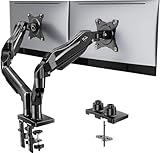
- Compatible with Wide Screens - To ensure compatibility with the dual monitor mount, your each monitor must meet three conditions at the same time: First, computer screens size range: 13 to 32 inches. Second, screen weight range: 4.4 to 19.8 lbs. Third, the back of the monitor screen must have VESA mounting holes with a pitch of 75x75mm or 100x100mm.
- Regarding the compatibility with desks - Your desk must meet three conditions at the same time: First, desk material: Only wooden desks are recommended, plastic or glass desks cannot be used. Second, desk thickness range: 0.59" - 3.54". Third, the bottom of the desk should not have any cross beams or panels, as this will interfere with installation. We recommend carefully checking that your desk and monitors meets all above conditions before purchasing.
- Dual C-Clamp Hold - Worried your dual monitors might wobble or slip? Our upgraded base uses a larger platform plus a dual C-clamp structure to lock the dual monitor arm firmly to your desk. Each arm safely keeps your screens steady while you type, click and game—no shaking, no sliding, just a clean and secure setup you can trust every day. It also provides Grommet Mounting installation choice, both options ensure stable and secure fixation for your 0.59" - 3.54" desk.
- Full-Motion Adjustment For Comfortable View - Pull the screen closer when you’re deep in a spreadsheet, push it back to watch videos, or rotate to portrait for coding — moving everything smoothly with just one hand. The monitor stand offers +85°/-50° tilt, ±90° swivel and 360° rotation. Raise your monitor up to 15.75″ to support a healthy sitting posture. Whether you’re working from home, gaming through the night, or switching between video calls and documents, getting the screens to your natural line of sight helps relieve neck, shoulder and back strain so you can stay focused longer with less fatigue.
- Keep Your Desk Organized: By lifting both screens off the desktop, this dual monitor stand opens up valuable space for your keyboard, notebook, docking station or a simple, clutter-free work area. Built-in cable management guides wires along the arms, keeping cords out of sight and out of the way. Enjoy a tidy, modern workstation that looks as good as it feels to use.
Images look soft, blocky or have halos
Check the derivative’s pixel dimensions first. A file that is too small cannot be repaired by increasing quality. If dimensions are correct, raise the quality setting or use lossless compression for line art and screenshots, then regenerate the affected sizes.
Pages show the wrong image after deployment
Clear the page cache, object cache, CDN variants and browser cache in a controlled order. For content negotiation, verify that cached objects vary by Accept. For filename-based replacement, confirm that each WebP file is present before the rewrite runs.
What’s actually slowing this PC down?
Pick the symptom - the matching free tool is one click away.
Which workflow fits your site?
- Choose the core filter when you control hosting, have GD or Imagick with WebP support and want a small, transparent implementation for future uploads.
- Choose cwebp or a build pipeline when developers already process assets, need reproducible quality settings or want to convert a large library outside production requests.
- Choose a maintained plugin when you need bulk conversion and automatic metadata or markup updates, but accept the plugin’s storage and maintenance requirements.
- Choose client-side processing only after confirming browser support, version behavior and a server-side fallback for unsupported setups.
- Choose negotiation at the edge when you can verify cache variation and response headers across every CDN and proxy layer.
Whichever path you choose, keep the original files, generate the responsive widths your design uses, provide a fallback, and validate both bytes and appearance. Those controls matter more than the conversion tool’s label.
Frequently Asked Questions
Can I delete the original JPEG or PNG after creating WebP files?
Keep the originals. They provide the fallback for clients that cannot decode WebP and let you regenerate a different width or quality later. Delete them only after a documented backup and a workflow that proves every required fallback still exists.
Does WebP replace the need for responsive images?
No. WebP changes the encoding, while responsive images choose an appropriate pixel width. A large WebP can still waste mobile bandwidth, so use WordPress sub-sizes with matching srcset and sizes.
Why does a browser download JPEG when it supports WebP?
The page may contain only a JPEG URL, the WebP candidate may be missing from srcset, or a cache may have stored the fallback variant. Inspect the rendered HTML and the network response, then check negotiation and cache variation if your server selects formats.
Quick Recap
Product prices and availability are accurate as of the date/time indicated and are subject to change. Any price and availability information displayed on Amazon at the time of purchase will apply.