Recommended Free Tools
Optimize WordPress CSS in this order: measure every stylesheet, stop unnecessary files at their source, minify what remains, deliver only above-the-fold rules immediately, and defer the rest with a safe fallback. Then retest dynamic blocks, responsive layouts, forms, menus, logged-in views, and repeat visits. This approach improves loading without trading away the styles that make a site usable.
Antihost offers managed WordPress hosting with free migration, one-click staging and a 14-day free trial.
Why CSS optimization matters on WordPress
Every stylesheet can add network transfer, parsing work and render-blocking time. A theme may load its base CSS, a page builder may add component files, and plugins may enqueue styles for forms, galleries, commerce features or blocks that a particular page never uses. Visitors on mobile connections feel the cost first, but excess CSS also affects desktop rendering and server-side caching behavior.
As an Amazon Associate I earn from qualifying purchases.
The goal is not to create one enormous file or remove every nonessential rule. Modern browsers can cache multiple files efficiently, and separate files can be useful when only some components appear on a page. The practical target is the smallest set of correctly ordered styles for each template, delivered at the right time.
Google defines Core Web Vitals as metrics for real-world loading performance, interactivity and visual stability. CSS changes can influence all three: less blocking work can improve loading, missing or late styles can hurt interaction and cause layout shifts, and incorrect responsive rules can make content jump between breakpoints.
#1 Best Overall

- BLUE LIGHT BLOCKING GLASSES: Our blue light glasses for women boast UV400 protection, blocking harmful blue rays from computer screens. With these bluelight glasses women, you can enjoy gaming, reading, or watching TV with no worries of eye strain.
- EYE RELIEF: Our blue light glasses are engineered to reduce blurry vision or strain caused by prolonged screen time. These womens blue light glasses aid in better sleep by preventing blue light from disrupting your natural sleep cycle, helping you fall asleep faster and enjoy a more restful night's sleep, making them the perfect christmas present.
- COMFORTABLE: Crafted from durable material, our trendy blue light glasses for woman or blue light glasses men ensure long-lasting comfort. The high-transmittance lenses accessories, gamer gifts for men, help keep your eyes relaxed. Perfect stocking stuffers, gifts for gamers men, christmas gifts for men, halloween costumes.
- LIGHTWEIGHT: These clear blue light glasses feature a lightweight frame, meaning they’ll stay comfy for long-term wear. Perfect as blue blockers glasses for women or mens blue light glasses, these non-prescription fake glasses for men can be worn throughout the day. The blue light blocking glasses women feature polycarbonate HD lenses, which are anti-reflective and restore true color.
- WORRY-FREE PURCHASE: If you experience any issues, our support team is ready to assist you quickly. These are the perfect costume glasses for cosplay dressing up.
Start with a complete CSS inventory
Do not change loading behavior until you know what is being requested. Record representative pages rather than inspecting only the home page.
Templates to inspect
- Home page on mobile and desktop.
- A normal article or page.
- A commerce, membership or form page.
- A template containing dynamic blocks, galleries, sliders or menus.
- The same views while logged in, if editors or members use the site.
What to record
- Stylesheet URL and handle, when available.
- File size before and after transfer compression.
- Whether the file blocks first render.
- Its dependencies, media condition and version string.
- Which template or component actually needs it.
- Whether it is reused on later visits from browser cache.
Use the browser’s Network panel and performance trace to inspect the request waterfall. Capture a baseline for mobile and desktop, and save the Core Web Vitals results so later changes have a reference. A stylesheet that appears wasteful on one page may be required by a responsive menu, a form validation state or a block that appears only after interaction.
Outdated Drivers Are Slowing You Down
One free scan finds every outdated or missing driver and matches the right update for your exact hardware.Free scan · exact hardware matchWindows Errors? Fix Them Before They Spread
Repair common Windows errors and clear accumulated junk for a smoother, more stable PC - no reinstall needed.Free scan · no reinstallHow WordPress loads styles
wp_enqueue_style() is WordPress’s primary function for enqueueing a stylesheet. It registers a handle, source URL, dependencies, version and media condition so WordPress can print styles in the correct order. The Theme Handbook recommends unique handles prefixed with the theme or plugin slug, which prevents collisions and makes later maintenance easier.
function arcade_theme_styles() {
    wp_enqueue_style(
        'arcade-theme-main',
        get_stylesheet_directory_uri() . '/assets/css/main.css',
        array(),
        '2.4.0',
        'all'
    );
}
add_action('wp_enqueue_scripts', 'arcade_theme_styles');
Keep a meaningful version string. When the file changes, updating the version gives browsers a new cache key; removing versioning entirely can leave visitors with stale CSS. Dependencies should reflect reality. If a component stylesheet relies on variables or base rules from another file, declare that relationship instead of relying on print order by accident.
Registering versus enqueueing
Registration defines a handle and its metadata; enqueueing asks WordPress to print it for the current request. This distinction matters when conditionally removing styles: a handle can be dequeued only after it has been registered and enqueued by the relevant code.
Rank #2
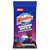
- WINDEX GAMING WIPES: effortlessly clean all your gaming gear and gaming electronics in one easy step with our new Windex Gaming Wipes
- AMMONIA FREE: our ammonia-free formula is safe to use on all of your favorite gaming equipment like consoles, headsets, controllers, screens, keyboards, and more
- PRE-MOISTENED WIPES: each wipe instantly removes dust, dirt, and stubborn smudges and fingerprints leaving a streak-free shine
- ANTI-STATIC: great for cleaning and wiping down your gaming gear and electronics leaving behind no visible residue
- COMPACT RESEALABLE PACKAGE: store your pack of Windex Gaming Wipes anywhere in your home for whenever a quick and easy wipedown is needed
Remove unused CSS at the source
The safest byte is a file that never gets enqueued. If a plugin adds a stylesheet globally but its feature appears on only a few templates, change the plugin or theme integration so the asset is loaded only where needed. Source-level conditions are generally more durable than a growing list of front-end exceptions.
Conditional enqueueing
function arcade_form_assets() {
    if ( is_page_template('templates/contact.php') ) {
        wp_enqueue_style(
            'arcade-contact-form',
            plugins_url('css/contact-form.css', __FILE__),
            array(),
            '1.3.0'
        );
    }
}
add_action('wp_enqueue_scripts', 'arcade_form_assets');
Choose conditions that match the feature’s real location. A form may be embedded in a widget, a reusable block or a shortcode, so a simple page-ID rule can be too narrow. Test every placement before removing a global load.
Dequeuing an already-loaded stylesheet
wp_dequeue_style() removes a previously enqueued stylesheet. It does not work if the handle has not been registered, and it can fail when another callback enqueues the file later in the request. Run dequeue logic at an appropriate priority after the code that adds the asset.
function arcade_remove_gallery_css() {
    if ( ! is_page_template('templates/landing.php') ) {
        wp_dequeue_style('gallery-plugin-style');
        wp_deregister_style('gallery-plugin-style');
    }
}
add_action('wp_enqueue_scripts', 'arcade_remove_gallery_css', 100);
Deregistering is optional and more aggressive; use it only when you are certain no remaining dependency needs the handle. A plugin update may rename a handle or change its dependency graph, so treat dequeue rules as code that needs regression testing.
Page-level asset managers
For plugin-heavy sites, an asset-management tool can expose a per-page list of styles and scripts. This is useful when changing the plugin itself is impossible, but it increases operational risk: a page may appear correct in one state while failing after a form submission, a menu toggle or an AJAX update. Record each unload rule, its reason and the templates it covers.
Do these 3 things before closing this tab:
1Clear out junk files and repair common Windows errors2Fix the driver behind crashes, sound loss and screen glitches3Repair Windows errors before they cause bigger problemsRank #3

- Ergonomic & Adjustable Design: Fight "text neck" and improve your posture. Designed for comfort, it offers an adjustable height (7.1in-8.5in) (1.4in adjustable range) and angle (5°-85°) Please note: cell phone stand is only 9 inches tall—the length of a standard pencil
- Without blocking subtitles Perfect for office desk Tiktok Face Time Zoom video—this is the ultimate kitchen desk essential for phones! Perfect viewing experience while reducing neck back strain, A must-have for gamers streamers desk, and anyone who values both style and support!
- Sleek & Stable Design fits Otterbox Case: Say goodbye to bent cables, tangles, and tip-overs! LISEN’s stylish adjustable desk phone holder features a built-in charging hole and smart cable management, keeping your phone secure and your workspace clutter-free cool gadgets for men
- ANTI-SLIP DESIGN free hands: The under 10.00 items easy gadgets back and the bottom of this kitchen essentials for women are fully covered by anti-skid silicone, which LISEN stand up desk decor can provide maximum protection device from any scratches and slides
- Your Perfect Viewing Companion:If your product arrives damaged or breaks within 365 days, reach out to LISEN for a quick and hassle-free solution. Struggling with assembly, like tightening the screw? We’ve got your back! Your experience matters to us. (Product including: phone Holder stand*1, screw*1, hexagon screwdriver*1, specification*1)
WordPress block assets
WordPress 6.9’s Frontend Performance Field Guide describes omitting assets for blocks that are ultimately not printed. The guide reports that this can reduce 5KB or more of CSS on a page, creating room for critical CSS. It also warns that unusual dependency patterns may require the enqueue_empty_block_content_assets filter. Treat that filter as an advanced compatibility measure, not a blanket switch.
Minify the CSS that remains
Minification removes unnecessary whitespace, comments and similar characters without changing intended behavior. It reduces transfer and parsing work, but it cannot fix a stylesheet that contains rules the page never uses. Remove or split waste first, then minify the files that are still required.
Safe minification checklist
- Keep a readable source file in version control.
- Generate a separate production build rather than editing minified output by hand.
- Preserve required character encoding declarations.
- Verify custom properties, calc expressions, escaped content and data URLs.
- Confirm source-map handling does not expose unwanted development files.
- Change the enqueue version when the generated file changes.
Do not combine files automatically just because an optimization tool offers that option. Under modern HTTP protocols, multiple sensibly sized files can perform as well as or better than one oversized bundle, especially when visitors cache common files and download page-specific ones only when needed. Let the request waterfall and repeat-visit measurements decide.
Inline critical CSS for the first viewport
Critical CSS is the subset of rules required to render the visible portion of a page at an initial viewport. Placing it early allows the browser to paint the shell while the remaining stylesheet loads later. Critical rules must be generated per materially different template and breakpoint; a homepage hero and an article page rarely share the same above-the-fold requirements.
What belongs in the critical set
- Base typography and colors visible immediately.
- Header, navigation and logo layout.
- Above-the-fold grid, hero or article structure.
- Responsive rules for the tested initial viewport.
- Placeholder dimensions that prevent images and embeds from shifting layout.
Do not put every component in the inline block. Large inline payloads delay HTML delivery and are repeated on pages where those rules are not needed. Keep the critical section small, deterministic and easy to regenerate after theme changes.
Rank #4

- Easy Installation: Our gaming lights have been designed to enhance your entertainment experience. Simply position the led light bar next to your TV or game console to create a game room environment with ease. They come with USB power and a 60 inch cord for direct mounting and mobility
- Audio Syncing & Extensive Mode: The built-in high-sensitivity music sensor allows you to sync the TV led lights to your favorite music. Lights react and move to the beat of music, film and game audio, creating an incredible immersive sound and light experience – and all without the need for an additional hub. You can choose from 64+ patterns, including strobe, illusion, jump, energy, gradient, running, chasing, fluttering mode etc. Each mode can be applied to different scenes
- 64+ Chasing IC+RGB & W Effect: The independent control design of IC+RGB and white all-in-one multifunctional rgbw led bar lights monitor backlight allows you to easily switch the led lights for desk between IC+RGB and white to enjoy a variety of lighting effects, you can choose white lighting mode with high brightness for better illumination when working, etc. Choose IC+RGB lighting mode when you need to create an entertaining atmosphere for the light show, 16 million colours of Color changing rgb light bar let you dance to the beat and create a dynamic party atmosphere
- Dynamic and Dimmable Lights: 1%-full brightness free brightness adjustment gives you the flexibility to adjust dimmable led light bar for room decorations or a variety of occasions
- USB Powered: USB light bars for room can be powered by powernank, usb charger, TV, Monitor, laptop PC mainframe, making behind TV led lighting bar easy to install in any location.TV led lights are powered by the TV usb interface / PC mainframe, can be turned on/off synchronously with TV / PC
Deliver the remainder with a fallback
The deferred stylesheet must still load when JavaScript is unavailable or delayed. A common pattern uses a preload request that switches to a stylesheet when loaded, plus a noscript fallback:
<link rel="preload"
      href="/wp-content/themes/arcade/assets/css/main.css?ver=2.4.0"
      as="style"
      onload="this.onload=null;this.rel='stylesheet'">
<noscript>
  <link rel="stylesheet" href="/wp-content/themes/arcade/assets/css/main.css?ver=2.4.0">
</noscript>
Test the transition between critical and full styles. A missing selector can leave buttons unstyled, while a late rule can cause a visible flash or layout shift. If a site uses a strict content-security policy, inline event handlers may be disallowed; use the site’s permitted loading strategy instead.
Defer non-critical styles without breaking components
Non-critical CSS includes rules for content below the first viewport or features that are activated later. Deferring it can improve the first render, but the page must become fully styled before users reach those components. Menus, modals, checkout steps, validation messages and responsive breakpoints are frequent failure points.
Free tools Windows power users keep installed
One-click scans. No signup required.
Use a component boundary
Keep feature CSS associated with the feature when practical. A gallery stylesheet can load when the gallery block is present; a checkout stylesheet can load on checkout routes. This preserves cacheable boundaries and reduces the chance that removing one file silently affects unrelated markup.
Respect media conditions
Use the media argument of wp_enqueue_style() for genuinely conditional files, such as print styles. Do not label a file with a false media condition merely to bypass render blocking; the browser may delay or omit rules that are actually needed at the current viewport.
Best Value
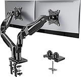
- Compatible with Wide Screens - To ensure compatibility with the dual monitor mount, your each monitor must meet three conditions at the same time: First, computer screens size range: 13 to 32 inches. Second, screen weight range: 4.4 to 19.8 lbs. Third, the back of the monitor screen must have VESA mounting holes with a pitch of 75x75mm or 100x100mm.
- Regarding the compatibility with desks - Your desk must meet three conditions at the same time: First, desk material: Only wooden desks are recommended, plastic or glass desks cannot be used. Second, desk thickness range: 0.59" - 3.54". Third, the bottom of the desk should not have any cross beams or panels, as this will interfere with installation. We recommend carefully checking that your desk and monitors meets all above conditions before purchasing.
- Dual C-Clamp Hold - Worried your dual monitors might wobble or slip? Our upgraded base uses a larger platform plus a dual C-clamp structure to lock the dual monitor arm firmly to your desk. Each arm safely keeps your screens steady while you type, click and game—no shaking, no sliding, just a clean and secure setup you can trust every day. It also provides Grommet Mounting installation choice, both options ensure stable and secure fixation for your 0.59" - 3.54" desk.
- Full-Motion Adjustment For Comfortable View - Pull the screen closer when you’re deep in a spreadsheet, push it back to watch videos, or rotate to portrait for coding — moving everything smoothly with just one hand. The monitor stand offers +85°/-50° tilt, ±90° swivel and 360° rotation. Raise your monitor up to 15.75″ to support a healthy sitting posture. Whether you’re working from home, gaming through the night, or switching between video calls and documents, getting the screens to your natural line of sight helps relieve neck, shoulder and back strain so you can stay focused longer with less fatigue.
- Keep Your Desk Organized: By lifting both screens off the desktop, this dual monitor stand opens up valuable space for your keyboard, notebook, docking station or a simple, clutter-free work area. Built-in cable management guides wires along the arms, keeping cords out of sight and out of the way. Enjoy a tidy, modern workstation that looks as good as it feels to use.
A practical optimization sequence
- Measure. Save request waterfalls, transfer sizes, render-blocking status and Core Web Vitals for mobile and desktop representative templates.
- Map ownership. Identify which theme, plugin or block enqueues each handle and document its dependencies.
- Prevent unnecessary loads. Prefer conditional enqueueing; use carefully scoped dequeue rules when source changes are unavailable.
- Minify. Build production CSS, preserve cache-busting versions and verify syntax.
- Create critical CSS. Generate it for each materially different template and initial viewport.
- Defer the remainder. Use a robust fallback and confirm styles load with JavaScript disabled.
- Run regression tests. Check dynamic blocks, menus, forms, responsive breakpoints, logged-in views and interaction states.
- Compare repeat visits. Measure a cold load and a cached load; an optimization that helps only the first request may behave differently for returning visitors.
- Monitor real users. Watch field data after deployment and roll back rules that create visual regressions.
Testing matrix and failure recovery
| Area | Test | Typical symptom if CSS was removed or delayed | Recovery |
|---|---|---|---|
| Dynamic blocks | Render each block on its own template and after any client-side update | Unstyled block or incorrect spacing | Restore its handle or load the component stylesheet conditionally |
| Menus | Open desktop and mobile navigation, including keyboard use | Menu is visible when it should be hidden, or toggle has no layout | Keep navigation rules in the critical or early stylesheet |
| Forms | Submit valid and invalid values; test logged-in and logged-out states | Error messages, labels or focus states lose styling | Load validation and form-state CSS with the form |
| Responsive layouts | Check defined breakpoints and intermediate widths | Overflow, overlap or sudden layout shift | Restore the breakpoint rules and retest at nearby widths |
| Repeat visits | Reload with a warm browser cache | Old CSS or a flash caused by mismatched cache versions | Update the enqueue version and purge relevant caches |
When a regression appears, first identify the missing handle in the Network panel and page source. Restore that single asset, then narrow the condition rather than abandoning all optimization. Keep a rollback copy of the previous enqueue configuration.
How to choose a WordPress CSS optimization method
| Method | Bytes removed | First-render effect | Repeat-visit behavior | Compatibility risk | Maintenance |
|---|---|---|---|---|---|
| Prevent enqueue at source | Highest when a whole file is unnecessary | Usually immediate | Best, because the file is never requested | Low when feature conditions are accurate | Requires theme or plugin code ownership |
| Conditional dequeue | High for correctly scoped pages | Immediate | Good, but rules must track handle changes | Medium | Review after updates |
| Minification | Moderate transfer reduction | Helps transfer and parse time | Benefits from cache after versioning | Low to medium | Regenerate after changes |
| Critical CSS plus deferred remainder | Does not remove total CSS | Can improve first paint substantially | Critical HTML may be repeated; deferred files can cache | Medium to high if coverage is incomplete | Regenerate for template changes |
| One combined stylesheet | Not inherently lower | Depends on protocol and file size | Can cache well, but may ship unused rules | Low technically, high payload risk | Often easy, but can hide ownership |
No single plugin has a universally proven performance advantage. Choose tooling based on whether you need per-page unloading, critical-CSS generation, minification or reporting, and validate the result on your own templates rather than relying on vendor-wide claims.
Common mistakes to avoid
- Deleting CSS by filename. Handles and dependencies, not filenames alone, define WordPress’s loading graph.
- Using one critical block everywhere. Different templates and viewport sizes need different above-the-fold rules.
- Deferring without a fallback. Visitors without JavaScript can receive an unstyled page.
- Ignoring authenticated views. Admin bars, membership controls and editor-only blocks can use additional selectors.
- Testing only the home page. Forms, commerce routes and dynamic blocks often expose missing assets first.
- Removing version strings. Visitors can retain stale CSS after deployment.
- Combining everything automatically. A single file may increase unused bytes and reduce cache efficiency.
- Trusting a green lab score alone. Check field data and visual correctness as well as synthetic metrics.
Monitoring after deployment
Optimization is an ongoing maintenance task. Log the handles and conditions you changed, the templates tested and the date of deployment. Recheck after theme, plugin, block-library and WordPress updates because a new dependency or markup change can invalidate a dequeue rule or critical-CSS build.
Compare real-user loading, interactivity and visual stability with the baseline. If field data worsens, inspect whether the cause is a missing style, a delayed component stylesheet, a cache mismatch or a layout rule that now applies at the wrong breakpoint. Roll back the smallest change that restores correctness, then reintroduce a narrower rule after testing.
Frequently Asked Questions
How do I remove unused CSS in WordPress?
Find which theme, plugin or block enqueues the stylesheet, then prevent it from loading on templates that do not use the feature. Prefer conditional enqueueing; use a carefully scoped wp_dequeue_style() rule only after the handle has been registered and enqueued.
Should I inline critical CSS?
Yes, when the critical set is small and generated for the specific template and initial viewport. Inline only first-viewport rules, load the rest separately, and retain a noscript or equivalent fallback.
How do I defer non-critical CSS safely?
Load the remaining stylesheet with a supported deferred-delivery pattern, then test with JavaScript disabled, on slow connections and across interactive states. Keep navigation, forms, responsive rules and layout placeholders available early enough to avoid flashes and shifts.
Which WordPress plugin makes CSS load faster?
There is no universal winner. Select a tool for the exact job—per-page unloading, minification, critical-CSS generation or diagnostics—and verify its effect with your own request waterfalls, Core Web Vitals and visual regression tests.
Quick Recap
Product prices and availability are accurate as of the date/time indicated and are subject to change. Any price and availability information displayed on Amazon at the time of purchase will apply.